|
|
|
Showing 1091 - 1100 of ~1613 |
| Image |
Comment |
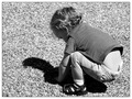
| 09/30/2006 02:10:15 PM | Planting the Seeds of Imaginationby freakin_hilariousComment: Critique Club Review:
I would have thought this picture would have done better. Evidently some voters didn't catch the metaphore. (Seeds of imagination aren't necessarily physical objects.)
Brightness, and contrast are good.
Focus is excellent. Though perhaps a soft focus would have helped communicate the imagination element in the title.
I do agree with winknasmile, that a position on the other side of the child would have been preferrable. Turned backs give the impression of exclusion. Also, we are left with a face in shadow and in competition with a "view" of a disposable diaper.
|  Photographer found comment helpful. Photographer found comment helpful. |
| 09/30/2006 02:02:01 PM | Maple Tree Seedsby AlainComment: Critique Club Review:
Very nicely done...
Excellent focus, and great use of depth of field. If there were leaves, I cannot tell where they were. Excellent job on the editing.
The backround is very pleasing. Very calm.
If anything, I would wish for the backlight to be a bit stronger, or a little fill flash (just a smidge), for the seeds bodies. As is I can make out a tiny bit of detail on the seed bodies. It's just a little bit distracting, not bad. But if it were pure black, or just a little lighter, I would like it better. I think more backlight would be preferrable. The wings are almost like stained glass windows. Increasing this effect would be even better for me.
Very nice job. | | Photographer found comment helpful. |
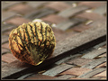
| 09/30/2006 01:56:02 PM | Juglans nigra (Black Walnut)by morg002Comment: Critique Club Review:
Nice picture.
The picture could pass for one done outside on an overcast or very cloudy day. The lack of shadows indicates that the "day" was not sunny.
Focus is excellent, and the depth of field was used very well to isolate the subject from possible distractions.
The use of the bottom light is interesting, and at the same time a small bit distracting. The highlight on the bottom of the nut, and the bright fiber above and to the right of the highlight, do not look "right". (Hard to say why, they just don't.)
Other than that, this is a nicely done picture, and if there were a visual indication as to why the nut is on the basket, it would make it a bit better for me.
Overall, nicely done and an enjoyable picture. |
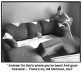
| 09/28/2006 10:00:26 PM | Thank You Gary Larson! by lifternessjtComment: Critique Club Review:
Congratulations on your ribbon, and a well deserved first place. It definetly looks like something straight out of a Larson book.
The wicker basket is a tiny bit distracting, but nothing major. It is really hard to critique this picture, because it is much closer to a graphic than a picture. However, that is not meant as a negative. That this picture was edited to this level without a bunch of post processing artifacts, speaks of a high level of artistic skill.
Congratulations on a well deserved first place. | | Photographer found comment helpful. |
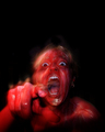
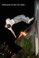
| 09/28/2006 09:55:04 PM | Look out, it's a red hot poker!by xianartComment: Critique Club Review:
To tell you the truth, the alternative entry would have worked better. Were there more "steam/smoke" coming off the character the picture would have worked better also. As is, the negative space is pretty good sized, and sort of just there.
Focus, lighting, color, saturation, and hue are well done.
You did a very good job keeping things sharp with the timed exposure, and yet at the same time, giving the impression of movement.
In some respects I feel that the challenge turning into a graphic arts contest, but nothing says that we can't have one of those once in a while. Perhaps that should have been made a little clearer to entrants.
Overall I really like this picture, the alternate picture felt even more Larson-ish. I do not remember this particular cartoon. But then there are many I do not remember.
I do think you should have scored higher than you did. | | Photographer found comment helpful. |
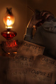
| 09/28/2006 09:46:57 PM | Early Writers Blockby JasComment: Critique Club Review:
Focus and depth of field are great.
I'm not sure if you meant to show all the dodging that went in. But it is apparrent on the names on the papers, and around the pencil and the fingers holding the pencil. A little subdued dodging in that area would look a litte better to me.
The amount of post processing around the lamp chimney has made it look soft and slightly out of focus, while the lamp base is nice and sharp.
The picture is a little dark, but not overly so.
Overall I really like the picture, and as others mentioned it is much more photographic than some that came much closer to being drawings. | | Photographer found comment helpful. |
| 09/28/2006 02:42:39 PM | Lines Linesby cryingdragonComment: Critique Club Review:
Lighting, contrast, color, brightness hue, and saturation are all excellent.
Focus is lazer sharp, and depth of field is fine.
I like the colors, the contrast of the sky against the kite.
My only complaint, and maybe my eyes are just backwards, is that my eyes follow the lines away from the kite to to pint where they converge, and then off the page to the left. The kite plays optical tricks. At first, and at times it looks like you are viewing the kite from behind. Then you notice the lines continue into the kite and you are actually seeing the inside or front of the kite.
When seen as from outside or behind the kite, the distraction is extremely strong. When seen as inside or in front of the kite, the effect is still there, but not as strong. Even from the front my eyes as they follow the expanding strings, tend to want to slide back down to the junction of the strings and away from the subject.
Overall a very good photo. | | Photographer found comment helpful. |
| 09/28/2006 12:33:15 AM | After years of photography Gus still didn't get why his photo's were all too darkby indridistefansComment: Critique Club Review:
I think you are already aware of the biggest problem. It is hard to see exactly what is going on with the camera. It it sideways, upsdide down, lens cap on, backwards, what?
The flowers intrude in the camera area, and distract the eye, the details of the camera are hidden in shadow. I don't believe the dark clothing really affected the camera detail, the clothing just blends into the shadow that obscures the needed information about the camera.
Other than that, focus is good, depth of field is OK. The closest flowers are soft, but hard focus is not really needed there. Skin tones do look a little bit cool. Flowers are a little under saturated for my taste.
Overall an interesting and funny photo. |
| 09/27/2006 08:20:41 PM | Falling Upby theSajComment: Critique Club Review:
Nice photo, and technically very well done. Good exposure, very good action capture.
I think what hurt you here is that it was not obvious enough as to what what going on. The title tells us that he is "falling up", which to me works for the far side. I'm beginning to think I remember on about falling up as opposed to falling down. Maybe it's just my imagination.
However, the subject isn't obviously falling up. I think the key word is obvious. Most voters spend much less than a minute per image. The story has to be told either qucikly or in a dramatic fashion so as to hold th interest untill the teller if finished. He looks like he is doing a flip, or falling down. His body language head positon, all are responding to normal gravity. So though the title says falling up, to many voters saw falling down, and some may never have even read the title. | | Photographer found comment helpful. |
| 09/26/2006 08:06:42 PM | Pythagorasby SergePComment: Critique Club Review:
Size does matter. When working on an entry, take advantage of every pixel and every byte allowed. Small pictures seldom do well. As noted in the comments below, it cost you some points here. The smaller a picture is, the harder it is to see details, judge focus, and other problems. Often voters will suspect the small size was done on purpose, in order to hide something and vote accordingly.
As for the picure: Color, saturation and hue look OK. Lighting is a little flat. 10 - 2 is a bad time for sunlit photos. The sun is almost directly above, and photos come out a little flat looking.
I like the contrast of the sky. I would have liked it a bit better, either without clouds, or full of clouds with lots of detail.
Overall a very nice picture. Congratulations on making the top half of the class. | | Photographer found comment helpful. |
|
Showing 1091 - 1100 of ~1613 |
Home -
Challenges -
Community -
League -
Photos -
Cameras -
Lenses -
Learn -
Help -
Terms of Use -
Privacy -
Top ^
DPChallenge, and website content and design, Copyright © 2001-2026 Challenging Technologies, LLC.
All digital photo copyrights belong to the photographers and may not be used without permission.
Current Server Time: 07/19/2026 03:45:41 AM EDT.
|