|
|
|
Showing 1011 - 1020 of ~1613 |
| Image |
Comment |
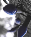
| 11/07/2006 06:26:52 PM | Lightsby KrystleComment: Critique Club Review:
Technical: Color, saturation, hue: Colors have been altered for effect, adding a bit of drama and coldness to the piece. Fits the dead tree well. Focus is very good.
Reaction: The trunk and background lights go against the idea of bokeh. While the limbs and sky work well. I'm not sure what you are trying to say with this piece. The out of focus bulbs that jut out from the tree are distractions for me, while the out of focus bulbs that lie flatter, work better. |  Photographer found comment helpful. Photographer found comment helpful. |
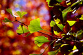
| 11/07/2006 05:54:31 PM | Ready To Leaveby bassboneComment: Critique Club Review:
Technical: Color, saturation and hue are excellent. Focus is nice and sharp.
Reaction: The challenge is the background, and the background is beautiful. However, the shadows on the leaves make them look as if they are damaged or dying. On several of the leaves the shadows at first look like brown dead spots.
When I look at the picture, I wonder what it might have looked like with only the single leaf that is broadside to the viewer. That one makes a great contrast to the background. As is, there is not really a single point of focus in the foreground to hold the eye for comparison against the background.
Even so, I sure do love that background. Nice work.
| | Photographer found comment helpful. |
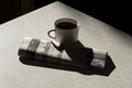
| 10/25/2006 12:41:08 AM | Cuppa Joe and the Newsby MaagicComment: Critique Club Review:
Technical: Focus and depth of field are both very good. Color saturation and hue: Picture is almost black and white, very little color to determine saturation and hue. Picture might work even a little better in black and white, since there is so little color.
Reaction: The picture lacks a little punch. I like the orinetation of the table coming to a point near the edge of the frame. I think I'd like it a little more if the table exited the frame at the two lower corners, making a triangle. Along with the afore mentioned black and white possibility, I think an increase in contrast would work well. Make the shadows black, so that the cup seems almost cut out of the newspaper, and the paper cut out of the table. Steam from the coffee would work well also. I know it is hard to get everything set while the coffee is still hot, but it sure looks like cold coffee at this point.
Overall an interesting picture with a lot of potential. |
| 10/25/2006 12:33:59 AM | Mornin' Coffeeby c_rosneyComment: Critique Club Review:
Technical: Focus is very good, and depth of field is well applied to this image. Color, saturation and hue are done well.
Reaction: A bit too staged for my tastes. The sugar cubes are frozen in space like tiny space stations. It's morning, cup-a-joe, action! I really would have liked to see the moment the cubes hit the coffee. A nice splash shot would be great. Maybe a little steam rising off the surface of the coffee too. As is, the coffe looks almost as frozen as the sugar cubes.
Overall a nice picture, could see it as part of an ad in a magazine, would love to see it redone with some action and energy. | | Photographer found comment helpful. |
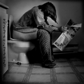
| 10/25/2006 12:28:05 AM | Morning Paperby xianartComment: Critque Club Review:
Technical: Focus is good, and depth of field works for this photograph. Brightness and contrast are done well.
Reaction: Over-sharing! Looking at your comments, your bio, and other work, this was obviously done to provoke a reaction. Looks like by the scores you got what you were looking for. By that I mean that I sense you were not necessarily aiming for a low score, but just for people to feel something, anything, about this image. Unfortunately voters here do not seem to separate feelings from votes. Something that makes us uneasy, or is graphic, gets low marks. Happy pictures get high marks.
It isn't all about the marks. And I'm impressed that you are willing to submit a picture that you know will get voted down, in order to have an image that will provoke a reaction.
I have to confess I probably would not have made this one of my top ten. It is more a reaction piece in my mind. But still I feel that this could have been say top 30 if not 20, based on somebody willing to say something other than saturation and sunsets.
Nice Job!
| | Photographer found comment helpful. |
| 10/24/2006 09:33:08 PM | Duck Shootby WillSnapsComment: Critique Club Review:
Technical: Focus and depth of field are excellent. color saturation and hue are excellent as well. Slide seems slightly tilted tot he left, but that could be an optical illusion.
Reaction: I like the use of the gradient filter. It helps provide some interest to an otherwise bland background. I really like the use of the blue tones in contrast to the duck.
I assume the duck is facing forward. The orange is taken for the bill, but could be a little hat. Which means the duck is a bit small. (S)He is overwhelmed by the slide. Together it is an interesting statment. Small duck big leap, or slide, of faith etc. A duck about twice the size of this, would have been great. I wouldn't want the camera any closer, as the view of the slide is great.
Overall this is a very good photo and well deserving of the top 30 finish you received. | | Photographer found comment helpful. |
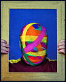
| 10/21/2006 03:13:11 AM | Gift Wrappedby sherpetComment: Critique Club Review:
Technical: Focus and depth of field are excellent. Color, saturation and hue are very good, with the exception of the skin tones. Skin tones are a bit blue. Is he suffocating?
Reaction: After reading your comments, it is a wonder he could breathe. Then again, looking at the skin tones, perhaps he wasn't. ;-)
I really like what you've done here, but at the same time, the camera angle and lighting makes him look a bit flat. Had he turned his head a bit, there would have been much more depth to the picture. Which I feel would have helped some.
As is, very creative, and I really like the colors and energy of the piece. Nice job!
| | Photographer found comment helpful. |
| 10/20/2006 06:08:30 PM | Faceless Ghostby kevinkingComment: Critique Club Review:
Technical: focus and depth of field are good. Nice use of a shallow depth of field to reduce background distractions. Color, saturation and hue are OK. Lighting is a bit off, the bright highlight on the tree steals the show from the ghost somewhat.
Reaction: The straw at lower left distracts some, along witht the very bright highlight on the tree. The image would have worked better had the ghost been highlighted. The ghost is a bit centered, but not a fatal problem. Some people might have voted you down a bit, seeing eyes as part of a face. I like the backround colors and pattern. I think the big problem is I like it too much. The background is great, but it makes the ghost look a little weak in comparison. It's just more or less a ghost hanging in a tree in front of a cool background. If the ghost were better lit, and perhaps a bit larger in the frame, it might work better.
| | Photographer found comment helpful. |
| 10/19/2006 04:22:08 PM | Cowgirl Codyby JeniYComment: Critique Club Review:
Technical: Focus and depth of field are excellent. Color, saturation and hue are excellent as well. Even the brightest areas are not burned out, yet whites do not look dingy. Skin tones are natural, other colors are not over processed, which is desireable in this photo.
Reaction: I like the pose. The white shirt may be a little clean or out of place for a real cowgirl. White doesn't stay white long on a working ranch. I love the texture of the barn, but at teh same time wonder of the picture might work a bit better if it were softened a bit through a shallower depth of field. While it is beautiful, it does compete a little bit. Only other thing is I wish I could see what she is looking at.
Overall an excellent photo. Congratulations on your top 20 finish.
| | Photographer found comment helpful. |
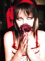
| 10/17/2006 07:38:00 PM | Angel of Deathby ratsforcandyyyComment: Critique Club Review:
Technical: Focus is good, depth of field is just a bit shallow. The rose and fingers go a little soft. Color, saturation, and hue are good. Skin tones are bordering on too bright for another challenge, but work well with this one.
Reaction: Wow, what a picture. You did almost too good a job here. The model's eyes steal the show. As is, it took until I read your comments to even notice the rose has deteriorated. So you did achieve your goal of making it pretty again. I would recommend a tighter crop.
Perhaps just the above the eyes, and below the hands. If the rose were moved up a tiny and the hands down a little, you could even eliminate the hands.
This has the bones of a really fine picture. I'd really like to see you work with it, and see what it could become. Though I guess wou would need to find a new rose by now.
Very nice work... |
|
Showing 1011 - 1020 of ~1613 |
Home -
Challenges -
Community -
League -
Photos -
Cameras -
Lenses -
Learn -
Help -
Terms of Use -
Privacy -
Top ^
DPChallenge, and website content and design, Copyright © 2001-2026 Challenging Technologies, LLC.
All digital photo copyrights belong to the photographers and may not be used without permission.
Current Server Time: 07/21/2026 04:17:05 PM EDT.
|