|
|
|
Showing 991 - 1000 of ~1613 |
| Image |
Comment |
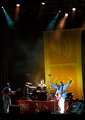
| 06/26/2008 07:20:12 PM | Brazilian Minister of Cultureby odradekComment: Critique Club Review:
Color and saturation are good. Contrast and brightness are OK, but leave the white of the guitarists pants completely blown out. The scene is otherwise well lighted. However I think the vertical format works against this image. The smoke in mid frame and the lighting at the top of the frame, compete with the subject (which I believe to be the band). When I look at the image my eye keeps wandering to the top of the frame, and this may have held down your score. I find myself wanting to see more of the band, and see more detail there.
There is an out of focus shadow at the center, at the bottom of the stage. (Another person, a stray photographer's finger?)
Although not bad, the stage does tilt from left to right. A little rotation of the image and then cropping just enough to make the edges of the picture straight, will fix this.
If this picture had been cropped at the top of the lower orange panel in the background, and then made larger, it would have worked better for me. You used the rule of thirds to good effect top to bottom, but then centered the band left to right. I don't know what was to the left or right of the band for getting them off center. Perhaps this was the best that could be done.
|
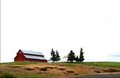
| 06/23/2008 02:41:44 PM | Overlooking the Bluffby riversongComment: Critique Club Review:
Color and saturation are good. The barn roof appears to go a bit soft where it meets the sky, but otherwise focus and depth of field are good. I think, as you have already mentioned in your comments, that the sky killed you. Too much, too featureless. This was a high contrast challenge, and while the dirt in the foreground shows some good contrast, the rest of the scene comes across as mid tone or bright. Had this been a day of magnificent thunder clouds, where the contrast could have helped, this much sky might have worked. As it is, over half of your frame is featureless and pale.
What I would really liked to have seen is the dirt embankment fill more of the screen. There is some great contgrast and shapes there. A picture where the farm was at the very top, with the embankment filling much of the rest of the frame, could really pop. All those great saturated colors, and the great shapes and contrast would really work together. You have a good start for a great picture, get closer next time, and see what happens. |  Photographer found comment helpful. Photographer found comment helpful. |
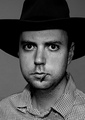
| 06/22/2008 09:31:36 PM | The Day is Doneby sailracer_98Comment: Critique Club Review:
Color/Saturation/Hue N/A Brightness good, Contrast good. Focus Excellent Depth of field very good
The blank background takes away from the picture. The photo looks a bit overprocessed, as evidenced alon the edge of the hat, particularly along the left side of the frame.
Crop is a bit tight, as the hat bleeds out of the frame. The head-on lighting makes the skin shiny, coupled with the intense stare, it gives it an almost Heeere's Johnny! feel. Sort of a half crazy cujo kind of thing.
I see you were going for a greiving portrait. Downcast eyes, and a downward tilted head would help there. The grieving tend to look down and not face the world.
Overall an interesting photo. | | Photographer found comment helpful. |
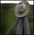
| 06/22/2008 09:20:33 PM | His Hatby LadyKComment: Critique Club Review:
Color/Saturation and hue are all good. Brightness is maybe a bit cool, but reading your comments there is only so much one can do with a cloudy day.
I like the texture on the fence posts, a bit brighter would have been better for my eyes. With the heavy border, the hat appears periously close to the edge of the frame. The shallow depth of field helps isolate the subject from the background, but at the same time renders the sky almost featureless. It does appear that there might be some patches of blue there. Or were they darker clouds?
The darkness at the left of the frame, joins to form a vertical shape that makes the picture a bit heavy and almost ominous. (Sort of..."and a shadow passed over the land... effect.)
Overall a good picture. | | Photographer found comment helpful. |
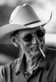
| 06/22/2008 09:04:23 PM | An American Cowboy “I'm the stuff men are made of” John Wayneby izadoodleComment: Critique Club Review:
Nice Picture!
Color N/A Saturation N/A Brightness Very Good Contrast Very Good. Lighting Very Good Focus Excellent Depth of Field Good. (Just a bit of softness on his right shoulder.)
This is a timeless picture. Could have been yesterday or 20 years ago. The cigarette is a little bit distracting. It takes a moment to realize the smoke is curling down. At first I was wondering if it was lit. Which means that I had been pulled away from the main subject. It almost looks like it was barely in his mouth, judging by the lenght of the exposed filter. A bit later in the smoke, with more smoke, or as he was lighting up could have made this picture stronger. Or no cigarette at all, for that matter. I could also visualize this photo in sepia or with an old photo effect.
Over all a strong photo. One where you feel like you get a sense of a little bit about who the subject is, which I really like in a photo.
Congratulations on making the top 25, it is well earned.
| | Photographer found comment helpful. |
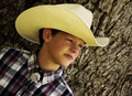
| 06/22/2008 08:53:28 PM | "Happy Trails, Cowboy!"by 777STANComment: Critique Club Review:
Without seeing the original I can't really say, but from the appearance of this photo and your comments, it appears to me that the picture was overprocessed. Lighting and contrast are good. Saturation is good. Color appears a bit yellowish to me. Perhaps it is he hat influencing the skin tones, as the shirt white areas are clean and bright.
The angle is different and interesting, but after a bit it appears almost as if he is toppling over. Sharpness in the area of the face, especially the cheeks is acceptable. What I believe that makes the picture look overly soft is the bark on the tree. The eye knows bark is rough, the boy is up against the bark. So if the bark looks soft, I think the mind transfers that mood to the boy's image.
I think had he been further from the tree, the eye would have seen it as a shallow depth of field and not at out of focus. | | Photographer found comment helpful. |
| 06/23/2007 08:12:49 PM | | | Photographer found comment helpful. |
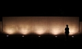
| 06/23/2007 08:05:29 PM | A Moment of Reflectionby m_sarzynskiComment: Critique Club Review:
Interesting picture. The monument taken by itself, looks a bit centered in the frame to me. With the darkness, the monument become a band running across the middle of the frame.
The solitary individual is a nice touch, but it looks almost as if it were a disinterested by stander, facing away with arms crossed. A bit more light, would have told us more.
Perhaps it is just an illusion but the image seems to slope downwards a bit from left to right.
Overall an interesting picture, congratualtions on making the top half of the class. |
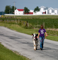
| 06/23/2007 07:58:49 PM | When the cows don't come home, you go get them by Buckeye_FanComment: Critique Club Review:
I didn't even know people walked cows...
Focus is nice and sharp, with a good use of depth of field to isolate the subject from the background. Color, staturation, and hue are done well. Brightness and contrast are good. Whites are not blown out, nor are they dim and dingy. Blacks are nice and crisp.
I like that the girl and the cow are in step. Nice touch.
The only drawback, is that her face is down and in shadow, which makes her hair run into the shadow, resulting in what starts to look like an oblong shape with just the tip of her nose for features.
Still this is a nice picture, and congratulations on making the top 25% of the class. | | Photographer found comment helpful. |
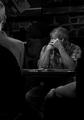
| 06/23/2007 07:51:22 PM | bad poetryby posthumousComment: Critique Club Review:
Overall I like the photo. The back of the chair and the disembodied arm at the right is a little distracting. I like the contrast, but the overall lighting seems a little bit dim to me. Not bad, mind you. Just a little brighter but not so as to change the mood, would have worked better for me.
Focus and depth of field are done very well. This picture certainly looks like it would work better in black and white, than color. Nice choice.
The semi transparent item in the upper left of the frame doesn't seem to fit, almost looks like a double exposure.
I do like the person on the left. We see enough to set the mood, and tell the story, but not so much as to compete for attention. I also like the dark background. There is enough there to let us know it is busy, but not enough to distract us from the subject.
Overall I would have scored you well into the top 100. One of the things about taking a different path, is that not everyone will be able to follow. Good on you for doing your own thing. | | Photographer found comment helpful. |
|
Showing 991 - 1000 of ~1613 |
Home -
Challenges -
Community -
League -
Photos -
Cameras -
Lenses -
Learn -
Help -
Terms of Use -
Privacy -
Top ^
DPChallenge, and website content and design, Copyright © 2001-2026 Challenging Technologies, LLC.
All digital photo copyrights belong to the photographers and may not be used without permission.
Current Server Time: 07/20/2026 05:54:42 PM EDT.
|