| Image |
Comment |
| 04/13/2006 07:40:10 AM |
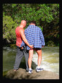
Just Friends.......?!by AryellaComment: The capture looks a little awkward but perhaps that's appropriate for the subject. Deinitely makes the viewer wonder who the photographer in realtion to these dudes. |
 Photographer found comment helpful. Photographer found comment helpful. |
| 04/13/2006 07:37:32 AM |
|
| 04/13/2006 07:37:01 AM |
|
| Photographer found comment helpful. |
| 04/13/2006 07:35:16 AM |
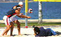
Who's got the better shot ?by RUEDISCHMUTZComment: great title and choice of image - -almost looks like everyone's trying to squeeze into your image! So this is a candid of people setting up another shot -- I wonder if that's your friend taking another dpc image! |
| 04/13/2006 07:33:40 AM |
|
| Photographer found comment helpful. |
| 04/13/2006 07:32:16 AM |
Mr. Coolby BeeGeeComment: Sweet title ... Color, tone balance and focus are dead on - bokeh is great - perhaps a little more off-set might make him even cooler. 7 |
| Photographer found comment helpful. |
| 04/13/2006 07:31:00 AM |
|
| Photographer found comment helpful. |
| 04/13/2006 07:30:25 AM |
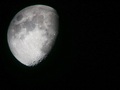
Just the Moonby alienComment: Wow - great moon image. I'm not really seein gthat aas candid, however. I'm guessing you were expecting responses like that. This is something that people might have been tempteed to do (squeeze somehtin gin) but most resisted. I'm guessing that fact will make this awesome image a less than awesome score. Giving it a 6 but it's also a fave! If the challenge was "sky" or "light" ... you'd get an 8. |
| 04/13/2006 07:26:52 AM |
stretchby bjjwannabe152Comment: Great candid! ... It has many possible emotions attached to think about. |
| 04/13/2006 07:26:02 AM |
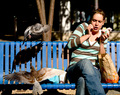
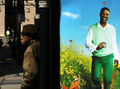
Man at Bus Stop with Advertisementby Keith ManiacComment: This is my kinda stuff here. the juxtaposition of these elements makes it startling. I also love that this ad is so completely cheesy and surreal while reality blasts in your face when you see the "non-ad" man. To me, this is what photography is about. The focus is perfect ... people in the disatance put the viewer in the real world. Brilliant. 10 and fave. |
| Photographer found comment helpful. |
Home -
Challenges -
Community -
League -
Photos -
Cameras -
Lenses -
Learn -
Help -
Terms of Use -
Privacy -
Top ^
DPChallenge, and website content and design, Copyright © 2001-2026 Challenging Technologies, LLC.
All digital photo copyrights belong to the photographers and may not be used without permission.
Current Server Time: 06/23/2026 09:53:10 PM EDT.