| Image |
Comment |
| 04/27/2006 07:10:52 AM |
|
 Photographer found comment helpful. Photographer found comment helpful. |
| 04/27/2006 07:08:29 AM |
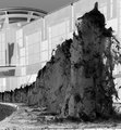
Observersby jmsetzlerComment: I like the alienish idea here and the subtle title doesn't say anything to distract for the ambiguity. 7 |
| 04/27/2006 07:06:52 AM |
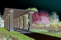
The Rose Gardenby basicentryComment: Thas has a unique sort of cartoonish quality to it.
The guy breaking into the image at the left would have been better withter completely in or out.
6 |
| Photographer found comment helpful. |
| 04/26/2006 07:59:55 PM |
|
| Photographer found comment helpful. |
| 04/26/2006 11:40:49 AM |
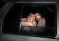
Bustedby LevTComment: I love this one. I like that you chose to have the models look at the camera. Really nice and a refreshing idea. 8 |
| Photographer found comment helpful. |
| 04/26/2006 08:18:21 AM |
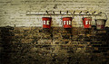
Extinguishersby FalcComment: I like the simple composition and nostalgia of this. Adding as fave. |
| Photographer found comment helpful. |
| 04/26/2006 08:12:00 AM |
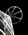
Siloby rioloboComment: Good composition and POV ... posterization leaves me wanting to see more. 6 |
| Photographer found comment helpful. |
| 04/26/2006 08:09:41 AM |
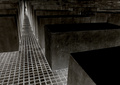
holocaust memorial - berlin, germanyby henningComment: cool - nice choice for this challenge. i might have roatated it slightly but i can see why you did it this way, and if the person was slightly moree legible it would be a 9 or 10 ... nonetheless very nice and effective negative: 8 |
| Photographer found comment helpful. |
| 04/26/2006 08:07:31 AM |
Don't Think Negative!by ralfwComment: the crop is a little distracting at the bottom and top but a nice idea and execution. Effort definitely shows here. |
| Photographer found comment helpful. |
| 04/26/2006 08:05:41 AM |
dandalionby BluebearComment: yup - you got somethin here. Simple and obvious inverted colors. Well done macro. 7 |
| Photographer found comment helpful. |
Home -
Challenges -
Community -
League -
Photos -
Cameras -
Lenses -
Learn -
Help -
Terms of Use -
Privacy -
Top ^
DPChallenge, and website content and design, Copyright © 2001-2026 Challenging Technologies, LLC.
All digital photo copyrights belong to the photographers and may not be used without permission.
Current Server Time: 06/24/2026 10:17:36 AM EDT.