DPChallenge: A Digital Photography Contest You are not logged in. (log in or register
 
Browse Settings
Currently viewing:
Registered UserCEJ

Show comments:

Per page:

Order:

Comments:


Comments Made by CEJ
Pages:   ... [93] [94] [95] [96] [97] [98] [99] ... [210]
Showing 951 - 960 of ~2097
Image Comment
My rock collection
11/30/2005 05:59:09 PM
My rock collection
by hannafate

Comment:
hey, one of those looks like coprolite!
Photographer found comment helpful.
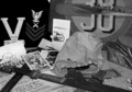
Spoils Of War
11/30/2005 05:57:32 PM
Spoils Of War
by Caitlyn

Comment:
Hard to find a focused area in this image - it all appears blurry.
Photographer found comment helpful.
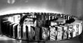
DVDs
11/30/2005 05:56:44 PM
DVDs
by ignite

Comment:
Not a bad concept, but I find the glow in the back and the irregular gray streaks (shadows?) in the background to be very distracting. I find myself looking for the source of the glow to make sense out of it.
Photographer found comment helpful.
November Fishing in Montauk
11/30/2005 05:55:19 PM
November Fishing in Montauk
by ilemme

Comment:
OK>>>I have looked at this a few times now and still cannot come up with a connection to COLLECTIONS.
My Golden Handcuffs
11/30/2005 05:54:02 PM
My Golden Handcuffs
by livitup

Comment:
Hmm...these look more like cuf links than handcuffs. And only one of them looks gold. Are cufflinks considered a collectible?
Photographer found comment helpful.
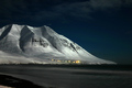
UFO leaving the mountain
11/30/2005 02:36:37 PM
UFO leaving the mountain
by gisli

Comment:
Hello from the Critique Club!

I have studied your image and have the following to offer:

Composition/perspective - I like the distance to your main subject. The bottom could have been cropped a bit more to remove the small white patch in the lower left - a minor distraction in the overall perspective. It also appears as though a little more of the mountain on the left, with the slope of the mountain on the right would still allow the off center appearance and move the right hand edge to the edge of the picture. The same effect could have been produced with a tighter crop on the right. This would allow an overall larger image - closer to 640x640 which may have had more impact with your 'title' element. This would also move the lights off center. They are a bit high for a rule of thirds placement. Your 'title' element is not very prominent in the shot. The composition is very minimalistic which is saved by the small grouping of lights at the base of the mountain to give it an element of interest.

Color - the colors here are very rich in the blues and grays. The small amount of yellow adds a nice bit of contrast. Saturation is good and there is good separation between the subtle shades of gray that are present.

Lighting - very nice use of natural light which is made better by your exposure control. The brightest whites are not blown out at all and the dark areas are not overpowering at all. The shadows are only where they appear they should be. Well done!

Challenge requirements - in my opinion, most voters voted on the beauty of the image and not the challenge requirements. The 'ufo' does not appear to be a UFO at all, just a plane and is not a large enough element to be more of a factor. Without the title there would be no element to meet the challenge requirements.

Overall/my opinion - this is certainly a well done and very striking image. It falls short in meeting the challenge requirements.
Photographer found comment helpful.
Running Inside
11/30/2005 02:08:39 PM
Running Inside
by bucket

Comment:
Hello from the Critique Club!

I have studied your image and have the following to offer:

Composition/perspective - I like the concept behind this shot, but feel the snow on the glass is a major distraction from the point you were trying to convey. Also there is nothing to explain the snow and to connect it to a snowball is stretching it a bit. The boy appears to be giving the classic thumbs in ears, waving fingers, neener, neener, neener gesture which is totally obscured by the snow. Without the title and your description, there is no element in this image that conveys running or even running away. This adds to the difficulty in making the connection to the challenge. A different crop may have helped as well. Since the arms are already cut off by the bottom of the window, cropping closer on the sides would have allowed a more square and overall larger (closer to 640x640) shot which may have helped to emphasize what parts of his expression are still visible. Right now, if you don't take into account the description of the shot, it appears more as though he is longing to go outside as opposed to just running inside.

Color - the colors appear to be well developed. Saturation is good and there is good separation and contrast between the background colors to keep it from appearing flat.

Lighting - good use of natural light. The window in the background is a good aid in the overal light appearance while not being a distraction. Nothing gets lost in it. The transition between inside and outside light is very nice.

Challenge requirements - this may be where it fell short a bit (see above). Although your shot is clear to you what is going on, there are not enough elements to convey the true situation to the viewer. Perhaps if he was caught with one leg still outside and the snowball hitting the window it would be more clear.

Overall/my opinion - I find the snow a major distraction on the window. It hides most of his face which appears to have the exact expression you would need to support your title and make the meaning more clear to the viewer. Even if he had some attire on that clearly is outdoor attire would help - no hat, no gloves, cannot even tell if he is wearing a jacket.
Photographer found comment helpful.
"Clip Artist"
11/30/2005 01:50:27 PM
"Clip Artist"
by tfarrell23

Comment:
A clip artist is a swindler, who I guess is sort of a cheater. A clip artist is also a thief which is not a cheater. Either way, the only relation between this image and the challenge is your title and that usually is not strong enough alone to carry an image. Especially one with an abstract element that must be figured out. Just my opinion...
Cheaters Hand
11/30/2005 01:37:46 PM
Cheaters Hand
by gr8dane

Comment:
Hello from the Critique Club!

I have studied your image and have the following to offer:

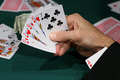
Composition/perspective - the view onto this shot is nice. It allows for a first hand view of the subject hand. The background is a little busy. Too many extra hands of cards with no attachment to anything as well as the money that is mostly hidden. Removing some of the cards and the money would remove some of the distraction. The focus is good in the foreground while the background is sufficiently blurred for the effect - good DoF. Position of the subject hand in the shot is a good application of the rule of thirds. The processing seems a little severe - the sleeve of the jacket looks painted in or more like you would want a background to appear. But for a jacket it is too smooth and lacks any detail whatsoever. This close to the sleeve I would expect to see at least a little of the detail of the weave of the fabric or slight variations in the surface. None of this is present.

Color - the colors here are good. They all seem to retain their original hue without being overbearing or over processed. The skin tones appear in the right range. The numbers on the cards appear solid with no blending or fringing into the white (more processing than anything).

Lighting - this may have hurt the image some. There are many conflicting shadows on the table which come across as distractions. There appears to be at least three, possibly four different shadow sets - too many. Also, the brightness of the lights may have caused you to process your levels a bit too much which is what caused the sleeve to appear somewhat fake. Perhaps adjusting the exposure (apperture/shutter speed) would have helped this and allowed the processing to be less severe which would have allowed more detail to be retained in the sleeve.

Challenge requirements - it meets the challenge requirements, but it may have been another area where it fell short. The subject was repeated many times in the challenge so an image would need something to really make it pop to stand out among all the others.

Overall/my opinion - with better lighting and less clutter on the table this would have been a stronger image. The distractions hold attention for too long and take away from the focus of the subject.
Photographer found comment helpful.
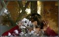
Christmas Cheater
11/30/2005 11:38:30 AM
Christmas Cheater
by cheegirl

Comment:
Hello from the Critique Club!

I have studied your image and have the following to offer:

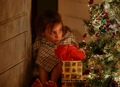
Composition/perspective - the focus here is on the tree while the main subject is the child. If the impression was to have her appearing to wait for Santa or whatever, it would have been stronger if she was the center of focus and let her expression speak as the tree still would have been recognizable. The child appears to be sitting in front of a doorway. This also takes away from your photo in my opinion. Especially since the door appears to be open. I think to make the point it would have been stronger to have her in a corner behind the tree or at least against a solid wall to give the appearance she is hiding OR crop off more of the door, less of the tree and offset the open door factor. If the concept is showing her opening a present which would be early, her hand is not prominent enough in that area to immediately give that impression as the red tissue paper can easily be mistaken for wrapping decoration. Having her feet cut off makes her toes appear to be sticking out of nowhere detached from her. A lesser crop on the bottom may have worked as well. The dark area of the open door is somewhat distracting (see below).

Color - the colors here are across the spectrum and seem to be, for the most part, well distributed over the scene areas. A slight boost in contrast/saturation may have helped to bring out the reds and greens more to help overcome the browns and dark areas in the background.

Lighting - the lighting is done fairly well. No flares or glares. Nothing seems to be washed out or blown out. The weakest part here is the child's head. It starts to get lost in the darkness of the doorway and the lighter wall behind her head in the hallway is light enough to show difference but dark enough to hide detail. It just creates an odd transition area.

Challenge requirements - in my opinion this is the weakest area of the image. It is not clear what exactly she is doing. There is no representation of time of day to indicate she may be waiting in the middle of the night. If she is not waiting, but watching what mom and dad are doing, wrapping presents, etc., this is also not represented but has to be assumed. If she is opening a present which would be early, her hand needs to be more obvious in that area. As it is, you only see, just barely, the knuckles of a few fingers and these you have to look for as she is not the center of focus.

Overall/my opinion - the concept and idea here are very nice. The execution falls a bit short. It is just hard to determine what exactly she is cheating at as opposed to just sitting next to the tree. And then it is hard to determine just exactly how she is cheating since the hand opening the present (??) just is not prominent enough in that area to make that point clear.

Pages:   ... [93] [94] [95] [96] [97] [98] [99] ... [210]
Showing 951 - 960 of ~2097


Home - Challenges - Community - League - Photos - Cameras - Lenses - Learn - Help - Terms of Use - Privacy - Top ^
DPChallenge, and website content and design, Copyright © 2001-2026 Challenging Technologies, LLC.
All digital photo copyrights belong to the photographers and may not be used without permission.
Current Server Time: 07/24/2026 10:20:45 AM EDT.