DPChallenge: A Digital Photography Contest You are not logged in. (log in or register
 
Browse Settings
Currently viewing:
Registered UserCEJ

Show comments:

Per page:

Order:

Comments:


Comments Made by CEJ
Pages:   ... [90] [91] [92] [93] [94] [95] [96] ... [210]
Showing 921 - 930 of ~2098
Image Comment
Waiting for you
12/02/2005 08:42:46 AM
Waiting for you
by pacpinto

Comment:
Very simple, but quite exquisite! I really like the composition and perspective of this shot. Something about it just hits me. Well done!
Photographer found comment helpful.
Finally Free
12/02/2005 08:36:41 AM
Finally Free
by UNCLEBRO

Comment:
Very original! Nice job!
Photographer found comment helpful.
Saturday Morning
12/02/2005 08:25:47 AM
Saturday Morning
by tpoc

Comment:
I like this shot - sets a great mood. There is some grain/artifacts in the lower left upper right that is a bit distracting. But it doesn't depress the mood in the least.
Photographer found comment helpful.
A little too lucky in Poker
12/01/2005 09:21:04 AM
A little too lucky in Poker
by nico_blue

Comment:
Hello from the Critique Club!

I have studied your image and have the following to offer:

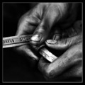
Composition/perspective - I like the closeness of the shot, really allows the details in the reflection to come through quite well. The contrast between the smoothness of the glasses and the textures of the hair/skin translate well in the image. I find the near edge of the cards being out of focus a little distracting. Not sure if it is due to the DoF in the shot or they were moved (seems kind of wide for just a DoF result). The negative space to the left of the shot adds nothing and leaves the shot kind of empty looking. A tigther crop - closer to the cards - in my opinion would have made the subject stronger as it would have been the only area to focus. Also the varying color in that area - blue to black to blue is a little distracting. As it is I find myself looking to the left to see what else is there either in the background or as part of the composition itself. Placement of the subject and in particular main center of interest within the shot is well done. The overall focus/Dof in the shot is excellent...especially for a close shot such as this.

Color - the colors here are developed quite well. The skin tones look natural. The blue in the shot is very rich and really adds strength to the image. I think it works much better than if it was solid black on the background or even a lighter color.

Lighting - no flares, glares, washed out areas, all the details of the various elements are completely visible. Well done!

Challenge requirements - it certainly meets the challenge requirements. Probably one of the stronger images to portray this theme and may have done even better than it did if poker was not so prominent in the entries.

Overall/my opinion - I like the idea/concept of this image. As stated above, the only thing I may change is the crop. I just find the background on that side distracting. Perhaps if it was solid and did not vary between the blue and the black it would not be a distraction to me. Overall, well done!
Photographer found comment helpful.
Sunset over San Francisco
12/01/2005 07:24:07 AM
Sunset over San Francisco
by blanceric

Comment:
I only wish the railings weren't in the shot.
Photographer found comment helpful.
Grid locked
12/01/2005 07:23:10 AM
Grid locked
by caba

Comment:
Very...very interesting perspective. Good eye!
Photographer found comment helpful.
Machine Girl
11/30/2005 08:08:34 PM
Machine Girl
by fadedbeauty

Comment:
Gratuitous half naked lady shot at best...just not right for the challenge in my opinion.
Industrial Bronze
11/30/2005 08:07:40 PM
Industrial Bronze
by fotomann_forever

Comment:
You know, I like this photo, but not for this challenge. The requirements were industrial, not nude. You would never see a nude person working in an industrial setting.
Photographer found comment helpful.
Persuasive Industrial Employee
11/30/2005 08:06:17 PM
Persuasive Industrial Employee
by Horsie Girl

Comment:
This really has nothing to do with the challenge requirements at all. Why did you enter it?
Blue Light District
11/30/2005 07:00:37 PM
Blue Light District
by SJCarter

Comment:
And for the record, I thought the processing on this was quite interesting and certainly gave a different impression on the challenge. The pose, I don't know about the shrink tool, don't have that in PI, but to go with the title it is perfect. The shirt gives the exact impression of a 'teddy' or short top on woman (no, not saying you are feminine looking) getting ready to reveal all. I suffer from the same fate with a lot of my shots - original thinking gets squashed.
Photographer found comment helpful.
Pages:   ... [90] [91] [92] [93] [94] [95] [96] ... [210]
Showing 921 - 930 of ~2098


Home - Challenges - Community - League - Photos - Cameras - Lenses - Learn - Help - Terms of Use - Privacy - Top ^
DPChallenge, and website content and design, Copyright © 2001-2025 Challenging Technologies, LLC.
All digital photo copyrights belong to the photographers and may not be used without permission.
Current Server Time: 09/11/2025 03:15:58 PM EDT.