| Image |
Comment |
| 12/04/2005 05:59:24 PM |
Brown sugarby edmengComment: Very nice photo with a really rich palette of colors, tones and shades here. Nicely composed and a really good perspective on the shot. My only criticism would be sharpening - a little more sharpening and the top of the drink pops right out at you with detail.
|
 Photographer found comment helpful. Photographer found comment helpful. |
| 12/04/2005 05:54:33 PM |
Mating Seasonby MayaMComment: Very rich, deep color in this shot. The slight contrast by the pollen is excellent. Very nice photo! |
| Photographer found comment helpful. |
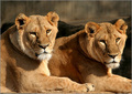
| 12/04/2005 12:24:30 PM |
Twins..????by sajinComment: Hello from the Critique Club!
I have studied your image and have the following to offer:
Composition/perspective – the shot is very nicely framed. The position of the lions is perfect. Puts both the faces very nicely placed via Rule of Thirds. The amount of negative space helps to keep them strong in the image. I find the rocks (??) being darker a bit of a distraction, but not overly so. The focus seems a little soft/blurry across the face of the lion on the right in the image. The plane of focus seems to be just in front of the face – closer to the front surface of the left side lions leg/face. Perhaps a bit of sharpening could have helped that (see below). The lack of space beneath the lions is also a strong element. Shooting at eye level really adds a lot of strength to their expression. Overall, well done composition!
Color – a very narrow palette with a lot of rich tonal variations. There are a lot of subtle tone variations in the coats that you have preserved well. The muted tan of the background with the darker areas allows the lions colors to stand out. A boost in contrast would have brought out more of the rich tones (see below).
Lighting – very well controlled natural light. Nothing is washed out, it is evenly distributed over your subjects, no harsh shadows hiding detail. Well done!
Challenge requirements – for even, this is perfect. Meets the challenge requirements extremely well with an overall strong image.
Overall/my opinion – this is a fantastic capture! As it is the color variations are very well preserved. However, a boost in contrast makes it even richer (I downloaded the image and applied contrast and sharpening). A small amount of sharpening brings the right hand lions face to come into crystal focus. This also brought out much more detail in the fur and made the left hand lion even crisper.
|
| Photographer found comment helpful. |
| 12/04/2005 11:49:50 AM |
Onlyby nico_blueComment: Hello from the Critique Club!
I have studied your image and have the following to offer:
Composition/perspective – interesting that not quite half the face is visible. This leaves all the weight and strength to the flower. The plane of focus appears to be the face/hair/lower part of the flower. This leaves the top of the flower slightly OOF due to DOF. I find this a minor distraction as I am always drawn to that part of the flower – led off her eye, placement in relation to Rule of Thirds. Overall though the focus is well done – a lot of detail and texture from the hair and skin and the lines in the flower are very well represented. The balance of negative space works well with this image. However, with the background being white, it plays hard to the left side of the image (see below). On the other side of that, the white allows the hair color and flower colors to really stand out and present a very nice contrast and blend of colors.
Color – very well developed. The richness of the tones is very strong and really stand out. The contrasts between flower colors and flower and hair, especially against the white, is excellent. A very rich palette that has been well maintained.
Lighting – the left side of the picture is a little blown out – very bright. Detail in the shape of the nose is lost, the lips are a bit soft and start to blend in as well. This in contrast to the white negative space which does not appear bright at all. The white not being as bright make the face seem all the brighter.
Challenge requirements – while this is a strong image on its own, the relation to odd can only be made by the fact that it is one eye, one flower – I have to assume this is what you were going after. In this respect it meets the requirements nicely.
Overall/my opinion – if the skin tone on her face was more natural looking this would be much stronger. I think it would also play into the red of the flower better (see area along the chin line). Other than that I think it is a strong composition and very well presented.
|
| Photographer found comment helpful. |
| 12/04/2005 10:34:18 AM |
Loadedby banmornComment: Hello from the Critique Club!
I have studied your image and have the following to offer:
Composition/perspective – this is a very well shot image – very crisp lines, clean with no distractions of any kind, focus is spot on. Being a minimalist image, the composition – the angle of placement, balance of the two sides, is perfect. The alignment and specific placement is quite well done. It is obvious you thought about the geometry you were creating. The clean background almost gives this a 3-D look with your perspective. While the viewer has to assume it is on a mirror, being so clean it makes you think a second longer to make sure. Overall, well done composition and a good clean shot.
Color – well done! All the colors here are strong and very well developed. There is no bleed over into the white areas on the spots and the white dice only slightly show reflected color from the red dice…just a tinge pink on the front side – good control over levels and saturation.
Lighting – very well done, especially since it is on a mirror. There are no glares or odd reflections. The dice reflection is only slightly darker than the real dice – very good control there.
Challenge requirements – this may be where it fell short in my opinion. While the implication is there by the numbers you have showing, there is no real element to imply an actual act of cheating or that the die themselves are loaded.
Overall/my opinion – this is one of the cleanest images I have viewed in recent days. Although I think it falls short in the challenge requirements, technically this is a strong image and clearly demonstrates excellent camera technique and a lot of attention to details. Well done!
|
| Photographer found comment helpful. |
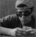
| 12/04/2005 09:43:31 AM |
Cheater faceby edmengComment: Hello from the Ciritque Club!
I have studied your image and have the following to offer:
Composition/perspective - the angle of the camera to the shot is good - down at eye level. Lends to the impression you are sitting on the other side of the table from him. Havign the small space on the right keeps it from becoming too weighted on that side. The DoF applied here works as well - keeps you focused on his face - the subject. I don't find the foreground distracting in the least. It may have been nice to see more of his eye (see below) but the expression was captured quite well. I like the fact that you canot actually see any of the card values. Again, it keeps the focus on his expression which gains strength through this aspect. I do find the reflection in the sunglasses a bit distracting. I find myself trying to determine what cards he does have. Perhaps if they were held at a slightly different angle this reflection could have been avoided. The crop works here as well - tight on the top - another element that adds strength to the expression.
Color - b/w, the conversion to b/w was handled nicely. All the small textural details from the shirt, hat, shin are all still present in the scene. The shades of gray blend and contrast nicely across the image.
Lighting - maybe a weak area. Overall the image is a bit dark. The eyes are almost obscured by shadow. Especially the left eye (right in image). All the light appears to be coming from the image left which leaves image right all in shadow. Maybe a slightly different angle of the subject or placement of the light source would have avoided this. The overall brightness even being a bit dark, is not overbearing in the scene. By this I mean that even though the shadows are a bit dark, nothing is totally obscured by shadow, just almost. Adds an element of frustration - you can almost see his eye, you can almost see the reflection in the glasses...
Challenge requirements - the way this is set up all the interpretation is weighted soley on his expression. This may have been another weak or weaker area. While in concept it meets the challenge requirements, in interpretation it isn't as strong. His expression is good and he has a strong look - but perhaps too strong. It appears more a look of determination or concentration as opposed to someone who is relying on cheating to win. A slight smirk or maybe one eyebrow raised...something to offset the determined look.
Overall/my opinion - nice, well defined subject and composed shot. A little short in the challenge requirements, but a strong image otherwise. The expression is strong (keep him in mind for future shots) but perhaps too strong for the intended idea.
EDIT: Typos Message edited by author 2005-12-07 13:52:22. |
| Photographer found comment helpful. |
| 12/02/2005 09:03:39 AM |
|
| Photographer found comment helpful. |
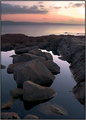
| 12/02/2005 08:42:46 AM |
Waiting for youby pacpintoComment: Very simple, but quite exquisite! I really like the composition and perspective of this shot. Something about it just hits me. Well done! |
| Photographer found comment helpful. |
| 12/02/2005 08:36:41 AM |
|
| Photographer found comment helpful. |
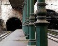
| 12/02/2005 08:25:47 AM |
Saturday Morningby tpocComment: I like this shot - sets a great mood. There is some grain/artifacts in the lower left upper right that is a bit distracting. But it doesn't depress the mood in the least. |
| Photographer found comment helpful. |
Home -
Challenges -
Community -
League -
Photos -
Cameras -
Lenses -
Learn -
Help -
Terms of Use -
Privacy -
Top ^
DPChallenge, and website content and design, Copyright © 2001-2026 Challenging Technologies, LLC.
All digital photo copyrights belong to the photographers and may not be used without permission.
Current Server Time: 07/24/2026 06:25:27 AM EDT.