| Image |
Comment |
| 02/24/2006 10:36:30 AM |
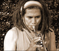
Sax soloby burtctComment: I would say that is trumpet/coronet not saxophone. |
 Photographer found comment helpful. Photographer found comment helpful. |
| 02/22/2006 07:10:05 PM |
Crushed...by SJCarterComment: Excellent! Very well done Mr. Carter! Congrats on the placement!
This shot has so much working for it. The color balance is excellent. The subtle shades and tones that give the accents are in synch. with the overall mood. The effect is very well executed as it actually looks to be as you intended. Alignment is spot on! I like very much your subject placement within the shot and the strong contrast between the top of your arm - hard, well defined - and the bottom - fading into the background and the top of the heart - crushed, cracked - and the bottom - leaking, flowing. The amount of soil/dirt on the hand and skin is just right - much more and it would have looked messy and less would not be as strong. Now take all this and add your title and this really has impact. An extremely well put together idea! Very well done! Message edited by author 2006-02-23 17:32:08. |
| Photographer found comment helpful. |
| 02/01/2006 12:27:07 AM |
|
| Photographer found comment helpful. |
| 02/01/2006 12:26:50 AM |
|
| Photographer found comment helpful. |
| 01/31/2006 02:54:04 PM |
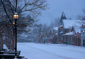
Sign That The Day Is Doneby ElmakiasComment: Hello from the Critique Club!
I have studied your image and have the following to offer:
Composition/perspective - the composition here is interesting...the foreground trees and the background trees with the house leave the only clear spot in the sky in fairly good placement via rule of thirds. Also, the sun through the pine tree is located in a good spot for the composition. Also well done is the perspective. You have managed to get a real nice balance between the different areas of the shot - the open sky, the partially blocked sky and the dark silhouetted areas. The detail present in the clouds is another strong aspect - really keeps it from being 'plain.' Well done.
Color - not much in this shot. The silhouettes are true and even throughout the shot. The slight tint in some areas of the sky add a nice offset to the reast of the shot. Perhaps a boost in color/saturation to bring them out a bit more would add another element that would strengthen the image.
Lighting - natural and well controlled for a shot directly into the sun. The tree helps there, but the exposure was well controlled as evidenced by the rest of the sky. There is still a lot of detail left in the clouds and no distracting blown out areas. Well done!
Challenge requirements - this, in my opinion, is where it fell short. Without the title there really is no connection to the challenge - Signs. It could be the beginning of a day or the end or even somewhere in the middle since it is winter. The title is the only thing that connects it to the challenge and this usually does not support the image very well with the voters.
Overall/my opinion - as stated above I think the weakest part of the shot is its connection to the challenge. The shot does demonstrate a good grasp of your camera and producing the image you want. Applying a bit of sharpening would allow the tree branches, especially the ones on the left in the sky, to become clearer and better defined. it might also help with stronger definition in the clouds. Overall a nice image, well composed.
|
| Photographer found comment helpful. |
| 01/30/2006 05:34:59 PM |
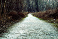
Path to serenityby ZigomarComment: Hello from the Critique Club!
I have studied your image and have the following to offer:
Composition/perspective – with the path being hemmed in by trees and brush, your approach to the shot is excellent. I think it helps having no sky in the shot as well. The low approach allows you to feel the surroundings (see below), however, I think the processing took away from this strength. The broad path in the foreground fading in the distance really draws you into the shot and works well as a leading line. This also helps the centered feel of the path. If you were higher up I think that would be a problem so this was one way to solve that – good job. The perspective also helps to give this shot a very desolate feel that I thinks works very well with the palette.
Color – very nice and rich tones available all across the shot. The contrasts between the gray of the path and the green grass at the edge works very well. The browns and reds of the brush up to the darker grays and blacks in the trees makes a very nice shift and the symmetrical aspect of the shot helps set this up quite nicely.
Lighting – natural light for the most part controlled quite well. Some of the path at the far end appears blown out a bit and it shows as a bright spot. With the small amount of sky seen through the background trees appearing gray, this looks unnatural (there is no hint of sun anywhere in the shot).
Challenge requirements – a nice take on the requirements which it certainly meets. A path is certainly a road as far as this challenge was concerned, in my opinion. Nothing was said it had to be a paved or even auto use road.
Overall/my opinion – I see your comment that editing is everything. In this case, I think it is where it fell short. Not sure why you put a blur on the photo. It would have been much stronger, in my opinion, if there was more sharpness/crispness in the shot. There is a lot of great texture in the path, especially in the foreground, that is lost. The differences in density of the brush to the trees, if sharper, would have added greatly to the natural contrasts in color between the areas. Also, I think if it was sharper you get more of a sense that you were actually there when viewing the photo.
|
| Photographer found comment helpful. |
| 01/30/2006 02:14:11 PM |
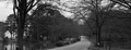
Country Roadby ad12Comment: Hello from the Critique Club!
I have studied your image and have the following to offer:
Composition/perspective - the overall scene here is very pleasing to look at, but could have a lot more impact. The crop to make it wide leans the image more towards a landscape (see below) and takes away focus and strength from your subject, the road. A narrower crop would have allowed for an overall larger image (closer to 640x640) which also would make the road more prominent in the shot and placed better to the rule of thirds. I think this also would help with the lack of foreground in the shot. The road appears to come out of nowhere and when you follow it you are immediately in water which opens the scene up as the next thing you are led to is the shore. Again, this takes away from the subject as one naturally follows the shoreline across the scene and focus is lost on the subject as the main element.
Color - black and white obviously. But overall I think slightly different processing would make it stand out more and give the individual elemnts more presence. It is very gray. Some more adjustment with contrast and perhaps levels would help separate the abundance of similar shades.
Lighting - natural and well controlled in the shot. There appears an even cast over the whole scene. The sky is not blown out at all and there are no flares or bright spots.
Challenge requirements - this meets the challenge in the sense that it does have a road. However, it leans closer to being a landscape. A stronger presence of the road in the shot to make it the center of attention would have made it a much stronger contender. This could have been achieved a number of ways - crop being one, different zoom/camera angle.
Overall/my opinion - as stated above this is a very pleasing scene to look at. I think it needs work on the processing end to give it more contrast. Would be interesting to see a color version. The road is very centered in the shot. What saves this is the width and the fact the road, although the subject, does not seem a major element. A different crop to offset it some to get closer to the rule of thirds would eliminate this. |
| Photographer found comment helpful. |
| 01/27/2006 08:40:20 AM |
After Dinnerby DAWARComment: This appears to be a cat. The challenge called for non domesticated animals. |
| 01/24/2006 12:58:35 PM |
Summer Lubberby rox_roxComment: So glad you entered this shot! This is absolutely beautiful! Perfect focus, excellent composition, stunning detail! The colors are gorgeous! I hope this does well, it deserves it! Very...no, strike that...extremely well done! Fantastic photo! A perfect 10 from me!
I keep coming back to this shot and every time I am just amazed. This is just such a beautiful photograph! |
| Photographer found comment helpful. |
| 01/23/2006 05:16:12 PM |
Judgingby angela_packardComment: Very nice image that, IMO, should have done better. I really liked the concept and the execution could not have been better. Well done! |
| Photographer found comment helpful. |
Home -
Challenges -
Community -
League -
Photos -
Cameras -
Lenses -
Learn -
Help -
Terms of Use -
Privacy -
Top ^
DPChallenge, and website content and design, Copyright © 2001-2026 Challenging Technologies, LLC.
All digital photo copyrights belong to the photographers and may not be used without permission.
Current Server Time: 07/23/2026 03:38:45 AM EDT.