| Image |
Comment |
| 04/25/2006 06:32:39 PM |
C H E E S E !by SJCarterComment: Man...sorry about the DQ. I know where at least one of your tens came from. I love this shot. Very unique and creative. |
 Photographer found comment helpful. Photographer found comment helpful. |
| 04/25/2006 12:11:41 PM |
Earth Moverby holdingtimeComment: A lot of interesting things going on here...almost too busy with the reflections and changes in depth across the image. I start out looking at your subject but very quickly wander to the background. Looking at it a few more minutes I find myself looking through your subject and around it bypassing your subject altogether. The wheel seems a bit dark. The rust can handle this. But perhaps if the wheel was a little brighter to get more detail of the surface as well as making that yellow stand out a bit more may have helped to keep the subject the point of focus. |
| Photographer found comment helpful. |
| 04/25/2006 12:08:17 PM |
|
| Photographer found comment helpful. |
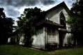
| 04/25/2006 08:11:46 AM |
Abadoned Churchby scared_of_the_darkComment: I know... it is only the title. But... it is part of the overall presentation of your entry. A spelling error in the title leaves the impression you don't care enough about your entry to spell the title correctly. |
| Photographer found comment helpful. |
| 04/25/2006 08:04:14 AM |
1902 Sears Catalogueby RubyRedComment: I think this would have been a much stronger entry if more attention had been paid to the background and lighting. The paperclip also detracts from the concept of 'age' or being old. |
| 04/20/2006 12:04:48 AM |
|
| Photographer found comment helpful. |
| 04/20/2006 12:03:32 AM |
All sales final!by scalvertComment: Very creative and unique to the challenge.
Edit for spelling. Message edited by author 2006-04-28 10:52:16. |
| Photographer found comment helpful. |
| 04/20/2006 12:01:57 AM |
|
| 04/19/2006 11:59:46 PM |
|
| Photographer found comment helpful. |
| 04/19/2006 11:58:14 PM |
|
| Photographer found comment helpful. |
Home -
Challenges -
Community -
League -
Photos -
Cameras -
Lenses -
Learn -
Help -
Terms of Use -
Privacy -
Top ^
DPChallenge, and website content and design, Copyright © 2001-2026 Challenging Technologies, LLC.
All digital photo copyrights belong to the photographers and may not be used without permission.
Current Server Time: 07/22/2026 08:21:25 PM EDT.