| Image |
Comment |
| 05/10/2006 07:19:28 PM |
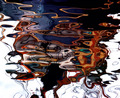
... canal colours ...by GuGiComment: Hello from the DPC Critique Club!
I have studied your image and have the following to offer:
Composition/perspective: this is an interesting image for many reasons. Being totally abstract in composition, there is no point of reference for comparison. But that doesn't hurt the image. I think it is one of the stronger points. The reflection is very well placed in the photo and as such makes you look all the longer trying to figure out what the reflection is of. By the time you figure it out you are so caught up in the colors (see below) and the soft designs that you are absorbed. Very pleasing shapes and designs and your angle of approach helps to strengthen that aspect. Very well done!
Color: very well developed and preserved colors in the image. The contrasts are strong and not distracting. The balance between light and dark colors is very well done. The range of colors is great and one can find pleasing tones all across the image.
Lighting: nice control of natural light - good choice of time of day as well as exposure control. Nothing seems blown out and nothing seems too dark. All delineations are clear and crisp.
Challenge requirements: as a Free Study the boundaries were off. A brave choice to enter such an abstract image. But it fits the challenge well as it allowed you to obviously express an artistic side while not relying on processing to achieve it. Very creative image.
Overall/my opinion: very strong abstract image. A real nice overall balance and composition. I like abstracts to begin with and this I find very pleasing and interesting to look at. Even for an extended period of time. At first I was a little distracted by some of the tendrils of reflection leaving the image at the bottom, but when viewed critically, they really don't have an impact at all. Very well done image! |
 Photographer found comment helpful. Photographer found comment helpful. |
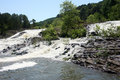
| 05/10/2006 04:32:38 PM |
Distant Peaceful Currentby rickhd13Comment: Seems a little bright and lacking contrast/saturation. Perhaps a polarizer or different exposure combination would have helped. |
| 05/10/2006 04:31:20 PM |
De- Parting Coupleby loveComment: Having a bit of a hard time with this one...her face is off - too bright/blurry or the combination makes it appear almost featureless. He is lost into the background. The main focus seems to be the back of the truck which also has some problems - grain, blown out plate. Then the title...seeing as how this was mentioned in the challenge description specifically, this is being shoe-horned in as it really isn't three words but two with one of them being split to fit. |
| Photographer found comment helpful. |
| 05/07/2006 06:46:37 PM |
|
| Photographer found comment helpful. |
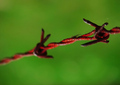
| 05/07/2006 06:08:59 PM |
Tetanusby ZigomarComment: hello from the Critique Club!
I have studied your image and have the following to offer:
Composition/perspective:
Composition is very well done. The ends of the barbed wire cut almost exactly at thirds lines which places the subject at a very appealing angle to the eye. The placement of the barbs is also very well done. The angle of approach to the shot seems well placed. The background is solid to the theme keeping distracting elements out of the shot. Well done. Appears a bit grainy in the green, but not distracting or taking away from the image. The DoF is interesting though. It appears your main subject is the spider on the wire. It may have been stronger if both the barbs were within the DoF (obviously including the spider) which would have set up a sort of 'trapped' element to the shot. Overall composition is very well done.
Color:
The colors are very strong and consistent in the shot. The variations seem natural and not forced by processing. Both the main colors are very strong and well preserved throughout the image.
Lighting:
This seems to be a weaker area to me. The setting seems totally natural but the lighting doesn't. The bright spots on the wire take that element away. Some appear to be due to oversharpening, others appear to be either direct light or flash that when coupled with the DoF of the shot seem out of place. A softer light on the wire may have helped.
Challenge:
Definitely met the challenge criteria. The color scheme is simple yet effective. Two strong colors that complement each other well. I like that you chose rust as opposed to a more general red color. The tonal contrasts are stronger and less harsh to view. Well done!
Overall/my opinion:
The DoF being a strong point for this composition is also a weak point. I really feel it would have been stronger with both barbs in focus. The composition is very appealing and the balance is well placed. The spider adds an element of 'surprise' to the shot that could have been better served if it was not the only focused point (that and a little of the wire in front of it). Also, if you meant to focus on the spider and not the barbs and just use the wire for the color, a different angle to bring the spider into a more prominent position in the shot would have helped. Overall a well done composition with a lot of appealing qulities. |
| Photographer found comment helpful. |
| 05/07/2006 12:54:32 PM |
Crystalby rox_roxComment: What's great about this shot is it looks completely natural. Great use of DoF and natural lighting. Her skin tones are perfect. Maybe her face could be a tad sharper, but the overall composition is very nicely done. |
| Photographer found comment helpful. |
| 05/06/2006 10:58:48 PM |
medpc.jpgby deapeeComment: Oh yeah, let us not forget the expression. Added to favs. I like this! Message edited by author 2006-05-06 22:59:05. |
| Photographer found comment helpful. |
| 05/06/2006 10:50:51 PM |
medpc.jpgby deapeeComment: Pretty cool shot. Great work with the lighting - very nice balance. The DoF being so deep really makes this pop and seem like the fist is in your face. Well done Dave! A strong image for all the right reasons! |
| Photographer found comment helpful. |
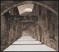
| 05/06/2006 11:31:12 AM |
The Corridor - Since 1720by SandyPComment: What a wonderful shot! Very well done with the bright lighting. A lot of texture and detail - really can almost feel the stone and the heat of the sun. The perspective is excellent! Composition couldn't be better. Very well done! |
| Photographer found comment helpful. |
| 05/06/2006 11:27:22 AM |
Detail at Duskby Bear_MusicComment: Very nice view...at first a little busy with all the antennae, but the compositional split between the top, middle and bottom is very nice. The color shift in the sky is excellent (good timing). The amount of light/detail on the boats is perfect. Nice job! |
| Photographer found comment helpful. |
Home -
Challenges -
Community -
League -
Photos -
Cameras -
Lenses -
Learn -
Help -
Terms of Use -
Privacy -
Top ^
DPChallenge, and website content and design, Copyright © 2001-2026 Challenging Technologies, LLC.
All digital photo copyrights belong to the photographers and may not be used without permission.
Current Server Time: 07/23/2026 03:39:18 AM EDT.