DPChallenge: A Digital Photography Contest You are not logged in. (log in or register
 
Browse Settings
Currently viewing:
Registered UserCEJ

Show comments:

Per page:

Order:

Comments:


Comments Made by CEJ
Pages:   ... [61] [62] [63] [64] [65] [66] [67] ... [210]
Showing 631 - 640 of ~2097
Image Comment
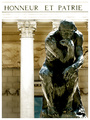
Think for Yourself
05/31/2006 07:03:52 PM
Think for Yourself
by Rikki

Comment:
Courtesy critique:

Composition/perspective: The overall balance and composition is good in the image. The subject is well placed for the crop - eliminates thirds as a negative. The apparent weight of the statue (appears to be solid metal which indicates weight) with the stone wall behind it creates a presence that should install a sense of strength and permanence. The problem with that perspective, IMO, is the focus and light (see below). The DoF presented in the shot is a little confusing - perhaps the processing? The statue is crisp and sharp, the pillars appear soft with the detail sort of blurred, but the stone wall behind, although blurred as if DoF is the controlling factor, but the edges are a bit too sharp to support that m- as in the pillar seems to be more out of focus than the wall does.

Color: The preservation of such harsh...or cold colors is well done. The tonal range is well preserved. Some of the white appears a bit bright (see below), but the preservation of the rich metallic feel of the statue and the hard delineation of the stone wall is well done. The splash of blue I find refreshing in the shot - the calm or eye of the storm so to speak.

Light: I find this aspect to be not as strong as the others. The pillar appears a bit bright, as does the header beam above the words. The top of the statue's head is lost in the beam as well as the shoulder (his right, picture left). This spot seems to draw attention due to this. The highlights on the arms are not as distracting as there is more definition in shape whereas the head appears to be flat because of it..

Challenge requirements: this is where I feel it fell short. The words above the statue are from French Legion and actually mean "Honor and Fatherland.' This is a total disconnect from the mood and lyric of the song. The song is indicative of someone going it alone without the help/companionship of another after the break-up of a relationship and the photo indicates something of honor or patriotism in times of battle. It may have come across stronger without the words in the shot. Then it would be a solitary person with no outside reference to influence the voters. The one element of the lyric that is represented well here is individual strength. But I don't think most voters will go that far...they will take it on first impression from a very short look.

Overall/my opinion: I will admit I am not that familiar with the Beatles and their music. I did a lot of research for this challenge. This was one song I had to look up. I really like the intent of the shot and the strength of the presence of the statue in the composition. But feel that was offset by the text. It just changes the whole mood of the shot from a lyric to more of a remembrance or tribute/memorial. Without that I think it would be much stronger for the purpose.

Hope this helps, please feel free to PM to discuss any element above.

C/A

Photographer found comment helpful.
You Won't See Me
05/31/2006 06:54:05 AM
You Won't See Me
by scalvert

Comment:
Very clever and well shot!
Photographer found comment helpful.
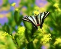
"Cellophane flowers of yellow and green..."
05/31/2006 12:31:14 AM
"Cellophane flowers of yellow and green..."
by SJCarter

Comment:
Ha! The only one to use this lyric. Very well done! Great colors; excellent use of DoF (and control). The setting with the butterfly make a perfect backdrop for the lyric and the whole mood of the song. I really love the contrast between the butterfly and the background - much better than the other interpretations of this song. Well done! Love it!
Photographer found comment helpful.
Hollow
05/30/2006 05:57:21 PM
Hollow
by SJCarter

Comment:
Was just thinking...a triptych (sp?) with this shot in the center and the recent SP shot (Inner child) on one side and Blue in the face or Cheese on the other...the three sides of Jimmy.
Photographer found comment helpful.
My Inner Child
05/30/2006 05:54:52 PM
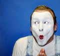
My Inner Child
by SJCarter

Comment:
I keep coming back to this shot for a variety of reasons - just showed it to my daughter and her husband and they both loved it - and I just enjoy the mood and the fun of this shot. Again, great job Jimmy! I now know where to go to get an instant smile!
Photographer found comment helpful.
33
05/28/2006 01:13:31 AM
33
by Kronus

Comment:
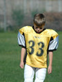
A little too bright on the overall exposure, IMO. If you shot in RAW this can be compensated for. Expression is good and a strong point in the image. A bit too much negative space in the upper left, but overall a good capture of a moment - really shows emotion. Nice job!

Message edited by author 2006-05-28 01:13:46.
Photographer found comment helpful.
Tiger jump - desat
05/28/2006 12:21:02 AM
Tiger jump - desat
by ShutterPug

Comment:
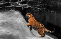
Love the desat work on this. Nice composition and great focus. Very nice image. Going into favs.
Photographer found comment helpful.
Banana Split
05/28/2006 12:15:32 AM
Banana Split
by Kronus

Comment:
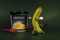
Very clever and creative. Shows a great ability to conceive an idea and execute it. Well focused and composed. Lighting is well done too. Nice shot!
Photographer found comment helpful.
cruise.jpg
05/27/2006 11:31:27 PM
cruise.jpg
by deapee

Comment:
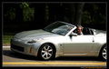
Not sure on this one. As a 'car' shot I want to see the whole car. As a 'random' shot I would like to see it cropped more on the right side to put more emphasis and placement on the driver and his expression. Exposure is well done. Focus is excellent. The contrast between the light foreground and dark OOF background is excellent.
Photographer found comment helpful.
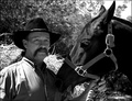
The Cowboy
05/27/2006 11:02:04 PM
The Cowboy
by SandyP

Comment:
Very nice shot. Got a 9 from me in voting. Very strong contrasts and great tonal range. Composition is very well done and the pose is perfect. Really sets up a nice contrast between two front subjects and the emphasis is well placed. Nice shot! Very well done and in within the theme!
Pages:   ... [61] [62] [63] [64] [65] [66] [67] ... [210]
Showing 631 - 640 of ~2097


Home - Challenges - Community - League - Photos - Cameras - Lenses - Learn - Help - Terms of Use - Privacy - Top ^
DPChallenge, and website content and design, Copyright © 2001-2026 Challenging Technologies, LLC.
All digital photo copyrights belong to the photographers and may not be used without permission.
Current Server Time: 07/22/2026 05:38:15 PM EDT.