|
|
|
Showing 1071 - 1080 of ~2097 |
| Image |
Comment |
| 11/21/2005 02:33:33 PM | Moon Over Caboby mpetersComment: Hello from the Critique Club!
I have studied your image and have the following to offer:
Composition/perspective - there is very little in this shot to really grab your attention and it seems as though everything is distant as well. The moon, although in your title, is very small/insignificant to carry the image. The horizon, although a bit low, with the stripe of color draws the attention. This keeps you looking low since, as stated, the moon is so small. With no visible detail and very little presence in the scene, I find the outcroppings on the right a bit of a distraction. Perhaps a different crop would help this to be a stronger image.
Color - except for the stripe at the horizon this has a nice blend of blues to black from top to bottom. The gradation from blue to color in the sky is very nice and preserved nicely in the processing. Perhaps a boost in contrast or saturation to accentuate the band of color a bit and create more of a gradation in tone there as well.
Light - natural, well controlled with the camera exposure and settings. However, the focus to the horizon leaves all the foreground dark and lacking detail. Different timing or perspective would help this as well as cropping differently.
Challenge requirements - the challenge called for a landscape and what I see here is more of a seascape. I think it falls somewhat short in this area.
Overall/my opinion - although I find this overall a very pleasing image to look at, I have to agree with one of the previous commentors - you may have been better off to turn around and capture the shorline in morning/daylight for this challenge. The moon, although mentioned in your title, is not really a very strong subject in this image. It is lost in a vast expanse of blue and only briefly draws your attention as the only bright spot as well. |  Photographer found comment helpful. Photographer found comment helpful. |
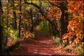
| 11/21/2005 10:20:45 AM | Pere Marquette State Parkby MyeReadBikComment: Hello from the Critique Club!
I have studied your image and have the following to offer:
Composition/perspective - your location in the shot is nice, but moving a little more to one side or the other would have been nicer. The path acts as a nice leading line taking you through the shot on its own, placement in the middle of it is not necessary. Also, it is not centered in the shot exactly, but it is close enough to make it become a distraction in that regard. Moving to one side or the other would eliminate this as well as a different crop on the shot. Your angle to the shot is good - not looking down or up, but straight ahead. This really lends strength to the path as a leading line. The focus seems soft. Nothing is really clearly defined. Even the limbs and trunks appear to have soft edges.
Color - the colors in this shot are nice and you have a broad palette to work with. Some of them get lost in the bright and dark areas of the shot (see below). Work with contrast, saturation, etc. cannot overcome this. There are a lot of natural contrasts in the shot which add to its appeal.
Lighting - I think this is the weakest part of this image. The natural light in the front of the shot washes out a lot of the colors and detail as well as the textures. At the same time it makes the front bright, it makes the back of the image dark. You lose the path and detail in this area. A different time of day or angle to the sun would have helped this disparity between front and back.
Challenge requirements - even though narrow in its approach, this does meet the challenge requirements for a landscape in my opinion.
Overall/my opinion - a different time of day so the lighting worked for you instead of against you would have helped to make this a much stronger image. The path, whether intended or not, is a great leading line that also could have worked better to your advantage. This image does demonstrate your ability to see the shot. Overall it is a decent and appealing image. | | Photographer found comment helpful. |
| 11/21/2005 09:36:56 AM | | | Photographer found comment helpful. |
| 11/21/2005 09:35:33 AM | | | Photographer found comment helpful. |
| 11/21/2005 09:31:49 AM | | | Photographer found comment helpful. |
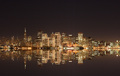
| 11/21/2005 09:15:29 AM | Meet me in St. Louieby lcfourstarComment: Hello from the Critique Club!
I have studied your image and have the following to offer:
Composition/perspective - looking at this I get the sense that location is key for this image. The bit of wall at the bottom left is a slight distraction and could have been cropped out. The reflection would have been stronger if the whole arch was visible. If this was not possible, cropping more off the bottom so the arch is not 'almost' complete would help it. A 'perspective' crop may have helped in this area if the arch reflection can be seen as complete. The arch itself is a strong enough element without the reflection. The dicks are a nice added feature to the scene. They help to break up the expanse of water but on the other side, they disrupt the reflection. Again, a different crop would help to place the interests in the right place and keep things from becoming distractions. Overall it is a very serene scene.
Color - the color of the sky against the arch is nice - not too dark. The acrh is not lost in a gray sky and the added spot of blue helps to accent the apex. The trees seem to contain a lot of colors, but they are muted or dull. Some contrast and saturation adjustments may have helped to bring those out more. The water is so dark the color would have helped to offset that.
Lighting - natural, no flares or glares or washed out areas. The sky is not blown out at all. In the brightest area of the arch the seam detail is still visible. Good choice of time of day and control of natural light with your camera.
Challenge requirements - in my opinion, I find this borderline. It is a beautiful scene that in the broadest sense meets the requirements. However, the arch being such a strong element and occupying the bulk of the scene, the water is not enough to offset that which leaves this closer to a subject photo than a landscape.
Overall/my opinion - this is a really wonderful scene that could be a lot stronger with a slightly different crop and some work on the colors. The image seems a little dark although it is daylight. This may be the water. Although the overall reflection is there, the colors even in the reflections are dull. Post processing is the key for this image. | | Photographer found comment helpful. |
| 11/21/2005 08:40:32 AM | Trout Countryby jonderComment: Hello from the Critique Club!
I have studied your image and have the following to offer:
Composition/perspective - the ratio of sky to land is good in this shot. The water and rocks help to break up the view and offer a few places to focus on. If the rock outcropping was a little lower in the shot, the little extra sky wouldn't hurt. There is a branch protruding on the left side I find a bit of a distraction and could have been cropped out all together or more of the tree included to make it part of the scene. The focus seems a little fuzzy or perhaps a bit of sharpening could have been applied. It appears you are over the water, perhaps on a bridge. It may have been a stronger image if you were at water level. I assume that is a fisherman in the distance, again it would have been a stronger image if he was more prominent in the scene.
Color - the colors seem a little flat or muted. There are a lot of autumn colors present in the scene that are just not strong enough. Boosting contrast and saturation some may have helped to bring these out more.
Lighting - natural light...the left side of the scene is a bit dark compared to the right hand side of the scene. Changing perspective left or right would have changed this and helped to bring it in balance or eliminate it. A different time of day may have helped as well. The sunlight appears a bit hard. Softer light would have helped with the colors (see above).
Challenge requirements - the challenge was for a landscape and this certainly fit the requirements. Your choice shows an interesting mix of elements that provide for a lot to view. The fisherman is a nice added touch.
Overall/my opinion - this is a nice scene that with slightly different processing could be made much stronger. I wish the fisherman was a stronger element in the picture which would have gone better with your title. The image has potential. |
| 11/18/2005 06:44:09 PM | Defying the oddsby InnaNComment: Hello from the Critique Club!
I have studied your image and have the following to offer:
Composition/perspective - the angle to the subjects is very good and presents a strong subject placement. The ratio of subjects to the rest of the image is good as well. The car in the street I find to be a distraction. I follow the line of people and continue right to the car and then get caught there. Timing could have been a little better. The only real clear area appears to be the light pole. None of the subjects is clear. Maybe a faster shutter speed or ISO - you posted no details of the shot so hard to tell.
Color - b/w, overall there is a good range of values in this image - lots of grays and whites balanced well with the heavy dark areas of the road. Some of the whites seem a bit bright (see below), maybe levels or contrast/brightness could have helped this.
Lighting - there seems to be a really bright flash bounce/light source used in this image. All the way down to the last bucket it is still very bright. The shirt of the first person is very bright. The pole has a light streak down the front which draws attention (which then leads to the headlight, another distraction).
Challenge requirements - I have struggled with this and tried to apply many trains of thought to this image, but still come up short with the requirements - Dead End. There is no element that stands out in any of the people or the group as a whole that strikes me as dead end.
Overall/my opinion - this could be a very strong image if better focused and lit to allow a more emotive force show through. Timing to avoid the background traffic and other distractions would help as well. | | Photographer found comment helpful. |
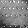
| 11/18/2005 06:19:18 PM | Restby tjmuellerComment: Hello from the Critique Club!
I have studied your image and have the following to offer:
Composition/perspective - a very unique perspective demonstrating a very creative thought process and the ability to translate that to an image. I like the shadows but feel a little later on in the day they would have been longer which would have made this a much more dramatic shot. Although an interesting scene, there really is not much to capture your attention after the first look. Hence, longer shadows would have added much more mood to the shot. The focus seems slightly off or perhaps sharpening a bit. But no place really looks clear and I find myself wandering around the image looking for something or a sharp area that may be the center of attention although not the scene. The larger stone in the top row is too close to the edge to be significant.
Color - b/w, but seems flat. Perhaps a boost in the contrast and levels adjustment would help this. Being so far away from the grass you lose that texture, but it would help to distinguish the shadows from the surroundings. In some areas they start to get lost.
Lighting - good use of natural light in concept, but more advantage could have been taken. Again, the shadows (see above). The control here is good though. There are no real blown out areas although some of the stones are a little bright.
Challenge requirements - this certainly is a representation of a 'Dead End' as the requirements defined it.
Overall/my opinion - in concept this is a good idea and you executed it well for what you captured. I think this shows a creative idea that fell short for many reasons. Visually, there is not much here. As stated above longer shadows would have really helped. Perhaps not so high above or zoomed in to emphasize fewer stones, longer shadows, and let the geometry and light work for you. | | Photographer found comment helpful. |
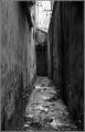
| 11/17/2005 09:13:20 AM | Untitledby TiberiusComment: Hello from the Critique Club!
I have studied your image and have the following to offer:
Composition/perspective - the approach to the alley is good, a nice level shot without any odd angles to contend with. Focus is good for the whole length which helps keep your eyes down. The patch of bright sky at the end is a bit of a distraction. Perhaps a tighter crop on the top would help here. The leaves and trash and stuff on the ground is good for the walkway, but the wires and cables with the bright spot on the top make it a little busy. Cropping to just above the door or a little higher still leaves the alley bright and eliminates the distractions. This image really gives you a feeling of confinement, like you are actually there in the alley, through the strong composition.
Color - b/w with a good tonal range. The contrast in the three main surfaces is great - the lighter wall, bright walkway and darker right hand wall. The shades of gray are strong with just enough shadow and darker patches to keep it from becoming bland. The image is an excellent choice for b/w processing.
Light - use of natural light here is very nicely handled. Being centered in the alley helps set up the balance between the light and dark areas. There are no heavy dark areas that hide the detail and textures. A different time of day and this alley may well ahve been too dark or even too bright. Good timing for the shot.
Challenge requirements - even though there appears as though it is a door at the end of the alley, a careful look shows that there is no destination beyond that door that can be seen. This helps to place the image within the parameters - dead end.
Overall/my opinion - this is a strong image even without the challenge. The composition really gives a lot to the imagination and lets you feel the alley. As stated above, the only area I find distracting is the patch of brightness above the door end of the alley. Black and white seems to be the right choice for this image as well, much more emotive than a color shot would be. Overall, well done! | | Photographer found comment helpful. |
|
Showing 1071 - 1080 of ~2097 |
Home -
Challenges -
Community -
League -
Photos -
Cameras -
Lenses -
Learn -
Help -
Terms of Use -
Privacy -
Top ^
DPChallenge, and website content and design, Copyright © 2001-2026 Challenging Technologies, LLC.
All digital photo copyrights belong to the photographers and may not be used without permission.
Current Server Time: 07/24/2026 06:26:42 PM EDT.
|