| Author | Thread |
|
|
11/21/2005 11:51:27 AM |
|
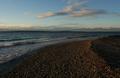
Looks like a very beautiful location. |
|
|
|
11/21/2005 08:40:32 AM |
Hello from the Critique Club!
I have studied your image and have the following to offer:
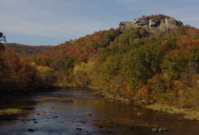
Composition/perspective - the ratio of sky to land is good in this shot. The water and rocks help to break up the view and offer a few places to focus on. If the rock outcropping was a little lower in the shot, the little extra sky wouldn't hurt. There is a branch protruding on the left side I find a bit of a distraction and could have been cropped out all together or more of the tree included to make it part of the scene. The focus seems a little fuzzy or perhaps a bit of sharpening could have been applied. It appears you are over the water, perhaps on a bridge. It may have been a stronger image if you were at water level. I assume that is a fisherman in the distance, again it would have been a stronger image if he was more prominent in the scene.
Color - the colors seem a little flat or muted. There are a lot of autumn colors present in the scene that are just not strong enough. Boosting contrast and saturation some may have helped to bring these out more.
Lighting - natural light...the left side of the scene is a bit dark compared to the right hand side of the scene. Changing perspective left or right would have changed this and helped to bring it in balance or eliminate it. A different time of day may have helped as well. The sunlight appears a bit hard. Softer light would have helped with the colors (see above).
Challenge requirements - the challenge was for a landscape and this certainly fit the requirements. Your choice shows an interesting mix of elements that provide for a lot to view. The fisherman is a nice added touch.
Overall/my opinion - this is a nice scene that with slightly different processing could be made much stronger. I wish the fisherman was a stronger element in the picture which would have gone better with your title. The image has potential. |
|
|
|
11/16/2005 09:14:58 AM |
Thanks everyone for your comments, they were very helpful. This was my first challenge entry and I learned a lot. I did go back and tweak the levels, contrast and brightness and it made a huge difference. I wasn't sure how much Basic Editing allowed me to tweak the picture so I left the it pretty much as it came from the camera.
Again everyone thanks for your comments. |
|
Comments Made During the Challenge  |
|
|
11/15/2005 06:52:48 PM |
|
Beautiful autumn colors. The exposure it great |
|
|
|
11/15/2005 10:14:58 AM |
|
Beautiful view but I think it could use a little more saturation. |
|
|
|
11/13/2005 10:25:52 PM |
|
Interesting right through out. |
|
|
|
11/13/2005 05:44:30 PM |
|
This photo is nice and has alot of potential, the colours and detail are there, but they could be enhanced through a little editing |
|
 Photographer found comment helpful. Photographer found comment helpful. |
|
|
11/13/2005 01:26:14 AM |
|
| Photographer found comment helpful. |
|
|
11/11/2005 07:37:31 PM |
|
| Photographer found comment helpful. |
|
|
11/11/2005 05:40:50 PM |
|
Interesting composition but rather underexposed. |
|
| Photographer found comment helpful. |
|
|
11/09/2005 08:26:25 PM |
|
Good picture. Some of the comments indicate grayness in the photo. I don't see that at all. Could it be some of the monitors are not set correctly? This picture and all the others came across my monitor with good color contrast. I see no grayness at all. Just wondering about those comments. Thanks. Debra |
|
|
|
11/09/2005 08:07:11 PM |
|
nice composition, but the colors seem a little muted, possibly a bump in saturation would help |
|
| Photographer found comment helpful. |
|
|
11/09/2005 04:25:08 PM |
|
Kinda gray-ish looking, did you try pumping up the contrast ? |
|
| Photographer found comment helpful. |
|
|
11/09/2005 03:32:41 PM |
|
dull! look at all those colors, i would have tweaked some of the settings before submitting this! |
|
| Photographer found comment helpful. |
|
|
11/09/2005 01:03:10 PM |
these trees could be so beautiful but they seem to be lacking something, they are somewhat dull, perhaps some post processing would help. same with the sky.
however, i love the peacefullness of the photo. the fisherman are definitely a great touch. |
|
| Photographer found comment helpful. |
|
|
11/09/2005 12:43:42 PM |
|
| Photographer found comment helpful. |
Home -
Challenges -
Community -
League -
Photos -
Cameras -
Lenses -
Learn -
Help -
Terms of Use -
Privacy -
Top ^
DPChallenge, and website content and design, Copyright © 2001-2026 Challenging Technologies, LLC.
All digital photo copyrights belong to the photographers and may not be used without permission.
Current Server Time: 06/29/2026 02:20:42 PM EDT.