| Image |
Comment |
| 08/23/2005 10:55:06 PM |
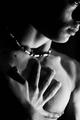
Myself.by TranquilComment: hmmm- might his be boy Joey? Great lighting and nice crop. Perhaps a bit more DOF as the shoulder looks a tad too blurry |
 Photographer found comment helpful. Photographer found comment helpful. |
| 08/22/2005 09:29:30 PM |
|
| Photographer found comment helpful. |
| 08/20/2005 02:54:57 AM |
Head or Tail ????by DrakeComment: ** Greetings from the Critique Club **
Technically this is a good shot. The bokeh is demonstrated very well. The colors are well balanced and natural looking. It does appear a little over-sharpened, and the lighting a bit harsh.
Composition is alright, but nothing that sets it apart from the average. Perhaps rotating the image 45 degrees ccw would make it more interesting.
As for meeting the challenge, there really was not much of an illusion here.
- Linda |
| Photographer found comment helpful. |
| 08/19/2005 01:31:07 AM |
Windermere Moonby kendall6Comment: Nice shot - I was hoping to get some of the full moon myself tonight, but alas, we are finally getting rain. Has been a drought all summer so I can't complain. |
| Photographer found comment helpful. |
| 08/18/2005 04:13:39 PM |
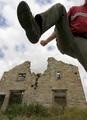
demolition time!!!by mrr1Comment: ** Greetings from the Critique Club **
Very creative. I like the image, depsite a few techincal problems. The building seems to be leaning backward too much - an angle correction is needed here. As for lighting, the lighting on the building is bright - no shadow from the leg lifted over it. It should have had some burn tool used on it to give it shadow. The person is a little too dark. needed more light here, especially on the boot.
Linda
|
| 08/18/2005 04:05:21 PM |
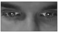
e-LOVEby anthonyczajaComment: ** Greetings from the Critique Club **
Technical: Image looks blurry, beyond soft focus. LIghting looks to be coming from the left as a deep shadow rakes across the bridge of the nose. The image itself looks a bit flat. Might have tried a little selective desat, leaving the eyes their true color. Would have given it a nice pop.
Composition: Feels too tight - but to keep focus on the hearts in the eys I'm sure you needed to keep it close.
Creativity; I like the creativity here. The message is sent with the title however - without it the meaning might be lost.
Linda
|
| 08/18/2005 03:59:07 PM |
Heavy Metalby esdarbyComment: ** Greetings from the Critique Club **
Technical: Lighting needs correction as there is a distractive glare along the top of the glass and chrome ring. The angle of the lighting leaves an undesirable shadow along the left side of the scale. Background choice is not one I would have recommended. Rather a solid white, or off-white would have done better I think. To add interest, the iPod could have been turned on so that the screen had something other than a blank face. Also would have kept the ear phone cord off the face of the scale. Exposure controls and white balance seemed right on.
Composition: well executed - good example of the rule of thirds.
- Linda
|
| Photographer found comment helpful. |
| 08/18/2005 03:46:42 PM |
Watercolorby OlyuziComment: ** Greetings from the Critique Club **
A beautiful illusion image! . Suggestions: straighten the horizon, and try adjusting the white bird a little. The bird is too bright. If you use PS, you can select just the bird, then selective color - choose white from drop down, and add 10% to black. Just a suggestion. Otherwise I love the colors. Not much else I could suggest as this was executed so well.
Linda
|
| Photographer found comment helpful. |
| 08/18/2005 02:44:19 PM |
Little dreamerby rameviComment: ** Greetings from the Critique Club **
Focus seems a bit soft, alnmost blurry on face of girl. Seems to have focused on the hand and item being tossed in the air.
Good use of shutter speed to give the illusion of the item floating or stopped in mid-air. Lighting done nicely too in my opinion - really accentuates the gaze in the girls eyes.
Linda
|
| Photographer found comment helpful. |
| 08/18/2005 02:33:41 PM |
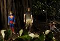
Family Portraitby neomachinaComment: ** Greetings from the Critique Club **
Technical: Foreground is very distracting, almost to the point of obscuring the main subjects in the image. The lighting seems to be coming from the left primarily, leaving the two individuals along the right hardly noticeable. Seems a bright spot is on the guy in camo.
Composition: Foreground needed to be cleared before the shot. Subjects not balanced well within the photo.
Meeting Challenge: I do not see how this meets the challenge at all. I simply do not see any illusion here, unless the large tree is not actually one tree but either more than one tree lit to look as one, or a backdrop. I just don't see it. Sorry.
Linda
|
Home -
Challenges -
Community -
League -
Photos -
Cameras -
Lenses -
Learn -
Help -
Terms of Use -
Privacy -
Top ^
DPChallenge, and website content and design, Copyright © 2001-2026 Challenging Technologies, LLC.
All digital photo copyrights belong to the photographers and may not be used without permission.
Current Server Time: 06/24/2026 01:41:36 AM EDT.