| Image |
Comment |
| 02/21/2008 12:23:11 AM |
Tiersby banmornComment: Pretty cool architecture here. I like how you used it in this challenge. |
 Photographer found comment helpful. Photographer found comment helpful. |
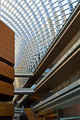
| 02/21/2008 12:22:04 AM |
|
| Photographer found comment helpful. |
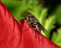
| 02/21/2008 12:21:29 AM |
On The Edgeby androgeusComment: I like fly macros as flies are such interesting looking insects. I'm not sure if it is too much sharpening or too high of contrast that makes the body look like it over illuminated and over sharp. Not a bad shot though. |
| Photographer found comment helpful. |
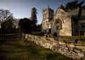
| 02/21/2008 12:17:58 AM |
Sunny Churchby martinturnerComment: Cool looking church. I like the lighting on it. The darkness on the left hand side of the fence though I feel takes away from the idea of leading lines. If there was more light or brightness to the left rail it would have more impact for me. |
| Photographer found comment helpful. |
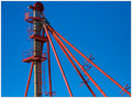
| 02/21/2008 12:13:44 AM |
Red Pipesby artvetComment: Red against sky blue - can't ever go wrong there. The lines lead me to the top of whatever this is - and that is where I have a problem....what is it? I wish there were more information to show me what I am looking at. |
| Photographer found comment helpful. |
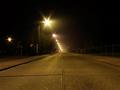
| 02/21/2008 12:12:07 AM |
road to ...by fotojoeComment: Many leading lines here. I like the starring of the streetlight. Other than that though the image just does not have anything to hold my attention. |
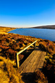
| 02/21/2008 12:10:18 AM |
Zig Zagby TacTZillaComment: I like this...great use of several lines that lead you throughout the image, yet to the same end point. Nice colors and textures. |
| Photographer found comment helpful. |
| 02/21/2008 12:09:03 AM |
tracks to the skyby hmiddle03Comment: Very neat perspective. The colors are nice and bright. The one thing that bothers me here is the but end of the wood smack dab in the middle of the bottom edge. I think it looks better cropped up higher to where the butt end of the wood does not show. |
| 02/21/2008 12:07:12 AM |
|
| Photographer found comment helpful. |
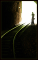
| 02/21/2008 12:06:15 AM |
...into the tunnelby chimaeraComment: Not sure I care for the soft focus on this shot or not. I keep debating it with myself. I like the softness on the ground, but long for detail in the tunnel wall. |
| Photographer found comment helpful. |
Home -
Challenges -
Community -
League -
Photos -
Cameras -
Lenses -
Learn -
Help -
Terms of Use -
Privacy -
Top ^
DPChallenge, and website content and design, Copyright © 2001-2026 Challenging Technologies, LLC.
All digital photo copyrights belong to the photographers and may not be used without permission.
Current Server Time: 07/27/2026 11:38:27 AM EDT.