|
|
|
Showing 2201 - 2210 of ~2566 |
| Image |
Comment |
| 05/16/2003 05:11:49 AM | Welcome Home, Troops!by ArtifactsComment: Although this water droplet technique is getting a little over done, I do like your take of it by adding the yellow ribbon. I do believe, however, that the droplets could have been in better focus to give it more of a "WOW" effect. |  Photographer found comment helpful. Photographer found comment helpful. |
| 05/16/2003 05:07:33 AM | primary colorsby GotchyaComment: I understand what you were trying to do with this by manipulating the colors or by using a filter to make the white stripes yellow. Although you were successful in meeting the challenge, it turned the flag into a displeasing color and very unnatural. I do like the ripples and shadows in it though. | | Photographer found comment helpful. |
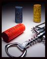
| 05/16/2003 04:58:30 AM | Vino Italianoby jmsetzlerComment: Composed nicely. Unique set-up for the challenge. Lighting and clarity are perfect. I like the reflection of red on the corkscrew. It adds a nice touch. Only drawback in my opinion...the border is just a little too wide for my liking. It could do without most of the inside black portion. 9 - Good luck in the challenge! |
| 05/16/2003 04:51:14 AM | Primary Friendsby sagestudioComment: Very cute shot and an unique take on the challenge. I also like how you coordinated the shirts to the color of the child's hair. I assume that this was done on purpose. 9 Good luck in the challenge! | | Photographer found comment helpful. |
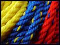
| 05/16/2003 04:28:22 AM | Primary Ropeby KazComment: I must say...VERY NICE!! I voted a 10 on this because this is a nice and unique representation of the primary colors. The lighting is perfect and the colors literally pop out of the screen. Only drawback...too bad there wasn't a stand of red running through the yellow rope to even out the color trend. You should score high...good luck! | | Photographer found comment helpful. |
| 05/16/2003 01:20:15 AM | Postcardby GussiComment: Critique Club
Composition: This is a beautiful picture and includes interesting subject matters. The building is lovely and unique. I have not seen one like it. Set nicely behind it is the beautiful blue sky. The geyser is nice and with the angle at which you shot this, it frames the building nicely and doesn't compete with the building. You were lucky that the wind was blowing the right way for this. Is this a constant errupting geyser? If it were possible, I would have walked a little closer to the fence. Although the colors of the grassy areas in the foreground are nice, it would have been better, I think, to get the fence out of the shot and still get in the spout of the geyser with the building behind it. At it's current distance, it would not be effective to just crop out the fence because you lose the bottom of the geyser.
Technical: I would not change anything about the technical aspects of the photo. The colors are fantastic in what appears to be a beautiful day. The lighting could not be more perfect. Well focused and shows nice depth.
Challenge: Good "postcardy" subject matter. However, the text seems awkward. Perhaps using a border around your picture and placing the text within it would be more appropriate. I noticed that many of the comments you recieved during the voting stated they wished they knew what building and landmark they were looking at. I believe that the purpose of a postcard is to educate the recipient of the area in which the sender is visiting. Perhaps including this information would be appropriate for this challenge.
Overall: Beautiful picture that portrays your homeland nicely. I was looking back at some of your other pictures and saw this building again in one called "The Trio". Although that picture was slightly blurry, my breath was taken away at the beauty of the sunset. I would have never guessed that building was a resturant. In any event, you seem to have a good eye for photography. Keep up the good work.
I hope you found this critique helpful. I enjoyed studying your photographs.
Connie | | Photographer found comment helpful. |
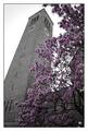
| 05/15/2003 01:57:54 PM | Classic Ivy Leagueby RiderGalComment: Critique Club
Hi Talya!
Before I start, I'd like to comment on your work as a whole. When I do critiques for the club, I study the pictures I'm assigned to for a long time before I start writing. I also check out the photographer's profile to check out other works and get a feel for their style. I am highly impressed with your work and can tell that you have loads of talent. I am especially impressed with your sports photos. You have a good eye and excellent mastery of your camera skills. I definately see you making money with your work. Good luck with your dream of working with Sports Illustrated. Okay...onto the task at hand.
Challenge: I could definately see this amoung a rack of postcards in the college bookstore. You portrayed an important landmark of the college campus that deserves to be shared. You know your subject well and what you wrote in your comments could be written on the back to educate the recipient of the card. The only thing I might possibly add is text on the front to label your postcard. You wouldn't want it to be bold and imposing...just perhaps a small script font in the bottom border of the card. I noticed that in your comments during the voting that people wished they knew what they were looking at.
Composition: Once again, your wonderful eye for effectively portraying your subject is evident here. The angle at which you shot the tower is excellent! The tree with its blossoms does a great job of framing the tower, covering the less interesting areas with its beauty, but staying away from the important upper parts of the tower. Then, the tree's branches continue to sweep over the tower to complete the effective framing. I don't know how more perfect you could get with the composition. Excellently cropped, it fits nicely into the postcard size. The border is appropriate and looks nice.
Technical: The saturation technique you used was very effective here. It still looks very natural. The blossoms against the grey tones looks very nice and provides excellent contrast. The white sky might be a bit stark, especially in the area behind the tree at the midpoint of the picture between the tower and the rest of the building. However, it really doesn't take away from the shot. The biggest problem I do have is the lack of clarity. Because of that, in my opinion, it lacked the "WOW" effect to boost the score during voting. You seem to show the stone texture of the tower well, but the blossoms on the tree are fuzzy and I would have like to see just a little more focus on them without taking away from the depth of the tower. Perhaps also a little boost in the saturation of the purple flowers would help "pop" them out a little more, but may not be necessary if they had more detail.
I hope you find this critique helpful. I thourghly enjoyed studying your work. You have great talent and I wish you the best of luck in your endeavors. Have fun this summer. It sounds like you have exciting learning opportunities ahead of you.
Connie |
| 05/15/2003 03:28:52 AM | .25 cents each / 5 for $1.00by KarenBComment: Critique Club
Hi, Karen
Challenge: I can definately see this included on the postcard rack of a gift shop in New England. This was one of my favorites in the challenge. I thought I had commented on it during voting, but I don't see me there, so I guess not. You definately met the challenge with this professional looking postcard. I like the overlapping text. The font is appropriate and adds to more of the postcard"ish" feel.
Composition:This is a beautiful picture of the coast. I especially like the lower portion of the sand and the gentle waves. I also like the wispy clouds of the sky. My only disappointment is with the coastline in the background. There isn't much clarity and takes a little away from the entire picture, in my opinion. I am in agreement with a comment that stated there should be a somthing such as a lighthouse to lay our eyes on. Perhaps a larger subject along that coastline would have helped to give it more clarity. The rock, unfortunately, is in shadow and doesn't "pop" out as eye catching to aid in this area.
You know, I could see your daughter (right?) out there with her hat and the water lapping over her bare feet. Just a thought.
Technical: Once again, I am drawn to the bottom portion of the picture. As I see it, that is where the focus lies. I like how it shows the texture and ripples of the sand, the foam on the water and the waves coming in. The colors are nicely done. The greens and blues of the water are nice and show well. The color of the sky is nice with the slight pinkish hue along the horizon adding to the beauty of the scene.
Overall: In my opinion the only drawback to this lovely picture is the shoreline in the background. As you state in your comments, the WOW factor is missing, but overall a very pretty scenic view of the coast. Ever since I've joined DPC, I have seen your work and have been impressed with what you come out with. You have a good eye for photography. I'm always eager to see more.
I hope you have found this helpful
Connie | | Photographer found comment helpful. |
| 05/09/2003 11:17:39 AM | Highway in the Skyby CreativeFlyPhotoComment: Hi Amy,
Greetings from the Critique Club:
Just to start out...I really like your photo. I liked it during voting and, of course, I still like it now. In my opinion, you have taken what would be a simple monorail snapshot and turned it into photographic art. What makes the picture is the reflection of the setting sun and horizon in the front car. The colors are beautiful.
If I remember correctly, the monorails at DisneyWorld move quickly, so I'm impressed that you were able to freeze it and get it in such nice focus. Just the front nose is a tad blurry, so I can tell that it was a moving monorail.
The angle of your shot is pleasing to the eye. I disagree with one comment that suggested you crop out part of the left side. That is the best part of it where the colors are rich. It also shows the track in front of the train and allows it somewhere to go. Your border is simple black and not overdone. Frames your picture nicely.
My only complaint is that it is a little overexposed on the right side. Actually, I think you could crop off a little more of the back of the train (perhaps the last two sections) and not lose the effectivness of the shot. In fact, the closer crop would make the front car more dramatic. I think it will also take out some of the negative space of the blaa sky and fill your picture in better. Just a thought.
Overall, it is a very nice photo and meets the challenge head on.
Good luck
Connie | | Photographer found comment helpful. |
| 05/08/2003 07:58:27 PM | Afternoonby jimmythefishComment: Critique Club: Greetings
CLarson557
Composition:
I like the plant pictures in your set. Although maybe a little on the dark side, the filtering light and the shadows are nice, especially with the leaves in the top one. Sorry, I'm not a plant person, so I don't know the name of the plant.
I'm in agreement with others who have commented on your above work...that the left picture seems out of place. Since you left no explaination, I am left with my creative imagination. What I believe it could be is a window seal. So, considering that, with the amount of bright sunlight coming in the window, the pattern of light seems a bit out of balance...meaning that there should be more sunlight showing in the top photo. However, since this is a triptych with three different photos, that is forgivable. However, it is just a thought...if you were to balance out the set in respect to light.
In regards to the bottom fern picture, I like the transition between the lower dark area of the photo on the left and the ferns. The lighting is balanced with the sorce of light on the ferns coming from somewhere below and out of the picture.
Framing/Border:
The pictures are arranged nicely in the set. It's simple and fitting. The black border is even and does a very good job in presenting the photos. I actually didn't notice the thin white line at the bottom until I read the comments you recieved and it was brought to my attention. Just a minor thing and I really didn't find it distracting, although, if a print were to be made, it probably should be fixed.
Technical Aspects:
Once again, I'm still stopped by the picture on the left. I'm not sure what it is I'm actually seeing. The focus is on the lower wooden area and, once again, I'm puzzled as to how it fits in, especailly with the upper portion out of focus. I'm finding it hard to comment on it any other way. I do like how you were able to bring out the texture in the wood.
In the plant pictures, you show nice texture of the leaves. However, I do feel that it could be lightened up just a tad without blowing out the ones lit by the sunlight and without losing the effect of the shadows. It would not only give the lighting more balance in your set as I talked about above but also would be a little more pleasing to the eye.
B/W is effective in this because of the use of shadows and light. I really do not think it would be as nice in color...although my curiosity is heighten to see a colored version just to see the difference. The focus is nice and shows good texture and dimension.
Overall:
A very well put together arrangement of pictures. Only a few troubling areas. One can tell that this is done by someone who is experienced and works well with a camera. You have a nice eye for shooting thought provoking photos, paying good attention to light and shadows. I did take a look at your others challenge submissions and I was quite impressed.
-I hope you find this helpful. This is my first critique since joining the club, so I hope I covered everything. If you have any questions, you can notify me.
| | Photographer found comment helpful. |
|
Showing 2201 - 2210 of ~2566 |
Home -
Challenges -
Community -
League -
Photos -
Cameras -
Lenses -
Learn -
Help -
Terms of Use -
Privacy -
Top ^
DPChallenge, and website content and design, Copyright © 2001-2026 Challenging Technologies, LLC.
All digital photo copyrights belong to the photographers and may not be used without permission.
Current Server Time: 07/19/2026 11:01:56 AM EDT.
|