| Image |
Comment |
| 06/09/2003 01:42:29 PM |
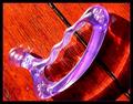
Tool of the tradeby kosmikkreeperComment: Quite a contrast between your subject and the background. Maybe if I knew what I was looking at, I could vote on this better. The shadow is interesting. The background just seem inappropriate for the purple plastic thingy. Up picked up the texture of the table nicely. You can see the grain and scratches of a well worn surface. Don't know what else to say. 4 Good luck in the challenge. |
| 06/09/2003 01:37:22 PM |
DOCutivityby TarbiniComment: Ahhh, fax machine face. Lets see...I know this seems a little nit picky but I would have liked to see the green button more in the bottom corner and could have gotten just a little more blue at the top. I like your use of DOF. I really like the colors. They are vivid. 8 Good luck in the challenge. |
 Photographer found comment helpful. Photographer found comment helpful. |
| 06/09/2003 01:34:12 PM |
Pilgrim and Friendsby ChiquiComment: Very cute cup. I like your color theme here. The green ribbon on the handle kind of distracts from those colors. The angle also appears a little ackward here. Too uniform for my taste. 5 Good luck in the challenge. |
| 06/09/2003 01:31:57 PM |
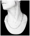
Paperclipsby sagestudioComment: Hey!! I used to do this as a kid!! I can see where some bored secretary on a quiet day could get carried away, so I guess it meets challenge. I don't like how the paperclips don't really stand out. The skin tone seems very washed out. Perhaps this would have been better in color where you would have natural skin tone. That's just my thoughts 4 Good luck in the challenge. |
| Photographer found comment helpful. |
| 06/09/2003 01:24:08 PM |
Turf Warby GeneralEComment: Very cute idea. What hurts you, though is the busy background. Perhaps a more neurtral background and surface would have been more appropriate. 4 Good luck in the challenge. |
| Photographer found comment helpful. |
| 06/09/2003 01:22:03 PM |
creating Art at the officeby falveyComment: I immediately wanted to turn my head to see what I was looking at. Did you mean for it to be laid out horizontal? Your focus and lighting are great and you do meet challenge. It just doesn't appeal to me much. 5 |
| Photographer found comment helpful. |
| 06/09/2003 01:17:55 PM |
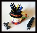
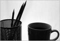
Morning Coffeeby MitonskiComment: I think that this would have been a nice picture without the coffee cup. I like the texture of the background and the placement of the pencils in the holder. The coffee cup just doesn't seem to fit and appears ackward to me. |
| Photographer found comment helpful. |
| 06/09/2003 01:14:59 PM |
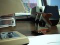
deskylineby kenboComment: Very nice take on the challenge. I really liked your idea to back light your subjects. I like the paperclip flower, but couldn't figure out what the rest was. I suppose that's a tape despenser, but where's the tape? Well focused 7 |
| Photographer found comment helpful. |
| 06/09/2003 01:06:45 PM |
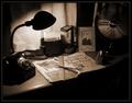
one for the scrapbook by indigo997Comment: Very nice! I like the set-up here. The duotone is effective and looks vintage. I like the single light source from the lamp. Very much meets challenge and hope you get a good result. 10 |
| Photographer found comment helpful. |
| 06/09/2003 01:03:57 PM |
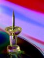
To the Pointby TerryGeeComment: I do like the colors here. Picture seems kind of pixilated though or perhaps over saturated. Just lacks definition |
Home -
Challenges -
Community -
League -
Photos -
Cameras -
Lenses -
Learn -
Help -
Terms of Use -
Privacy -
Top ^
DPChallenge, and website content and design, Copyright © 2001-2026 Challenging Technologies, LLC.
All digital photo copyrights belong to the photographers and may not be used without permission.
Current Server Time: 07/19/2026 10:02:57 PM EDT.