|
|
|
Showing 2001 - 2010 of ~2566 |
| Image |
Comment |
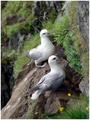
| 06/30/2003 01:18:13 AM | Birdsby eikidigiComment: Beautiful picture! Nice DOF. They posed nicely for you. I love the colors! |
| 06/30/2003 01:11:55 AM | Bridal Bellby karmatComment: I really like the muted colors in this photo. The only part that bothers me is the glare at the bottom of the bell. |  Photographer found comment helpful. Photographer found comment helpful. |
| 06/29/2003 02:41:41 PM | There is no Spoonby mbardeenComment: Greetings from the Critique Club:
Hi Mat,
I really like your photo. I didn't realize that there was a reference to the Matrix. I don't know too much about the movie. I just liked the picture and voted it fairly high in the challenge.
Challenge: The coffee cup is off-center in the picture and the spoon is sitting off-center on the cup, so you definately met the criteria for the challenge. I really like the unique-"ness" of it.
Composition: Very simple composition. I'm glad you stuck with the color version because I really like the color of the reflection in the cup. Where was this taken? It looks like a reflection of sky. In any event, it is very pretty and blends in well with the color of the cup.
Technical: I would not change a thing. I am impressed with your post-production work. The overexposure works well here. I like how the spoon disappears into the background. The soft focus give the coffee cup a frosted look.
Overall: I have nothing bad to say about your photo. I scored it a 9 during the challenge and am surprised at your score. I would have expected it to be in the mid to high sixes with a possible ribbon. I'm not understanding why 20 people score this below a 5. Perhaps they don't realize that overexposure and soft focus can work well in a photo.
Keep up the good work
Connie | | Photographer found comment helpful. |
| 06/28/2003 11:30:04 PM | Flooded Tunnelby RiderGalComment: Greetings from the Critique Club:
Hi, Talya
I've done one of yours before so here it goes.
Challenge: The subject is definately off center in the picture so you met the criteria for the challenge.
Technical: I appreciate your creativity with this shot. I do, however, agree with many of the comments below. I think that focus would define your picture better. With the daylight at the end of the tunnel, your subject is backlit. With focus, the lines would be clearer, but still be artistic. I think the ripples in the water are neat and could be seen better. Unfortunately, as well, the background (the light) is overexposed.
Composition: I do like the backlit guitar player. I wish that I could see even more of the guitar, however. The tunnel frames the picture nicely. Good choice of subject.
Once again, I enjoyed studying one of your pictures. Keep up the good work.
Connie | | Photographer found comment helpful. |
| 06/28/2003 09:23:31 PM | Sunspotby GeneralEComment: Greetings From the Critique Club:
Oh boy, Paul, I will have to admit that I was completely flubber gusted (confused) when I saw this photo and now that it has popped up as my assignment for the critique club, I'm still pretty much flubber gusted.
I've had to study and think hard about what I'm going to say...at least to sound intelligent. Your comments helped a lot to understand your photo better, so I'm glad you included the origional and explained.
Challenge: Now that I've read your comments after the challenge and understand what I'm seeing, I can now say that you had met the criteria for the challenge. However, I also understand the confusion of the masses who voted. When looking at the image without the explaination, the eye IS drawn to the yellow starburst in the middle, not realizing that the "sunspot" is the dark splotch to the left of the starburst which, of course, is off center. Therefore, I, like many others, looked at the starburst as a whole...thus the low score, especially from those who base most of their voting on challenge critera.
Composition: Actually, this is kind of a neat picture. With the sun being in the middle and the dark circle around it, makes it look like a representation of space. I think of the starburst as the light emanating from the sun and the specks as stars in space. The yellow on the edges doesn't really go along with my idea, since I don't know what it would represent. In other words, I don't like them. So, with that in mind, I wonder if you would have cropped a little different or had even taken the picture a little differently and gotten rid of the yellow edges, you would have gotten higher scores.
Question...would you still be able to obtain the sun spot image by encircling your entire hand around the lens instead of with just your fingertips? Doing that instead would give you more dark space. Or if that wouldn't work, by croping your current image closer in and taking out the yellow edges, would you lose image quality cropping in that close. I suppose that would depend on how big your origional was at the beginning. As it stands now, it already is small. Now, if even with the changes, would people still notice the splotch as the sun spot as off-center? I don't know, but outside the challenge, I think it would be a nicer picture as an abstract.
Technical: I don't have much to comment on the technical aspects of this photo. I like the post-production changes that you made to it. The colors really made it interesting. I don't really see how you could say that it was out of focus. It looks fine to me and your origional is in focus.
Overall: I do believe that this was definately a mis-understood photo for the challenge. People focused on the starburst image as a whole, not knowing where the sunspot actually was. A well devised and unique plan for the challenge, but was lost to others seeing it and voting on it. As you know, complicated (which may not be complicated to you) images that aren't noticeably visable and easily misunderstood by others, do not do well on DPC.
I hope this all makes sense and that I was able to put words to my thoughts effectively.
Keep up the good work, Paul and good luck in future challenges. You have been submitting on the site for a long time and I always look forward to what you come out with. Your pictures are usually always unique and fun to study.
Connie | | Photographer found comment helpful. |
| 06/28/2003 04:36:21 PM | Vinyl Reflectionsby ColeyComment: Greetings From the Critique Club:
Hi Cole,
I noticed that you are new here. I want to welcome you to this addicting photography site. I hope that you are finding it fun as well as informative.
CRITIQUE - VINYL REFLECTIONS:
Challenge: It is obvious that the subjects, the record label and guitar reflection, in your photo are off-center. Therefore, you have met the criteria for the challenge.
Composition: I am impressed with the thought that you put in to taking this photo. It is a nice symbolic way to represent Bob Dylan by not actually having him in the photo. I think the symbolism was lost on some people...thus your low score. I'm personally not a huge fan of Bob Dylan, but I do know that he is a singer, a song writer, and guitar player. The reflection of the guitar on the vinyl, to me, reflects the kind of guitar music that would be playing if we could hear the record being played. Very nice and inventive.
The thing that mostly bothers me about this picture is the color. Like I said above, it is such a good idea, but I do believe that it would be so much better if the record label were a different color, one that contrasts with the color of the guitar. Perhaps if Bob Dylan had a record with a label that is blue... or rather any color beside orange, red or brown would work better.
Technical: Technically, you picture is sound. It is well focused and the lighting is balanced. Perhaps, if I were to be picky, the cropping is a little uneven. On the left, you have cut off a portion of the record label, while the bottom portion was left intact.
I enjoyed doing this critique. I hope you found it helpful.
Connie | | Photographer found comment helpful. |
| 06/26/2003 07:41:26 PM | christopherby SatelliteSpeckComment: Greetings From the Critique Club:
Hi Jen,
Your picture has been sitting on my assignment set for a couple of hours. Sorry about that...I just kept getting interrupted and having to start all over again. Anyway, I wanted to share with you that I origionally opened your picture at work and a co-worker of mine saw it and commented "Hey, he's cute! He gets a perfect 10 and my phone number". So, I guess you can say that you might have gotten bonus points for having a good looking model. Now onto the critique....
Challenge: Christopher is definately posed off-center in this picture, so you met the criteria for the challenge.
Composition: This is your greatest strength. To help me with this critique, I went to your portfolio and pulled up other portraits that you have done. Actually, I'm ending up critiquing on the whole set. I hope you don't mind. Anyway, I'm impressed with your ability of being able to have your models pose in such a fashionable way that flatters their features and with pleasing expressions. You have a good eye in that respect. In Christopher's picture, I'm not too crazy about the background. I've noticed that you used the same wrinkled pattern background or at least one similar in your other portraits and they look okay. However, in Christoper's, it just isn't as pleasing...maybe its the way the light hits it.
Technical: The portrait is crisp and clean...in good focus and doesn't contain annoying artifacts. Lighting is your downfall in Christoper's as well as your other portraits. If anything, if portraits interest you and you'll be doing many of them, I would suggest you purchase a light difuser...you know the umbrella lights that you see in portrait photograhy studios. The light you are currently using is harsh and uneven. In Christoper's, you can tell where the light is located...in the top left. The light first hits the top left of the background, overexposing it and then travels to Christopher's left side of face just under his ear where it stops and leaves the right side of the picture dark and underexposed.
In your mother and child portrait the harsh lighting also distracts. In such a tender shot, there should be soft lighting. Currently, all the light is on the baby's back overexposing and leaving the rest in partial darkness.
Out of all of your pictures, I think Leslie's portrait is the best as far as lighting goes. If you notice, the light is even and soft. There are no bright spots or overexposed areas, yet all of her features are portrayed nicely.
You have great talent here. I hope my suggestions help.
Connie |
| 06/26/2003 01:04:01 PM | They call me - The Fish -by kosmikkreeperComment: Greetings From the Critique Club:
Hello Yanik,
Challenge: I'm assuming that this image is of you and it is a portrait, so I believe that definately meets the requirement of the challenge.
Composition: Very unique and origional. I didn't compete in this challenge because I'm not real big about having my picture taken even if it was me taking it. Using the goggles was a good idea. I wish I would have thought to do something like that. It also gives the veiwer a chance to get to know you...what you like and what your hobbies are. When this picture first came up, I thought it was taken under water. That would have been cool reguardless. It was good to think of having water drops on your face to make it seem that you just came up from the water. Your expression is great and very humorous.
Technical: I think the biggest thing that really hurts you is the lighting. I understand and appreciate that you were probably attempting to convey a mood, however I believe that if you were to only light only half of your face, that the mask should also be unlit on that side. It does look kind of awkward. If there was a choice, I would prefer the whole face to be lit, at least to see your other eye.
I also like your color choice. The desatuation of color works well here.
Overall: I greatly appreciate your orgionality. In looking back on the other pictures that you have entered in challenges, I'm reminded of your interesting eye for unique subjects and photographic techniques. This picture adds to your collection of fine work.
Hope this critique to helpful to you.
Connie | | Photographer found comment helpful. |
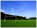
| 06/26/2003 11:41:06 AM | Playing Fieldsby KonadorComment: Greetings From the Critique Club:
I had a full critique done on your picture yesterday, but my internet service decided to hiccup right before I was about to send it, so I lost everything. I hope that I can re-create what I wrote.
Challenge: With the goal posts off to the left of your picture, you have definately met the challenge.
Composition: This picture does have a simple subject. I like how the park disappears into the background into the trees and then you see the hills beyond. The sky is absolutely beautiful with the wispy clouds. The front goal post kind of bothers me a little. It looks like it is leaning inward. I don't know if this is caused by the angle at which the picture is taken or it was actually leaning inward. In any case, not a big deal. I wonder what it would look like if you were to take the picture closer to the first post. Just an idea.
Technical: I would say that this picture is technically sound and would not change a thing. Quality is crisp, clean and well focused. The lighting may be a little dark, but I'm using the computer at work and I don't think the monitors are well calibrated. If I remember right, you picture looked fine on my monitor at home. The brilliant colors are what makes this picture. I was looking back at some of your other pictures from earlier challenges and you always seem to be able to bring out excellent color. I am impressed.
Overall: A well done simple photo that I feel was scored appropriately. I was in the hospital during the voting phase of this challenge, so this is the first time that I'm seeing most of these photos. I would have voted this a 7. The simplicity of this photo lacks the "WOW" factor that would posess me to vote it any higher. I am, however, impressed with the quality of your work. So, keep up the good work and I'm looking forward to seeing what you come out with in furture challenges.
Hope you find this helpful,
Connie
CLarson557 | | Photographer found comment helpful. |
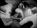
| 06/25/2003 11:49:48 PM | The Good Doctorby grigrigirlComment: Oh yuck! Makes my mouth hurt seeing this. Nicely done, though, and very much meets the challenge. Might be just a little on the dark side. In doing such precise work, I would think more light would be needed. | | Photographer found comment helpful. |
|
Showing 2001 - 2010 of ~2566 |
Home -
Challenges -
Community -
League -
Photos -
Cameras -
Lenses -
Learn -
Help -
Terms of Use -
Privacy -
Top ^
DPChallenge, and website content and design, Copyright © 2001-2026 Challenging Technologies, LLC.
All digital photo copyrights belong to the photographers and may not be used without permission.
Current Server Time: 07/21/2026 09:24:47 PM EDT.
|