| Image |
Comment |
| 05/09/2003 06:05:20 PM |
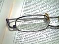
Eye-glassby robsmithComment: i like the set up, i wish there was more of a focus contrast between the text viewed through the lense and the text outside of the lense. |
| 05/09/2003 06:04:04 PM |
|
 Photographer found comment helpful. Photographer found comment helpful. |
| 05/09/2003 06:03:19 PM |
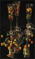
Candy Glassby bruster54Comment: interesting setup, but i think it falls short of its potential. a couple of thoughts: i'm not sure why you felt you needed the mirror on the bottom, but in using one i would have taken a large mirror so the edges were not visible in the photo, and it looks a bit dark, i assume because you wanted to avoid reflections from the light source, but if you had boosted the saturation a bit the m&ms would have come out a bit stronger. |
| 05/09/2003 05:52:28 PM |
The Logby tyrkinnComment: interesting subject, nice focus. i wonder what other angles would have looked like (that's not a nit, its just a unique object that looks like it has many possibilities). if you could have made the black background 'disapear' completely the photo would maybe had more zing to it. |
| Photographer found comment helpful. |
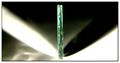
| 05/07/2003 01:55:11 PM |
Got Till It's Gone by arnitComment: wow. awesome photo. hope you didn't have too many takes for this one. please make more mistakes next time so i will find something constructive to say ;-) oh yeah, maybe if you boosted the saturation a bit the red would have come out a little brighter which against the strong white exposure might have given the photo a little more zing. |
| Photographer found comment helpful. |
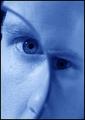
| 05/07/2003 01:51:30 PM |
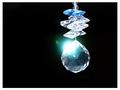
Magnifying Picassoby kosmikkreeperComment: cool idea and well done. the blue lighting was also a cool choice. must have been a pain to focus through the glass, but the outcome is great. |
| Photographer found comment helpful. |
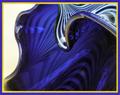
| 05/07/2003 01:50:29 PM |
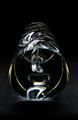
Abstract Art Glassby GallatinComment: neat. nice lighting, focus and composition. where the lower left edge looks like it melts into the gold border that can distract the eye, but that's just a small nit. |
| Photographer found comment helpful. |
| 05/07/2003 01:48:18 PM |
Shadow and Lightby K-RobComment: and symmetry. neat idea and well done. i don't know of you could have done anything about the additional light/shadow spots on the lower left side, but that would be the only nit i could find. |
| Photographer found comment helpful. |
| 05/07/2003 01:46:38 PM |
Glass necklaceby ParentxComment: these look like jetson apartment buildings. i like the reflection against the window panes. i probably would have boosted the saturation a bit to make the colors sizzle a little more. |
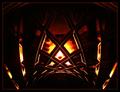
| 05/07/2003 01:45:21 PM |
Infernoby mariomelComment: very dark and abstract, which isn't a bad thing, although its hard for me to identify what the glass object is. |
Home -
Challenges -
Community -
League -
Photos -
Cameras -
Lenses -
Learn -
Help -
Terms of Use -
Privacy -
Top ^
DPChallenge, and website content and design, Copyright © 2001-2026 Challenging Technologies, LLC.
All digital photo copyrights belong to the photographers and may not be used without permission.
Current Server Time: 07/17/2026 02:32:08 AM EDT.