| Image |
Comment |
| 01/20/2003 02:30:41 PM |
|
 Photographer found comment helpful. Photographer found comment helpful. |
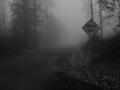
| 01/20/2003 02:28:48 PM |
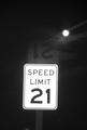
Broken Lawsby DJLubaComment: was this taken through a window (and therefore the reflection of the sign above it). its a strange sign - speed limit 21, but unfortunately the technical weaknesses of the photo detract from the subject. |
| Photographer found comment helpful. |
| 01/20/2003 02:27:17 PM |
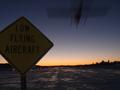
Low Flight at Nightby av8orboyComment: i think if you had used your flash to light the sign the photo would have come out a little better - or used a tripod to take a longer exposure and had the plane lights streaming through the picture while at the same time being able to get some more exposure on the sign, again, lightening it up. |
| 01/20/2003 02:25:34 PM |
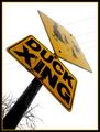
Duck Crossingby Wheeler1992Comment: i think the deceased stuffed duck (or whatever it is) detracts a lot from the photo - makes it perhaps too 'campy'. also i think taking the photo from another angle would have helped as well as the building in the background doesn't do much for the photo while perhaps more of the street would have highlighted a little more the 'xing' aspect of the sign. |
| Photographer found comment helpful. |
| 01/20/2003 02:20:37 PM |
Through a Kids Eyes.by vtruanComment: sorry - i didn't find this a compelling photo. the title helps make it work (although the title might work better with a photo taken of a real sign from a low POV), and i'm having problems saying why i don't like it - the quality is fine, there is a sign in the picture, and on an originality scale it is okay. maybe its because signs tend to be part of outdoor environments and you expect space and scale, and this portrays the opposite of that. also your sign is just sitting there - there is not context/purpose to it in your composition. |
| Photographer found comment helpful. |
| 01/20/2003 02:13:57 PM |
Breaking the rulesby zadoreComment: very nice. many of the sign photos come out with the sign darker than the background. you did a great job of having the sign stand out and still constructing a dramatic composition. would increased saturation have brought out the blue a little more? |
| Photographer found comment helpful. |
| 01/20/2003 02:12:28 PM |
Last Stop in Lifeby GordonComment: great effect! how did you do that? if you had increased the saturation would the red have come out a bit stronger (or maybe have used your flash to fill it out) - or would that have screwed up the effect? |
| 01/20/2003 02:11:04 PM |
forty-fiveby johnny_justjohnnyComment: its great how the clouds and sky reflect off the sign, but i feel the sign was pictured at perhaps too sharp of an angle. that said, excellent shot. |
| Photographer found comment helpful. |
| 01/20/2003 02:09:55 PM |
Onward by AlecComment: reminds me of my current love life ;-)
one of my highest ratings this week. good combination of subject and ambiance. |
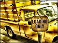
| 01/20/2003 02:07:56 PM |
Loading Onlyby GotchaComment: i love the color in this photo. great shot. one of my highest votes this week. |
| Photographer found comment helpful. |
Home -
Challenges -
Community -
League -
Photos -
Cameras -
Lenses -
Learn -
Help -
Terms of Use -
Privacy -
Top ^
DPChallenge, and website content and design, Copyright © 2001-2026 Challenging Technologies, LLC.
All digital photo copyrights belong to the photographers and may not be used without permission.
Current Server Time: 07/16/2026 02:14:47 PM EDT.