|
|
|
Showing 691 - 700 of ~1251 |
| Image |
Comment |
| 12/08/2006 03:11:56 PM | Aging Gracefullyby Dr.ConfuserComment: Hey there from the Critique Club
Camera Work/Technical: Terrific focus and perfect white balance to provide a very warm feeling to the capture. I do like your depth of field choice that provide the bokeh feel that emayner mentioned.
Lighting: Pretty nice work with very harsh lighting conditions. My only issue with the lighting is the harsh shadow on the left leaf, as well as the part of the branch. This creates a dark hole that distracts the eye, thus trapping it into one area of the image.
Composition/Content: Your chosen composition is just a bit tight. The leaf touching touching the bottom of the frame creates a feeling of tension that contradicts the overall warmth of the image.
My Opinion: I like it, and I think that the scoring was appropriate. While it is diagonal, I don't think that it captured the spirit of the challenge (nor did my sub-5 entry). If this were a bokeh challenge, I think the score would have peaked a bit closer to 6.
Eric
|  Photographer found comment helpful. Photographer found comment helpful. |
| 11/21/2006 08:17:49 AM | Empty Sundayby rexComment: Very nice, and a pretty nice score to match. Congrats, bro.
E | | Photographer found comment helpful. |
| 11/20/2006 01:32:51 AM | | | Photographer found comment helpful. |
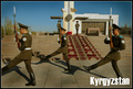
| 11/20/2006 01:31:47 AM | Kyrgyz Strengthby srichmondComment: Great subject and idea, but the missing foot from the front soldier hurts this one. It leads the viewer's eye right out of the frame. | | Photographer found comment helpful. |
| 11/20/2006 01:30:24 AM | | | Photographer found comment helpful. |
| 11/20/2006 01:29:28 AM | | | Photographer found comment helpful. |
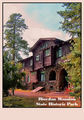
| 11/20/2006 01:28:24 AM | Riordan Mansion State Historic Parkby elizadebComment: I see some color banding in the clouds, almost as if this one is over saturated. I do like the subject and composition, but it looks like your post-processing detracts from the end product. | | Photographer found comment helpful. |
| 11/20/2006 01:28:20 AM | |
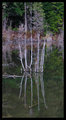
| 11/19/2006 07:09:08 AM | reflectby optionComment: I actually like the vertical composition here, as it works well to draw the eye up and down and up again over your subject. The capture is a bit flat, but that is easily remedied with a curves adjustment layer is PS. I see in your profile that you are fairly new to PP. Using a curves adjustment layer is one of my favorite tools, and I believe that it still withholds the purity of the image. To add one, Layer-->New Adjustment Layer-->Curves. Play around with the adjustments, but an S shaped curve usually works nicely for most images. Here is a small screen shot of what I think it needs...

Outside of that, your background is a bit too busy. Using a more shallow depth of field may help isolate the subject by blurring the background, but you have already shot at f/3.5, and I am not sure how much more your aperture opens up. Perhaps a different angle of view would also help. The best tip I have ever gotten for shooting was to be aware of everything in your frame. Is there something distracting in the BG, is there a big, blue line running through some one's head, etc, etc. I think if you got up a bit higher, thus taking the busy trees out of the image, this one would have been much nicer. Also, while I am not at all a stickler for the 'rules' of photography, using the rule of thirds and getting this one a bit off centered would have also added greatly to the composition strength.
Sorry for the novel, but hopefully is helps some. I like you r work from the Canadian back country, and I hope to see a great deal more. I think I'd enjoy a nice helicopter ride to work every morning. It'd sure beat the hell out of Atlanta traffic jams.
Blue Skies,
Eric | | Photographer found comment helpful. |
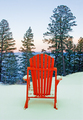
| 11/14/2006 05:11:43 AM | Hope for summerby mtnphotogComment: Hey there from the Critique Club
First of all, welcome to DPC. I see that this is your second challenge since October. I think you'll find that this is a great learning experience, as well as some really unnecessary headaches at times. Still, the good far outweighs the other in our large, dysfunctional family.
Camera Work/Technical: Three rules to keep in mind when entering challenges here...SIZE, SIZE, SIZE. I kindly point you to this tutorial to help remedy the sizing issue. This is better than the 4.95 that is scored, but voters here really hammer small images. Your focus is crisp and the colors are nicely vibrant. I would like to see the snow a bit more white. Perhaps shooting with the direct sun or flash WB would help.
Lighting: Great lighting! The chair really pops with the time of day and/or fill flash you chose here. You captured a very nice sky in the distant and managed to expose the chair very nicely as well. Very nice.
Composition/Content: I think your score would have also benefited from loosening the composition a bit (zooming out), as well as taking the main focus out of the center. While I am not a big stickler to the 'rules' of photography, I think this one would flow much better and draw more interest using the rule of thirds.
My Opinion: As-is, this is about the score I would expect this image to pull. Submitting this one at the max-allowed size, as well as composing it a bit different would have boosted the score a good deal. Welcome again, and keep shooting and tossing your captures into the mix. That is how we all keep growing.
Eric Message edited by author 2006-12-30 00:56:41. |
|
Showing 691 - 700 of ~1251 |
Home -
Challenges -
Community -
League -
Photos -
Cameras -
Lenses -
Learn -
Help -
Terms of Use -
Privacy -
Top ^
DPChallenge, and website content and design, Copyright © 2001-2026 Challenging Technologies, LLC.
All digital photo copyrights belong to the photographers and may not be used without permission.
Current Server Time: 06/17/2026 04:17:09 AM EDT.
|