| Image |
Comment |
| 08/01/2005 02:10:31 AM |
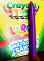
Red and Blueby severinComment: I think you have given yourself up (or maybe because I actually read the posts!) You have remember that not everyone reads the titles and it took me a full 5 seconds to get this one. ...although once I did I thought how clever! ok- so techincally I would have upped the saturation on the crayola box- you seem to have some glare off it. I am giving you a 7 for the idea and a +1 for those who don't read the titles! :0) |
 Photographer found comment helpful. Photographer found comment helpful. |
| 08/01/2005 02:03:46 AM |
|
| Photographer found comment helpful. |
| 08/01/2005 01:49:58 AM |
|
| 08/01/2005 01:48:30 AM |
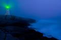
Piercing the Fogby BeagleboyComment: I don't know if that light is natural or not but it sure looks overdone to me! wow how do I judge? well, I guess wether it's natural or not I don't really like the effect and if it was natural I would have toned it down some. Ok- so, if not for the light a 9 or 10 but for now an 8. Such a superb image other than that!!! when I scroll down (so as to 'crop') it's just enchanting! |
| Photographer found comment helpful. |
| 08/01/2005 01:43:30 AM |
The Depotby rayg544Comment: ohhh I like it- did you tone this or is it natural? eerie |
| Photographer found comment helpful. |
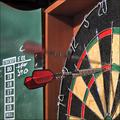
| 08/01/2005 01:42:19 AM |
ONE hundred and EIGHTYby burtctComment: a little bit of purple fringing I would have desaturarted on the metal- I had this idea but couldn't fathom how to pull it off! |
| Photographer found comment helpful. |
| 08/01/2005 01:40:36 AM |
|
| Photographer found comment helpful. |
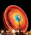
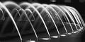
| 08/01/2005 01:40:32 AM |
Spout it outby jmleliiComment: I can see why the crop is how it is, but I would suggest cropping even further- just to the right of the middle poster and then you could crop out the others as well. Also the posters make me realize that the image is not level. I wonder if you could have gotten away with cloning them out without a DQ? Other than the posters a gorgeous image. perhaps you could have shot from higher up? Also there is a distracting element between the first spouts from the left that could have been cloned out... a 6, may bump up later |
| Photographer found comment helpful. |
| 07/31/2005 11:59:01 PM |
Pepper Sunlightby oOWonderBreadOoComment: From a thread- just want to keep it w/ the image...
The image is, first of all, not NEARLY as textural as you'd want it to be for this topic. It's luminous, but it doesn't really say "texture" to me. Compositionally, it's divided vertically into an in-focus and an our-of-focus section more or less precisely on the vertical bisector of the image; that's a very static composition. Fully half your image is out of focus, but it's unfortunately rendering the same VALUE as the in-focus part (the leaves are lit the same), so it looks vaguely like sloppy work.
Try making a selection of the in-focus leaf, invert the selection, and use levels to tone down everything but that leaf; I bet you'll find that a distinct improvement. I realize that wouldn't have been legal in this challenge, btw, but try it and watch what happens.
Finally, the way the left arc of the subject leaf is truncated by the left edge of the image doesn't feel right to me, especially inasmuch as there's (as I mentioned) fully half the image out of focus on the right, an area that could easily have been eliminated to osme degree by panning the camera left on the subject leaf, so the ratio was more like 2/3, 1/3.
|
| 07/27/2005 11:51:27 PM |
|
| Photographer found comment helpful. |
Home -
Challenges -
Community -
League -
Photos -
Cameras -
Lenses -
Learn -
Help -
Terms of Use -
Privacy -
Top ^
DPChallenge, and website content and design, Copyright © 2001-2026 Challenging Technologies, LLC.
All digital photo copyrights belong to the photographers and may not be used without permission.
Current Server Time: 07/22/2026 08:59:14 AM EDT.