| Image |
Comment |
| 01/04/2006 11:29:03 PM |
Meridian - 5 Weeksby just-marriedComment: This is adorable- I just have to say that I see a line all around the baby's head. To get rid of it might I suggest (hope you use photoshop...) selective color. Increase the black channel in black by 4 or 5. Or possibly you could burn where it seems to get grey. You must have had her head proped up on something? It is sooo cute besides that :0)
edit to say... play with selective color- it is fun! :0P Message edited by author 2006-01-04 23:29:39. |
 Photographer found comment helpful. Photographer found comment helpful. |
| 01/04/2006 11:05:33 PM |
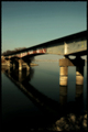
AtTheWaterby edwalk74Comment: **Critique Club**
Well, overall I find this photo very appealing.
I love the colors. I do like the gothic glow (I’m assuming you used?) very much. It gives the saturation the boost I always like to see with the deep dark blacks. From this action you unfortunately have some rippling effect of the blues in the sky. (I’m not sure if there’s a technical term???)
The contrast in my opinion is excellent- like I said I do like to see the dark black tones. The focus is spot on. I believe someone mentioned it being off but they may not be aware of the soft focus effect the glow gives off. Soft focus does not mean out of focus! I can clearly see sharpness from the lettering on the bridge down to the rocks in the water.
The real problem with the image I feel is the composition. The bridge cuts right through the center of the photo leaving us with nothing going on up top except negative space. You would have benefited from possibly shooting at a lower angle because you certainly wouldn’t want to crop from the left right or bottom. The top of the frame is the only down point.
Good luck with your future challenges! |
| 01/01/2006 09:20:24 PM |
|
| Photographer found comment helpful. |
| 12/23/2005 05:57:36 PM |
|
| Photographer found comment helpful. |
| 12/20/2005 01:26:50 PM |
|
| Photographer found comment helpful. |
| 12/19/2005 01:19:58 AM |
Inner Sanctumby RikkiComment: well- I think it needs more compositionally. it's such an indspiring background but the candles cover them up. they need to add, not diminish. I think if you had them set up below the stained glass it might have worked better for ya. well- no zeros! hey I always seem to have a few of those!!! I like the idea a lot :0) |
| Photographer found comment helpful. |
| 12/19/2005 01:11:39 AM |
|
| Photographer found comment helpful. |
| 12/19/2005 12:23:46 AM |
|
| Photographer found comment helpful. |
| 12/17/2005 05:28:14 PM |
spoon the appleby permapierComment: **Critique Club**
Interesting photo!
Well, let’s start off with some of the comments already left. The lighting is very harsh here. It is generally not good to have “hot spots” or blown out highlights. Sometimes done by the sun or exposing improperly- the one on your apple was created by your flash. Try diffusing the light; bounce it or if all you have is an on board flash try rubber banding a broken off plastic spoon just in front of the flash.
The focus does seem off. It is sharp at the knife and not on the spoon. A larger depth of field would help with this problem.
Your background is distracting in my opinion. You might have gone with all blue or black but the way it changes right behind your subject is not ideal.
Another problem I had was with distinguishing the knife. It looked like the countertop was distorted and I had to look closely to figure out what it was.
Your colors are magnificent! The contrast looks great and your idea was very creative.
Good luck with your future challenges!
|
| 12/12/2005 12:32:56 AM |
Time For The Holidaysby hokieComment: you could have lost the whole top of this image & cropped it to horizontal. The background is kinda distracting. nice clean image other than that tho... |
Home -
Challenges -
Community -
League -
Photos -
Cameras -
Lenses -
Learn -
Help -
Terms of Use -
Privacy -
Top ^
DPChallenge, and website content and design, Copyright © 2001-2026 Challenging Technologies, LLC.
All digital photo copyrights belong to the photographers and may not be used without permission.
Current Server Time: 07/23/2026 08:21:21 AM EDT.