| Image |
Comment |
| 12/21/2005 01:51:26 PM |
|
 Photographer found comment helpful. Photographer found comment helpful. |
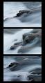
| 11/15/2005 08:41:52 PM |
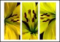
Liliesby gemeitComment: The only thing that kept this from being a 10 is that the lighting (exposure?) is off on the left panel as compared to the other two panels. Otherwise this is an excellent grouping of beautiful shots. |
| 11/15/2005 08:38:23 PM |
|
| Photographer found comment helpful. |
| 11/14/2005 04:31:53 PM |
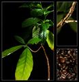
Pineconesby ElaineComment: Colors seem a little flat, but otherwise good job. |
| Photographer found comment helpful. |
| 11/14/2005 04:31:09 PM |
Foundation of the Starbuck's Empireby medoComment: This is the kind of picture I would expect to see in a high-dollar advertising campaign (and that's a good thing!). Beautiful lighting, interesting layout choice, gorgeous color. |
| Photographer found comment helpful. |
| 11/14/2005 04:28:17 PM |
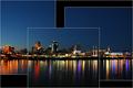
Cincinnati at Duskby jpetersComment: Love the arrangement of the panels - gives the overall picture a depth it might not have otherwise. |
| Photographer found comment helpful. |
| 11/14/2005 04:27:01 PM |
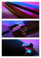
Split Bladeby DCThiessenComment: Interesting subject treatment and lighting. Could perhaps benefit from a different color border? |
| Photographer found comment helpful. |
| 11/14/2005 04:25:52 PM |
|
| Photographer found comment helpful. |
| 11/14/2005 04:22:37 PM |
No Titleby kyeboshComment: Only complaint I have is that the book is blocking the subject's face in the two end shots. |
| Photographer found comment helpful. |
| 10/19/2005 12:48:03 PM |
|
Home -
Challenges -
Community -
League -
Photos -
Cameras -
Lenses -
Learn -
Help -
Terms of Use -
Privacy -
Top ^
DPChallenge, and website content and design, Copyright © 2001-2026 Challenging Technologies, LLC.
All digital photo copyrights belong to the photographers and may not be used without permission.
Current Server Time: 06/11/2026 05:40:35 PM EDT.