| Image |
Comment |
| 02/22/2006 08:43:23 PM |
|
 Photographer found comment helpful. Photographer found comment helpful. |
| 02/22/2006 08:42:03 PM |
THE MODELby POLOComment: It seems odd to me that her face is in such soft focus while the walls to either side of her are so crisp. Also, the crop is a little too tight for me - she seems to be uncomfortable. |
| 02/22/2006 08:40:56 PM |
Tres Chic (Soi le Portrait)by kteachComment: Don't care for the reddish cast to the pic. The lighting is very harsh and not at all flattering. Not sure I can really see a connection to 'fashion'. It's an ok prtrait, but I just can't quite make the connection to the challenge. |
| Photographer found comment helpful. |
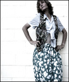
| 02/22/2006 08:39:16 PM |
New Fashion Trendby Nikolai1024Comment: Cute and unusual picture, but I'm not sure that simply calling it a new fashion trend makse it one, nor does it make the picture fit the challenge. As far as the picture itself goes, it's cropped too tight on the left, the background is very busy and distracting, and this has a look of a spur-of-the-moment snapshot. |
| Photographer found comment helpful. |
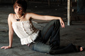
| 02/22/2006 08:37:25 PM |
Warehouseby fadedbeautyComment: This is a pretty good shot. My only complaint is that the crop at the top of the pic is waayyy too tight. |
| Photographer found comment helpful. |
| 02/22/2006 08:36:08 PM |
waningby thegrandwazooComment: An 80's challenge outtake, perhaps? :) Love the lighting and colors on this. The expression is very jaded, though. not sure if it bothers me or not... |
| Photographer found comment helpful. |
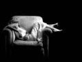
| 02/22/2006 08:33:50 PM |
relaxingby renefunkComment: I love this - except for the background. She seems to be hovering in nothingness, like she was hanging in the void of space... I would far rather see her with a background...the front porch of a small farmhouse...in a large living room with a fireplace... in front of a window with a view, perhaps. Otherwise, this is a beautiful shot. The lighting is really great, her pose seems natural and comfortable, I like the B&W treatment. It's just the lack of a background (or perhaps it's a lack of context) is off-putting to me. |
| Photographer found comment helpful. |
| 02/22/2006 08:30:28 PM |
Red Gloss..by CantaloopComment: I like everything about this picture except for the hand placement. It looks as though she's trying to hold a wig on her head in a high wind! Having the hand placed more toward the back of her head would alleviate this look a bit. |
| Photographer found comment helpful. |
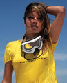
| 02/22/2006 08:28:58 PM |
Utopiaby freebsComment: Nice crisp colors, good skin tones, good pose. Would be nice to see more of her face and eyes. Perhaps a shot taken earlier or later in the day would allow for a softer light where she didn't have to squint? |
| 02/22/2006 08:27:28 PM |
Black & Whiteby DrKDBComment: Your whites seem overly bright, and there appears to be a little bleeding from the white shirt onto the black background. The pose isn't really flattering, and he looks really bored. |
| Photographer found comment helpful. |
Home -
Challenges -
Community -
League -
Photos -
Cameras -
Lenses -
Learn -
Help -
Terms of Use -
Privacy -
Top ^
DPChallenge, and website content and design, Copyright © 2001-2026 Challenging Technologies, LLC.
All digital photo copyrights belong to the photographers and may not be used without permission.
Current Server Time: 06/11/2026 02:21:08 PM EDT.