|
|
|
Showing 201 - 210 of ~1042 |
| Image |
Comment |
| 05/17/2006 05:35:42 PM | Fading flowersby tcyahathComment: To explain the low score: I fail to see the lens cap - DNMC. The photo is very blurry (although the title suggests this is intentional). The photo is very small - there are tutorials on the site that explain resizing. There does not seem to be any particular subject to this photo other than the blurriness itself.
Not trying to be mean, just explaining the vote. |
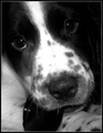
| 05/17/2006 05:32:04 PM | Guilty Pleasure.by buzzrockComment: The expression on the pup's face is absolutely, 100% perfect for this shot. Great capture. |  Photographer found comment helpful. Photographer found comment helpful. |
| 05/10/2006 04:45:28 PM | odyssey-b@w-2.jpgby Jaded_HousewifeComment: I like the pose here. It's very introspective for one so young, and it gives her almost a 'not here' feel - like she's in her own little world and having fun with it.
What I can see that could possibly use some improvement would be that her dress is almost overexposed, yet her face is very underexposed, which makes it hard to see clearly. The dress is so bright that it is trying to become the 'focus' of the shot. Perhaps shooting when the light is not so harsh (or carrying a large diffuser or pop-up shade with you) would help with the differences in exposure, or try to photograph her when she is wearing clothing that more closely matches her skin tones.
I know this is a 'spur-of-the-moment' capture (kids can be sooo difficult to work with! :) I know - I have a couple of my own.), so I completely understand that you have to work with what you have. | | Photographer found comment helpful. |
| 05/08/2006 02:57:44 PM | | | Photographer found comment helpful. |
| 05/03/2006 09:33:00 AM | | | Photographer found comment helpful. |
| 04/17/2006 03:23:31 PM | The One of my Dreamsby KivetComment: I can see that the processing is intentional, and that you're going for a particualr 'look' with this, but I think you may have overdone it just a bit. I like seeing the texture in her hair and lips, and I would like to see just a bit more of it in her skin (as well as just a hair more color and less 'glow'). I like the pose and the expression, it's just a bit overdone in the processing. | | Photographer found comment helpful. |
| 04/17/2006 03:19:58 PM | Simple lookby TOYComment: I think that what I find odd about this photo is the focus. To be a little more accurate, it's the focus combined with the pose. The forehead, hairline, eyes and nose are crisp and well-defined, yet the mouth and jawline are not. There does not appear to be enough change in 'depth' in the pose to cause this (the head does not seemed to be tilted down enough to cause this), so it appears to be a result of post-processing. It may indeed have been done in camera (and thus be an optical illusion), but it throws off the 'feel' of the photo for me - it just feels inconsistent.
Other than the focus issues, though, it's quite a good shot. The pose and composition are quite good, and the skin tones are very good. I also like that the eyes look natural. The choice of background color is unusual (to me) for a male subject, but it works quite nicely. | | Photographer found comment helpful. |
| 04/17/2006 01:00:54 PM | self portaitby alpharichComment: A few suggestions for your next self-portrait: Try a softer colored background - gray or a soft green - since the stark white of this one is overpowering. The shadows thrown by the light on the background are very sharp, but the focus on your face seems soft. This seems to indicate one of two things to me: either your focus was on the background rather than your face, or you've had to do extensive editing to compensate for overexposure/harsh lighting. (Or perhaps edited the background to white and not yourself?) In any case, I would suggest a couple of things. Firstly, try to position yourself far enough away from the background that you do not htrow an obvious shadow. Secondly, make sure your pic is correctly exposed and properly focused. For self-portraits, this can take lots and lots of pics to do - trust me, I know.
Another suggestion I would give you is on your pose. Instead of leaning back and lifting your head, try leaning forward just a bit and lowering your chin slightly, which will make you look up just a bit to look into the lens. This will have a slendering effect on your neckline and make your jaw appear 'stronger'. You might also try facing the camera more directly instead of from an angle.
The skin tones in this are good, but perhaps a shave next time? (personal preference for me - either clean shaven or beard but not in between so it's not a scoring issue).
Not trying to be mean or picky, just offering some tips. Hope some of it helps. | | Photographer found comment helpful. |
| 04/17/2006 12:51:15 PM | "Amanda'by tfarrell23Comment: There appear to be some serious color issues on this. (I say 'appear to be' since it may have been intentional - if it was intentional, I don't think it 'worked'.) Her skin color is way off. Even if she was sunburned, the color is still off. Also, the whites of her eyes are blue. I find this odd since the background is gray shading to white, which leads me to wonder if the eye color wasn't a result of trying to compensate for tooth color or for overdone redness in the skin or for bloodshot eyes...
At any rate, in the future, one of the best ways I have found to correct skin tone without throwing off the color of the skin (ie, adding too much red), is to copy your background layer and convert the copied layer to black and white (I usually use 'desaturate'). You can then adjust the opacity of the b&w layer using the slider until you get a more normal looking skin tone. This helps to correct skin that is too red or too yellow, and I've found that it also helps to correct bloodshot eyes and yellowish teeth without going overboard.
I'd also recommend (if the colors were not done deliberately) that you either have your monitor calibrated or if you work on a flat screen monitor to check your editing on a CRT monitor as flat screens can sometimes distort colors and contrast.
There are some good points to the photo. Her smile is wonderful, the pose is natural, the lighting seems good, and the focus is good. Just need to work on the color. | | Photographer found comment helpful. |
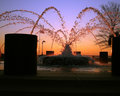
| 04/05/2006 08:13:49 PM | Fire and Waterby LeeDComment: Oooh! I can see why you're kicking yourself for not entering this one. THis is beautiful! | | Photographer found comment helpful. |
|
Showing 201 - 210 of ~1042 |
Home -
Challenges -
Community -
League -
Photos -
Cameras -
Lenses -
Learn -
Help -
Terms of Use -
Privacy -
Top ^
DPChallenge, and website content and design, Copyright © 2001-2026 Challenging Technologies, LLC.
All digital photo copyrights belong to the photographers and may not be used without permission.
Current Server Time: 06/10/2026 11:40:06 PM EDT.
|