| Image |
Comment |
| 11/01/2005 07:25:48 AM |
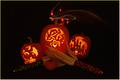
Jackby MudHutComment: Loved the swirling light. Very well executed. You took a simple carving and created an awesome image by surrounding it with interesting compositional items. Nice job. |
 Photographer found comment helpful. Photographer found comment helpful. |
| 11/01/2005 07:20:26 AM |
Into The Orange Lightby xlr8tnComment: Like the abstract nature of this one. Needed to reduce the noise, though. It realy is strong around the candle and the edges of the black. |
| 11/01/2005 07:18:51 AM |
Trick or Treatby rwouthuisComment: Traditional to the max. Loved the use of the candy in this one. Very good image for Halloween and composition is perfect. A little too much noise, though in the lit up faces. |
| Photographer found comment helpful. |
| 11/01/2005 07:16:43 AM |
HOWEEEEEN!by NaldComment: Carving is extradinary and intricate. The lighting doesn't seem to be creating enough impact, though. I also thought the corn didn't do much to enhance the pumpkins. |
| Photographer found comment helpful. |
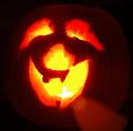
| 11/01/2005 07:14:34 AM |
|
| Photographer found comment helpful. |
| 11/01/2005 07:11:47 AM |
Burn Faceby m--EComment: Really the most that is gross in this challenge. I think the flame on the right didn't get depicted as well as it could. Not sure how to get it looking more like a flame. I am still trying to figure that one out successfully. |
| Photographer found comment helpful. |
| 11/01/2005 07:09:35 AM |
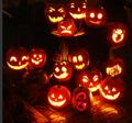
Family Reunion October 2005 by pinotkenComment: Loved the placement of the pumpkins on this one. Looks random, even though it wasn't. Great job on lighting too. Loved your title. |
| Photographer found comment helpful. |
| 11/01/2005 07:08:21 AM |
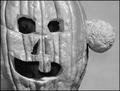
tumor faceby redpandaComment: Really bizarre. Did the pumpkin grow that on the side? Didn't care for the black and white treatment, though. Maybe if you had toned it differently it would have been less flat. |
| Photographer found comment helpful. |
| 11/01/2005 07:06:46 AM |
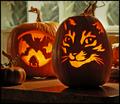
The Bats' Meow by rjksteschComment: Wonderful carving job. I loved the cat. Looks really good. The eyes came out awesome on that one. Lighting is so nice, too. Wonder how it would have looked with a solid background, like rice paper or something with a soft glow from behind. Just a suggestion. |
| Photographer found comment helpful. |
| 11/01/2005 06:59:17 AM |
So happy I could just hurl...by notesinstonesComment: Candle inside is really overexposed. Image is pretty fuzzy too. Maybe a higher shutter speed, or an exposure compensation would have created a more refined image. |
| Photographer found comment helpful. |
Home -
Challenges -
Community -
League -
Photos -
Cameras -
Lenses -
Learn -
Help -
Terms of Use -
Privacy -
Top ^
DPChallenge, and website content and design, Copyright © 2001-2026 Challenging Technologies, LLC.
All digital photo copyrights belong to the photographers and may not be used without permission.
Current Server Time: 07/24/2026 10:20:52 AM EDT.