| Image |
Comment |
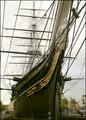
| 11/03/2005 07:33:31 PM |
Busy Riggingby WarbyComment: Reminds me of Mystic Seaport in Connecticut. I love the depth of this one, but I think a bit more cropping might have really brought out the rigging. |
 Photographer found comment helpful. Photographer found comment helpful. |
| 11/03/2005 07:31:39 PM |
busy...yeah rightby 5red99Comment: Very nice. I run a frame shop too. It can definitely be very busy. Anyway, the focus is a little soft on this one, and I think that the dark door frame to the left of the photo is distracting. Perhaps open doors would have made a better composition. |
| Photographer found comment helpful. |
| 11/03/2005 07:29:22 PM |
|
| Photographer found comment helpful. |
| 11/03/2005 07:27:26 PM |
Urban chaosby Bela45Comment: The busiest photo I've seen. Love the composition on this one. It had a bad balance of light and dark, though. Perhaps some fill in flash might have given the foreground a bit more light to balance the hazy background. Still, an excellent photo. |
| Photographer found comment helpful. |
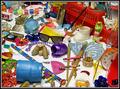
| 11/03/2005 06:31:08 AM |
Find 3 Thimbles...by PrismComment: Loved this one. The interactive title made this one very fun. Thanks for the challenge. |
| Photographer found comment helpful. |
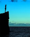
| 11/02/2005 11:37:37 AM |
Contemplationby alfrescoComment: The colors on this one are wonderful. A little more cropping from the top to get rid of the shadow that is there would add to the composition. I'm not sure if I would like it a little brighter, but maybe in the water and sky, which would serve as a great contrast to the silouette. |
| Photographer found comment helpful. |
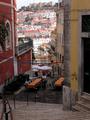
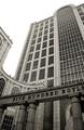
| 11/01/2005 10:02:26 PM |
500 Boylstonby YellowpeepComment: I didn't vote on this challenge, so I have nothing to compare this image to, but it sure looks good to me. Anyway, I have a feeling that one of the reasons it did not do better is because the foreground sign seemed to compress the photo, rather than stay with the wide angle idea. I especially like the curves of the building, and would have liked to see more of the right one as a balance to the left curve. |
| 11/01/2005 09:58:06 PM |
Riverside Benchby tsheetsComment: I looked at this one and Silverside Boat. I think this one is the better of the two. I like the compositional placement of the bench in conjunction with the horizon. The sky is much nicer on this one also. |
| Photographer found comment helpful. |
| 11/01/2005 07:30:52 AM |
|
| 11/01/2005 07:29:53 AM |
Roll Your Ownby TiNComment: Didn't think there was any white on this one. It looks basically yellow. |
Home -
Challenges -
Community -
League -
Photos -
Cameras -
Lenses -
Learn -
Help -
Terms of Use -
Privacy -
Top ^
DPChallenge, and website content and design, Copyright © 2001-2026 Challenging Technologies, LLC.
All digital photo copyrights belong to the photographers and may not be used without permission.
Current Server Time: 07/24/2026 07:34:34 PM EDT.