|
|
|
Showing 2941 - 2950 of ~3900 |
| Image |
Comment |
| 11/16/2005 09:22:31 AM | Dramatic Lightingby dr3amzComment: Nice silouette, but I am afraid the score will be lower than the picture deserves because we were supposed to use artificial light. This is a wonderful shot, love the sky and the light. You did a nice job photographically. |  Photographer found comment helpful. Photographer found comment helpful. |
| 11/16/2005 09:19:26 AM | |
| 11/16/2005 09:18:50 AM | Mystic Reflectionsby jccallowayComment: Really love the colors on this one. I guess it is some sort of a chinese lantern, though not sure. Thought it may have been a little out of focus, though the use of light was very good. | | Photographer found comment helpful. |
| 11/15/2005 09:20:05 PM | Thirsty Kittyby taterbugComment: This photo was so clear and concise. Great detail. I think that the one issue is one you can't do anything about, and that was that weed right in the front of the tiger. It upset the balance of the image so much. Just makes me wish I could yank it out of there. Have you tried to do some paintbrush over the weed with the orange and black from the tiger, to hide it? Not sure if the result would be decent, and you got to feel that it is worth it to spend some time on the picture. Other than that, the exposure was good even though it was a difficult light with the strong dark in the background and the bright white on the rocks in the foreground. Did you use a neutral density filter to balance the highlights and shadows? Nice overall effort. | | Photographer found comment helpful. |
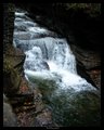
| 11/15/2005 09:12:56 PM | Waterfallby NeuferlandComment: I have been into waterfalls lately, trying my hand at that soft look. You did a nice job of capturing the water with slow shutter. It did seem too dark around the edges, though. Maybe it is my monitor, but I see absolutely no detail around the water at all. On my waterfall images that I put in my portfolio, I did receive a comment that it appeared pixilated, which may only be due to the change to a more compressed size. I see a little of that in this one too. I am not sure how to get past that problem. Overall, I liked the picture and your placement of the waterfall compositionally is very dramatic | | Photographer found comment helpful. |
| 11/15/2005 08:59:34 PM | metalic tapestry.jpgby elee3009Comment: I really love the use of color in this one. I hear the term desaturation alot, but I am not sure what you do to use it. Anyway, the foreground is my favorite part of the photo. I am not a big fan of purple though, but that is my personal taste. I'd like to see this done with some other color combinations. It seems a good subject to really play. If you don't mind, I would like to try and take this one and add a chrome texture to it just to see how it comes out. I have Microsoft Picture It as one of my editing programs, and it has a whole bunch of illusions which I love to use for different looks. Let me know and I will post it on my site for about a week.
| | Photographer found comment helpful. |
| 11/15/2005 07:01:48 AM | On The Road To Nowhereby KitKatComment: You had good leading lines on this one, but the use of shallow depth of field, though a wonderful tool for defined, single subjects did not work for this composition. It needed to be focused from top to bottom to have gotten a better response. Anyway, I was one that gave it a 4 and I think the reasons were focus, too low a contrast, a bit light on saturation, and I found the subject to be unexciting. You do have a good eye for composition, also. That is my strongest point as well, but I am discovering that composition is not something that many voters put much precedence into. I am still searching for the magic, so join the club. Let's keep on comparing our photos for the challenges and see who does best in the future, than we can talk about it. I am marking you as a favorite photographer and we can all be part of the brown nose club.(lol) |
| 11/15/2005 06:55:14 AM | The End of the Paved Roadby p3wizComment: I guess it didn't have enough good features for the voters. I was one of those that gave it a 3. It was mostly because it needed a better exposure, a better focus and I think even the composition could have been done differently. You were trying to use leading line technique to pull the eye into the image, but I'm not sure it was a strong enough attempt. Anyway, these are the kind of shots, even if well exposed and well focused, that score low because most would term it a snapshot. I have had more than my share of low scores to know of what I speak. I have been trying to put more thought into my subject, but I still don't know the magic. I hope you discover it, though not before me. (lol) | | Photographer found comment helpful. |
| 11/15/2005 06:49:48 AM | RAIDDD!!!!!!!!!!by totaldisComment: Sorry for your low score. I gave it a 7. Obviously I am in the minority. I think it was your subject that displeased people most. I would have scored it higher if it was a bit more exposed, but I think it did a good job for the challenge. I hope you do better and don't stop shooting. |
| 11/15/2005 06:47:20 AM | Dead-Endingby meowComment: I was only one of two that gave you an 8. I did not like the subject at all, and the image truly repulsed me, but I have a problem with needles anyway. I thought it definitely depicted the challenge really well. Your detail was exceptional. Of course, I think most people voted low because of the subject, not because it was badly done photographically. My problem too. I get a lot of low scores probably because my subject is not west coast enough. I live in merry New England, and I think my highest scores come from Europeans and Canadians. | | Photographer found comment helpful. |
|
Showing 2941 - 2950 of ~3900 |
Home -
Challenges -
Community -
League -
Photos -
Cameras -
Lenses -
Learn -
Help -
Terms of Use -
Privacy -
Top ^
DPChallenge, and website content and design, Copyright © 2001-2026 Challenging Technologies, LLC.
All digital photo copyrights belong to the photographers and may not be used without permission.
Current Server Time: 07/24/2026 07:47:14 AM EDT.
|