| Image |
Comment |
| 02/23/2006 07:29:18 PM |
Sweet Innocenseby cools98Comment: Beautiful portrait. Looks like a charcoal sketch. I love the artistry on this one, and the tones are gorgeous. 9 |
 Photographer found comment helpful. Photographer found comment helpful. |
| 02/23/2006 07:27:15 PM |
|
| Photographer found comment helpful. |
| 02/23/2006 07:26:40 PM |
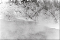
Warm Frostby pointandshootComment: Hey, I took one like this a few months ago. Yours came out worlds better. I know how hard it is to get the bumps on frost. You did a great job on detail, and the lights and darks are well balanced.8 |
| Photographer found comment helpful. |
| 02/23/2006 07:25:21 PM |
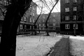
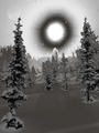
The World Is B&Wby LongComment: Tree in foreground makes the composition too heavy. Also snow detail could have been improved by more dodging of highlights and burning of shadows. Overall a nice attempt at linear composition. 6 |
| Photographer found comment helpful. |
| 02/23/2006 07:23:29 PM |
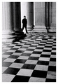
Flooredby e301Comment: Very contrasty. Nice detail on the columns. A little oversharped, though. 8 |
| Photographer found comment helpful. |
| 02/23/2006 07:22:31 PM |
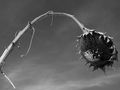
A Final Bowby dizzydean3Comment: Nice contrast on this one. Thought the composition needs some work, maybe less stem. |
| Photographer found comment helpful. |
| 02/23/2006 07:21:39 PM |
untitledby LilhoopComment: Found the tones to be nice, and it is well executed. I just don't like the subject. |
| Photographer found comment helpful. |
| 02/23/2006 07:19:23 PM |
Snow Vortexby deepfrog17Comment: Very strange effect on this one. It looks almost unreal. The extreme smooth foreground adds to the unreal look of the image. I don't know what to vote this one on, but for now I will give it a 7 |
| Photographer found comment helpful. |
| 02/23/2006 07:16:10 PM |
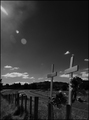
Double Tragedyby banditComment: Too dark and there is a flare in the upper corner. Don't see that it enhanced the image, though you may have left it there for artistic reasons. |
| Photographer found comment helpful. |
| 02/23/2006 07:14:46 PM |
Departure of the Soulby HungaroComment: I am assuming this was a long exposure. I love the detail of the sheet on the right. Looks very ghostly. The title seems to me that the upper image should be more transparent. You may have stayed too long in the upper position. Anyway, that is about the only technicality I see wrong with the image. 8 |
| Photographer found comment helpful. |
Home -
Challenges -
Community -
League -
Photos -
Cameras -
Lenses -
Learn -
Help -
Terms of Use -
Privacy -
Top ^
DPChallenge, and website content and design, Copyright © 2001-2026 Challenging Technologies, LLC.
All digital photo copyrights belong to the photographers and may not be used without permission.
Current Server Time: 07/25/2026 07:53:17 AM EDT.