| Image |
Comment |
| 02/23/2006 08:32:23 PM |
The Early Birdby owenComment: Very nice tones. I love the smooth lines created on this one. Well done. The only thing is that you might have wanted to separate the bird from the ship on the horizon. By placing them in the same line, I think the photo suffered a bit compositionally. |
 Photographer found comment helpful. Photographer found comment helpful. |
| 02/23/2006 08:30:13 PM |
Something old, something newby esmaice87Comment: It is two tones, but I am not scoring high on color photos. I know this one would not have come out very well applying duotone, so you might want to really take a lot of photos to see what works best in black and white. |
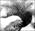
| 02/23/2006 08:28:33 PM |
Evergreenby outlandComment: Great detail on the pine, but it was at the expense of good exposure on the snow. Maybe if you could get a neutral density filter, the highlights would be less blown out. |
| Photographer found comment helpful. |
| 02/23/2006 08:27:05 PM |
lights outby hmairComment: How many bulbs did you have to break to get this one? Great stop action. 9 just because you might have invested in quite a bit to get the bulbs to break. |
| 02/23/2006 08:25:44 PM |
Candlelightby MazkaComment: Detail seems to have disappeared with the duotone treatment. I like the color choice of blue and black, but there is a bit too much brightness in the highlights of the candle holder. Maybe a little less exposure, if you have an exposure adjustment in your camera. Also, if you used long exposure, you might want to have the shutter open less time. |
| Photographer found comment helpful. |
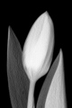
| 02/23/2006 08:20:56 PM |
|
| Photographer found comment helpful. |
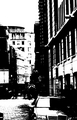
| 02/23/2006 08:19:26 PM |
A Black and White Londonby lucienawComment: I think you might have made it too contrasty. I know it is probably supposed to look like a photocopy, and that is well done, but I think as a photo it would have been better with some midtones. Your compositon is really well done, though. |
| Photographer found comment helpful. |
| 02/23/2006 08:00:16 PM |
|
| Photographer found comment helpful. |
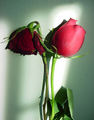
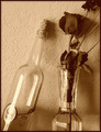
| 02/23/2006 07:33:23 PM |
Thirsty for Loveby TammerComment: Great use of background to make the bottles look transparent. Well composed. For some reason, I did not like the rose on this one. Maybe a different flower would have made the composition more agreeable, but that is my opinion. Others may love the rose. |
| Photographer found comment helpful. |
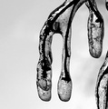
| 02/23/2006 07:30:32 PM |
Iced Branchby headbgoneComment: Great tones, but the ice look is lacking. I am afraid that the tones make it look more like snakes. It is hard to get really good translucence in black and white. |
| Photographer found comment helpful. |
Home -
Challenges -
Community -
League -
Photos -
Cameras -
Lenses -
Learn -
Help -
Terms of Use -
Privacy -
Top ^
DPChallenge, and website content and design, Copyright © 2001-2026 Challenging Technologies, LLC.
All digital photo copyrights belong to the photographers and may not be used without permission.
Current Server Time: 07/25/2026 04:51:16 PM EDT.