| Image |
Comment |
| 02/25/2006 07:01:54 PM |
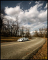
driveweb.jpgby deapeeComment: The curve of the road really leads the eye on this one. I am not a big fan of road shots, but your colors are very nice in this one. Also I like the slight distorion of the car. |
 Photographer found comment helpful. Photographer found comment helpful. |
| 02/25/2006 04:33:37 PM |
|
| Photographer found comment helpful. |
| 02/24/2006 07:47:12 AM |
Drawing the Battle Linesby CzechManComment: Nice use of color to try to make a duotone, but there is too much color. You have white, black, green and purple. The image is really nice and sharp, and it is excellent compositionally. However, for all those others who tried to stick with two tones, I can't score this one higher than a 6 as a courtesy to those who really went out of their way to keep their images within the guidelines. In another challenge though this would be a real contender. |
| Photographer found comment helpful. |
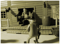
| 02/24/2006 07:44:16 AM |
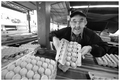
Harry The Egg Manby hotpastaComment: Too much was put into the comp. You need to simplify. Focusing on the egg shapes and Harry would have made a tighter comp. Contrast is good, and the emotive quality of Harry is very endearing. Anyway, the background left in made the image too busy. Still I give it a 7 |
| Photographer found comment helpful. |
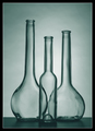
| 02/24/2006 07:40:03 AM |
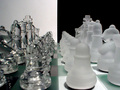
Green Glassby FranziskaLangComment: Very nice still life. I like the way the two background bottles meet in the center of the foreground bottle. Your composition and toning are really done. This image makes me want to try to take one just like it. 10 |
| Photographer found comment helpful. |
| 02/24/2006 07:38:54 AM |
Old Westby gpalosComment: Image is not well focused and the choice of subject is lacking. |
| Photographer found comment helpful. |
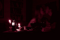
| 02/24/2006 07:38:15 AM |
Valentine's Momentby drisComment: A nice idea. The image is underexposed, though, and the candle flames are blown out. The tone matches the idea, but the overall detail is lacking, as well as too much put in the image. Need to simplify, get better exposure, and focus needs to be better. |
| 02/24/2006 07:31:24 AM |
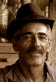
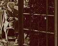
The Gentlemanby phylsy7Comment: Reminds me of a classic Hemingway portrait. REally nicely done. Like the leading lines of the trellis. 8 |
| 02/24/2006 07:28:37 AM |
Pow Pow at Ten Fiveby tph1Comment: I'll bet this looks really stunning in color. Person is really underexposed. Frankly, the composition was very strong, but the person took away from the undulating landscape and the subtle tones in the background. |
| Photographer found comment helpful. |
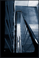
| 02/24/2006 07:25:17 AM |
Aroundby oliharComment: Great geometric. The placement of the rail in the foreground really brings the eye down through the center to the stairs below. Tones are very well done. I think the grain also adds to this composition. |
| Photographer found comment helpful. |
Home -
Challenges -
Community -
League -
Photos -
Cameras -
Lenses -
Learn -
Help -
Terms of Use -
Privacy -
Top ^
DPChallenge, and website content and design, Copyright © 2001-2026 Challenging Technologies, LLC.
All digital photo copyrights belong to the photographers and may not be used without permission.
Current Server Time: 07/26/2026 11:37:10 PM EDT.