| Image |
Comment |
| 04/17/2006 08:25:03 PM |
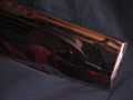
Clawsby Burger_BMXComment: Your dof is way too shallow. There is no part of the image that is really sharp. sometimes just backing up to fill less frame with the fork,then cropping creates just the right amount of dof and focus. |
| 04/17/2006 08:18:18 PM |
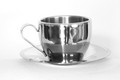
The colors of Chromeby spencewComment: It didn't look chrome enough. It looks more like too glass balls. Anyway, the colors appear to be almost grainy, and the surface of the balls have an almost soapy appearance. Not sure how to clear it up. |
| 04/17/2006 08:16:20 PM |
Reflectionsby SikLitlMunkiComment: Image is way too dark and the focus is also off. Need to also work on composition. This is a learning place, though, so keep refining your photo sense and it will really come alive. |
 Photographer found comment helpful. Photographer found comment helpful. |
| 04/17/2006 08:12:53 PM |
|
| Photographer found comment helpful. |
| 04/17/2006 08:12:14 PM |
Old Bikerby RefreshComment: I actually like this. It looks like it could be a great ad idea for a motorcycle, with the cycle in the background of course. You did a really good exposure on this one. |
| Photographer found comment helpful. |
| 04/17/2006 08:07:50 PM |
Metalic Flowerby LalormComment: The scratches on the image are very distracting. I would imagine the chrome was old and that is why, but overall it doesn't convey to a pleasing image. |
| 04/17/2006 07:43:51 PM |
|
| Photographer found comment helpful. |
| 04/17/2006 07:36:28 PM |
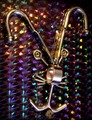
Crazy Chrome Ideaby dube140463Comment: A bit too busy. The background is really pretty, but distracts from the main subject. Still, unique take on the challenge. |
| 04/17/2006 08:03:37 AM |
Chromotestosteroneby BosborneComment: Very good composition. Shows the best properties of chrome. It looks like a ribbon winner. 10 |
| Photographer found comment helpful. |
| 04/17/2006 08:00:07 AM |
|
| Photographer found comment helpful. |
Home -
Challenges -
Community -
League -
Photos -
Cameras -
Lenses -
Learn -
Help -
Terms of Use -
Privacy -
Top ^
DPChallenge, and website content and design, Copyright © 2001-2026 Challenging Technologies, LLC.
All digital photo copyrights belong to the photographers and may not be used without permission.
Current Server Time: 07/26/2026 05:38:35 PM EDT.