| Image |
Comment |
| 04/30/2005 08:55:18 AM |
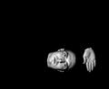
Symbolismby JPRComment: Meets description of challenge.....10
Meets description of Minimalism.....7
Technical.........................................10
Artisctic...........................................7
Average score.................................8 |
 Photographer found comment helpful. Photographer found comment helpful. |
| 04/30/2005 08:41:40 AM |
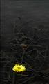
sunlit flowersby debbybrisComment: I think comments like, the image is to small and you should have put a black poster board behind the subject are weak and should be left up to the artist. Big is not better nor is small...but if the artist chooses to small or big it maybe important to him or her. I don't believe in digital photography it is important to stress every detail that can be destracting in many cases...........If you used the black poster as mentioned you would have not come anywhere the effect you were looking for plus you would have need another light source to light the image in front.....I like the small size because it makes the image more personal as if you had a special love for it going out of your own garden.
Barry |
| 04/29/2005 08:10:01 PM |
|
| Photographer found comment helpful. |
| 04/29/2005 08:06:57 PM |
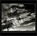
One last ride?by LevTComment: I think the sky distracts from the surfer........if I disregarded the challenge description and if you fix the image by taking out the noise I would give you a 10, but the technical problems have over run the beauty of this image. |
| 04/29/2005 08:04:02 PM |
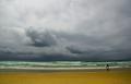
Alone up there.by visual28Comment: Very nice image....................some technical problems with artifacts in the sky and hills. with I could give you a perfect score.............8 |
| 04/29/2005 08:01:43 PM |
|
| 04/29/2005 08:00:37 PM |
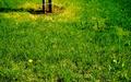
Negative Energyby DustDevilComment: Some technical problems and as far as I'm concerned the photo meets the description of the challenge and the definition of Minimalism. I don't believe all art needs to be perfect in the execution. 10 |
| Photographer found comment helpful. |
| 04/29/2005 07:46:30 PM |
Leaving in the grassby AntoninoComment: Color seems unnatural and combind with the focuse is very hard to look at due to the harshness. Flower in foreground competes with object in background which is interesting because it is unidentifiable.
|
| 04/29/2005 07:43:36 PM |
untitledby amjltComment: I hate scoring this image so low because I like it very much.....Seems to be technical issues concerning sharpness and clarity....I don't know if it is noise or artifacts but I am sure you can fix them up. Nice image though it show sensitivity to the subject and speaks to the viewer....at least me. |
| Photographer found comment helpful. |
| 04/29/2005 07:35:51 PM |
Abstractby redneckbondComment: interesting nude. I think this image would work well if the bottom left corner was the same color as the rest of the print, the white is very distracting. |
Home -
Challenges -
Community -
League -
Photos -
Cameras -
Lenses -
Learn -
Help -
Terms of Use -
Privacy -
Top ^
DPChallenge, and website content and design, Copyright © 2001-2026 Challenging Technologies, LLC.
All digital photo copyrights belong to the photographers and may not be used without permission.
Current Server Time: 07/16/2026 09:07:17 AM EDT.