| Image |
Comment |
| 05/01/2005 09:30:58 AM |
Sea Devilby DanielCzajaComment: I don't like the uneven coloring of the sky to the left. Is this because you did a burn and dodge?????? |
| 05/01/2005 09:28:54 AM |
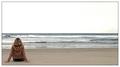
Stranded...by TerramarComment: I don't understand why the woman in the image needs to be so near the edge of the frame? This image is like so many others in this challenge with the exception of the objects used in the photograph. |
| 05/01/2005 09:25:42 AM |
|
| 05/01/2005 09:22:55 AM |
lookby dragonrunComment: Meets challenge description....................10
meets definition of minimalism...................0
Technical...................................................0 image not clear
Artistic.......................................................0 when subject falls out of the frame like this it appears to be a mistake rather than a conscience choice of the artist. The photograph says nothing to me as the viewer.
Score average is a 2.........................but you earn a four because I realize this challenge had problems from the start...... |
| 05/01/2005 09:16:28 AM |
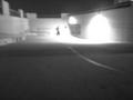
Blindsby JewellianComment: Very minimalist by definition.............................10
Meets challenge description...............................0
Technical.............................................................5 looks as though the images is breaking up in places
Artistic.................................................................6 You made a boring image grand by your framing.....and It speaks about, "Blinds" but what can you really say about "blinds"?
Average score, 5 |
 Photographer found comment helpful. Photographer found comment helpful. |
| 05/01/2005 08:15:48 AM |
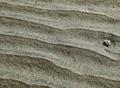
Rippled Sandby EvaanComment: Title says the sand is the most important element of photo. Seeing there is more sand than pebble I think you missed the challenge discriptio.
Meets challenge discription........5
Image meets definition of Minimalism....................10 Right on if you were talking about sand, beach, ocean, and etc.
Technical.............................................................10
Artistic.................................................................9 subjectively speaking I would have framed this a bit differently, but hey.....your the artist....Nice image overall in my opinion..
Average score.............................8 Yes this in a minimalist image.
|
| Photographer found comment helpful. |
| 05/01/2005 07:55:59 AM |
yellow t-shirtby naomikComment: My questions about this image are, Why do you title this image "Yellow Shirt"? Is the shirt the most important element of the image? Is the title you decided on, souly for the purpose of this challenge? If so, why not title the image "Left Shoe"? Or "Sock" The Point I am making is that if you choose a title it should have something to do with the main point of the creation. Here it is obvious that the little girl is more important than what she wears.
Meets challenge Description........10 (I believe the description is more about Isolation than mimimalism)
Meets the definition of Minimalism..10..(the way you framed this images seems to me to gives me more insight about the girl.
Technical..... 8 for the most part I think this image is fine except for some electronic artifacts the can be seen at the base of the wall.
Artistic.....10 The framing of the vents in the wall really add something to this image.
Average score..................9 Nice image needing a little bit of work on technical. Nice job and I hope you are in the running.
|
| Photographer found comment helpful. |
| 04/30/2005 06:17:35 PM |
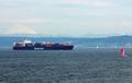
look at the pretty sailboat!by dickwilhelmComment: You should never have to tell the viewer of your photos to look as something by your title. 5 because this rates along with most of the other images in this challenge. |
| 04/30/2005 06:16:13 PM |
Red Eyesby WawaaComment: This image doesn't hold my interest. 5
I scored you average because most of the images in this challenge seem to look about the same except for subjects. Placement in frame is the same. |
| Photographer found comment helpful. |
| 04/30/2005 06:11:27 PM |
Feeling Blue?by lentilComment: After looking at all the different themes with the same subject placement in this challenge I don't think I can rate this higher than a 5. This sort of image does not move me beyond the, "thats pretty" stage. |
Home -
Challenges -
Community -
League -
Photos -
Cameras -
Lenses -
Learn -
Help -
Terms of Use -
Privacy -
Top ^
DPChallenge, and website content and design, Copyright © 2001-2026 Challenging Technologies, LLC.
All digital photo copyrights belong to the photographers and may not be used without permission.
Current Server Time: 07/16/2026 08:14:17 AM EDT.