| Image |
Comment |
| 09/28/2005 02:48:35 AM |
|
 Photographer found comment helpful. Photographer found comment helpful. |
| 09/26/2005 10:13:26 AM |
Get Wellby inspir8tionComment: Great idea, but IMHO the whole thing should be in very sharp focus. |
| Photographer found comment helpful. |
| 09/26/2005 10:12:03 AM |
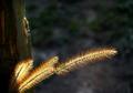
Sympathyby dragonladyComment: Good light on the grass stems, but the shadow at the left kills the composition. |
| Photographer found comment helpful. |
| 09/26/2005 10:10:48 AM |
Happy Birthday (Where's The Party?) by idnicComment: How did you get him to sit still? I'm sorry, but I really don't like the flat white background. I'd have gone for a green lawn, wooden floor, anything but white. |
| Photographer found comment helpful. |
| 09/26/2005 10:09:28 AM |
Invitation for dinnerby RUEDISCHMUTZComment: Nice thought and composition, but I'd have gotten rid of the candle. You can't see the flame and the drip looks messy for such a carefully arranged composition. |
| 09/26/2005 10:07:06 AM |
|
| Photographer found comment helpful. |
| 09/26/2005 10:05:46 AM |
Wish You Were Hereby magnusComment: I think it would have been better without the flags. The beach scene with the kite is fine by itself. |
| Photographer found comment helpful. |
| 09/26/2005 10:04:42 AM |
|
| Photographer found comment helpful. |
| 09/26/2005 10:04:04 AM |
Christmasby naomikComment: I'm not sure that I go for purple for Christmas, but I like the composition. |
| Photographer found comment helpful. |
| 09/26/2005 10:03:07 AM |
|
Home -
Challenges -
Community -
League -
Photos -
Cameras -
Lenses -
Learn -
Help -
Terms of Use -
Privacy -
Top ^
DPChallenge, and website content and design, Copyright © 2001-2026 Challenging Technologies, LLC.
All digital photo copyrights belong to the photographers and may not be used without permission.
Current Server Time: 06/18/2026 12:29:40 AM EDT.