| Image |
Comment |
| 01/30/2006 09:59:03 AM |
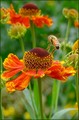
We have lift offby trainComment: I'd crop off a lot of the bottom. You'd still have the bee off-center, and IMHO, the picture would have more impact. |
 Photographer found comment helpful. Photographer found comment helpful. |
| 01/30/2006 09:57:12 AM |
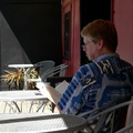
Wistfulby kari1Comment: I'd have cropped it to get rid of a lot of the white tables which aren't very interesting. You'd still have had a good picture with the subjec off-center. |
| Photographer found comment helpful. |
| 01/30/2006 09:55:19 AM |
|
| 01/30/2006 09:52:46 AM |
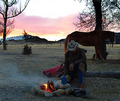
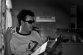
Morning Coffeeby linda12201Comment: Good picture, but it needs to be bigger. It could use some light on the man's figure -- just enough to give it some more definition.
Technically, i guess this is off center, but it doesn't really give that impression. The fire is what draws our eye, and it is balanced by the coffee pot and the man's figure. The total impression, with the square format, is a centered picture. |
| Photographer found comment helpful. |
| 01/30/2006 09:49:51 AM |
|
| 01/30/2006 09:48:20 AM |
|
| Photographer found comment helpful. |
| 01/30/2006 09:47:39 AM |
|
| Photographer found comment helpful. |
| 01/30/2006 09:46:46 AM |
|
| Photographer found comment helpful. |
| 01/30/2006 09:43:23 AM |
|
| Photographer found comment helpful. |
| 01/30/2006 09:42:41 AM |
|
| Photographer found comment helpful. |
Home -
Challenges -
Community -
League -
Photos -
Cameras -
Lenses -
Learn -
Help -
Terms of Use -
Privacy -
Top ^
DPChallenge, and website content and design, Copyright © 2001-2026 Challenging Technologies, LLC.
All digital photo copyrights belong to the photographers and may not be used without permission.
Current Server Time: 06/21/2026 01:41:04 AM EDT.