| Image |
Comment |
| 01/31/2006 02:16:51 AM |
|
 Photographer found comment helpful. Photographer found comment helpful. |
| 01/31/2006 02:15:30 AM |
|
| Photographer found comment helpful. |
| 01/31/2006 02:13:44 AM |
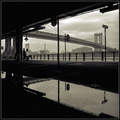
Overextended Intercourseby JPRComment: I think you were trying to be a bit too clever with the title, but those are great lines and shapes. Good subject for black & white. |
| Photographer found comment helpful. |
| 01/31/2006 02:12:23 AM |
Cathedralby MinstrelComment: Interesting subject matter and good placement in picture, but this is way over-processed. Too grainy and you can see the pixels in some areas. |
| Photographer found comment helpful. |
| 01/31/2006 02:11:09 AM |
|
| Photographer found comment helpful. |
| 01/31/2006 02:10:00 AM |
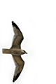
Sereneby SDWComment: Nice capture of the bird, but the white background kills it for me. |
| Photographer found comment helpful. |
| 01/31/2006 02:09:17 AM |
|
| 01/31/2006 02:08:14 AM |
|
| Photographer found comment helpful. |
| 01/31/2006 02:07:40 AM |
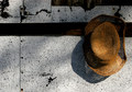
straw hatby dragonladyComment: Interesting composition, but a little dark. I'd like to see more light on the left side of the hat. The shadow just does to black. |
| Photographer found comment helpful. |
| 01/31/2006 02:05:50 AM |
|
| Photographer found comment helpful. |
Home -
Challenges -
Community -
League -
Photos -
Cameras -
Lenses -
Learn -
Help -
Terms of Use -
Privacy -
Top ^
DPChallenge, and website content and design, Copyright © 2001-2026 Challenging Technologies, LLC.
All digital photo copyrights belong to the photographers and may not be used without permission.
Current Server Time: 06/21/2026 08:33:15 AM EDT.