| Image |
Comment |
| 10/02/2006 11:34:40 AM |
|
| 10/02/2006 11:31:34 AM |
|
 Photographer found comment helpful. Photographer found comment helpful. |
| 10/02/2006 10:52:56 AM |
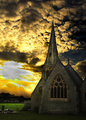
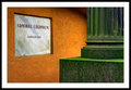
Seeking Heavenby jimnessComment: Looks way overprocessed. Could stand a little more light on the right side of the church -- it's too dark. |
| Photographer found comment helpful. |
| 10/02/2006 10:50:11 AM |
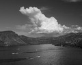
Canyon Lakeby phoeticComment: Looks like it's tilted to the left. Could also use more contrast. |
| 10/02/2006 09:38:46 AM |
|
| Photographer found comment helpful. |
| 10/02/2006 09:36:16 AM |
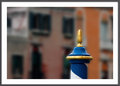
Just a pole...by silverscreenComment: Nice contrast in color between the pole and the background. Is the pole slightly tilted to the right?
I'm one of those folks that doesn't like frames. I'd get rid of it. Why waste pixels on a frame when you can look at a good picture. 8) |
| Photographer found comment helpful. |
| 10/02/2006 03:02:50 AM |
|
| Photographer found comment helpful. |
| 10/02/2006 03:00:28 AM |
|
| 10/02/2006 03:00:15 AM |
|
| Photographer found comment helpful. |
| 10/02/2006 02:59:29 AM |
|
| Photographer found comment helpful. |
Home -
Challenges -
Community -
League -
Photos -
Cameras -
Lenses -
Learn -
Help -
Terms of Use -
Privacy -
Top ^
DPChallenge, and website content and design, Copyright © 2001-2026 Challenging Technologies, LLC.
All digital photo copyrights belong to the photographers and may not be used without permission.
Current Server Time: 06/24/2026 09:59:30 AM EDT.