| Image |
Comment |
| 11/10/2005 09:05:41 PM |
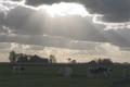
polderlandby RobMolComment: The sky in this photo looks very nice! I wish that the cows and the landscape were a little lighter so I could see some more detail on them. I think the composition of this photo is pretty good! |
 Photographer found comment helpful. Photographer found comment helpful. |
| 11/10/2005 09:04:56 PM |
Desertby nameIessComment: Very nice rays of light! I might like to see a little more land in the landscape, but the sky looks very nice. |
| 11/10/2005 09:04:22 PM |
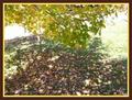
Falling For Beautyby Mel34Comment: It's hard to tell the detail of this photo :-( Go ahead and make it as big as DPC will allow!! :-) From here it looks like the colors are pretty good, but I think the angle would be shown off better if the submission was larger. |
| Photographer found comment helpful. |
| 11/10/2005 09:02:40 PM |
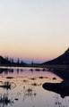
Nightfall Upon Usby kuhlmanComment: I really like the composition of this shot....but I wish it were bigger!! It's just hard to really get a good look at it when it's so small :-( But the colors are beautiful and I really like the sillhouette of the land and the grasses sticking out of the water. Really cool shot. |
| 11/10/2005 09:01:47 PM |
duskby Coffin3Comment: The rays of light in this shot look very nice! There seems to be some noise in the water on the lower left. Composition of the photo looks pretty good, though the outline of the trees looks slightly indistinct. You've captured some really nice colors in the sky here. |
| 11/10/2005 09:00:14 PM |
Beaverdam Parkby missinseattleComment: Very nice colors in this shot! There seems to be some distortion in the photo. I can see little cubes (maybe from compression) in the shot. Other than that, lighting and colors look good. |
| Photographer found comment helpful. |
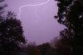
| 11/10/2005 08:59:15 PM |
Powerby photo07Comment: The lightning looks pretty cool, but I might adjust the levels a bit. The horizon is just light enough for me to notice that it's not straight across, whereas if the photo were a little darker, it would just look like solid sillhouette. I like the color of the sky too...really neat! |
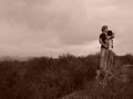
| 11/10/2005 08:58:15 PM |
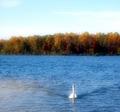
vast opennessby tracey3Comment: Good composition with the two subjects raised....I really like that! I might like to see this photo in color...I think it would add something. Or maybe just slightly in color...desaturated half way or something. |
| 11/10/2005 08:56:07 PM |
Lost in Greyby tanribilirComment: Very minimalistic. I like the composition of the shot, but I think it would have more interest if the water had a bit of color in it. Perhaps try taking a shot like this at sunset? Cause I think you've got something with the small boat in a large picture...really gives the feeling of the magnitude of the water. |
| Photographer found comment helpful. |
| 11/10/2005 08:53:30 PM |
Old Collegeby printerdwComment: Good composition of the building and landscaping. Because the sky is overcast, I would have cropped some of it out of the photo. The main interest is the building and the plants that accompany it, not the sky :-) Good colors on this shot...very true to life. |
| Photographer found comment helpful. |
Home -
Challenges -
Community -
League -
Photos -
Cameras -
Lenses -
Learn -
Help -
Terms of Use -
Privacy -
Top ^
DPChallenge, and website content and design, Copyright © 2001-2026 Challenging Technologies, LLC.
All digital photo copyrights belong to the photographers and may not be used without permission.
Current Server Time: 07/23/2026 02:19:33 AM EDT.