|
|
|
Showing 1451 - 1460 of ~2447 |
| Image |
Comment |
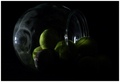
| 01/14/2006 02:49:05 PM | Imaginationby DAWARComment: ::: Critique Club ::: ladyhawk22
First Impression - the most important one: Very interesting texture and subject choice.
Composition: I might suggest putting the subject just a little more off center. This would allow for some different background texture and more shadow play in the beans behind the main subject. You've got a good angle to pick up all the detail and texture on the bean.
Subject: A very unique and creative idea for the shapes challenge! There is a lot of texture on the subject, which certainly makes it more interesting.
Technical (Colour, focus, and light): You have a nice focus on the subject! Color looks pretty good, though around the outer edge of the bean there is some bluish cast. Some tweaking with color balance might diminish that cast and help bring out some of the richer colors in the bean.
To grow its vote?: To grow its vote, I would recommend a composition that lets the viewer see more of the beans behind the one in front. Some slightly stronger lighting, or perhaps some lights from other angles might bring out the interplay in the shadowed areas.
Summary: A nice close-up macro shot here. A great job on the focusing, as well as preparation for the photo. If you hadn't soaked the chickpea during set-up, the texture wouldn't be nearly as interesting! Great job following your idea all the way through. |
| 01/14/2006 02:36:10 PM | Spiky Circleby AFViperComment: ::: Critique Club ::: ladyhawk22
First Impression - the most important one: Lovely colors in the sky and a quite attractive landscape shot.
Composition: Composition here looks very good. You have plenty of interesting lines along the horizon, and the proportions of land to sky are pleasing as well.
Subject: From the title of the shot, I understand that the spikey bushes are the subject of this shot. Not by any means a bad choice for this challenge, though there were likely some viewers who would have liked a stronger shape.
Technical (Colour, focus, and light): Focus on this shot looks just right, nothing to change there :-) Colors on shots like these are a little more difficult because of the sky. Like you state in your notes, it can be difficult not to blow out the sky--something you surely don't want to do with colors like this! So you certainly made the right choice. But then what do you do with the land? In my opinion, the colors are true to life, but I think the photo would have more impact if the greens were more vibrant. Perhaps some adjustments to the saturation of the greens would help.
To grow its vote?: I think that this is a lovely photo which probably caught the attention of many of the voters, most notably because of the sky. There were probably some voters who didn't feel strongly about the spiky plants as a subject. I think you have some lovely shapes and lines in the hills that might have done as shapes as well.
Summary: A beautiful landscape! For more color in the greens, try boosting the saturation levels a bit. Composition and other technical aspects look good. Great job on exposing the sky! |  Photographer found comment helpful. Photographer found comment helpful. |
| 01/13/2006 04:43:23 PM | Roundness of Toilet Paperby MochaNova1987Comment: [ I]::: Critique Club :::[/i] ladyhawk22
First Impression - the most important one: Definite solid shapes here, though there are a couple of things that need some work.
Composition: Composition of this photo is ok. You have one roll in the lower left and another partial roll in the upper right, which helps to lead the eye all the way through the photo.
Subject: You've chosen a subject that has a strong shape to it, making it a decent choice for this challenge.
Technical (Colour, focus, and light): The colors here look pretty good, though I think they could have been enhanced even more by some extra lighting. The focus here seems to be zoning in more on the wood in the background than the rolls of paper.
To grow its vote?: To enhance this photo a little more, I would suggest making sure that the focus and DOF really shows off the subject of the photo. A little more light to help overcome the shadows might be good too, and may bring out some interesting colors and patterns in the wood of the background.
Summary: Good choice of shape, and with a couple of small changes I think you'd be on the right track! |
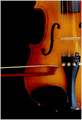
| 01/13/2006 04:30:01 PM | Stringsby carlomuscatComment: [ I]::: Critique Club :::[/i] ladyhawk22
First Impression - the most important one: Love this photo....really great! As a musician, it really speaks to me. A very classic image.
Composition: Composition is absolutely great! Wouldn't change a thing. I love the half-view of the instrument, and the bow leading to the curves really draws the eye right along.
Subject: Great choice of subject, especially for this challenge! I also appreciate that the instrument looks nice and clean-no fingerprints, dust, scratches, etc. visible.
Technical (Colour, focus, and light): Color on this shot and lighting look good. Depending on preference, the instrument could be a little bit lighter (not too much though!). You've picked up some really nice golden tones in the wood that might be accentuated by just a smidge more light, or perhaps a little more tweaking in the levels.
To grow its vote?: I think you've done a great job, as is! Again, maybe just a little tweaking with the lighting to give the instrument a bit more of a "glow"...but great job!
Summary: A really visually pleasing photo. Great job on the composition and execution of this shot. Well done all around! |
| 01/13/2006 04:23:40 PM | Lonely Drinkerby TiberiusComment: [ I]::: Critique Club :::[/i] ladyhawk22
First Impression - the most important one: My first reaction to this image is quite positive. It's a very emotive image with a strong sillhouette and very interesting colors.
Composition: I like the composition of this shot a lot. There's several points of interest for the viewer, between the sillhouette of the drinker and the shapes in the background.
Subject: As a stand alone image (without the context of the challenge) I think that the subject is incredibly strong and moving. In regards to the challenge theme, you may have taken some knocks from the shapes not being the main focus. In my opinion, the sillhouette would have counted as a shape too!
Technical (Colour, focus, and light): Technical aspects of this photo are spot on. There's no noise in the dark portions of the photo and both the light and colors are stunning!
To grow its vote?: I think what hurt the score here was probably what I mentioned above...the fact that the main point of focus is not the defined shapes you see in the background. In terms of the challenge, perhaps it would have a higher impact if the shapes of color were in focus and the sillhouette of the drinker was the blurred part.
Summary: Truly a great image! I wouldn't change a thing about it, really :-) I think you took a great shot that you can really be proud of. In terms of shooting for challenges, you often have to decide between doing what pleases you and what might please the voters more. But, all in all, a great job I think. | | Photographer found comment helpful. |
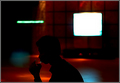
| 01/13/2006 04:04:41 PM | busy Newyork cornerby HalimComment: [ I]::: Critique Club :::[/i] ladyhawk22
First Impression - the most important one: Wow! This shot really is striking and I can't believe it didn't place higher!
Composition: Composition looks great to me! Plenty going on, plenty to keep the attention of the viewer. I like the angle and perspective--seems right at eye level, as if the viewer was walking down the street themselves.
Subject: Great choice for the City Life challenge...most definitely fits the topic. I love that there's some motion blur, showing the hustle and bustle of the city. Just the right mixture of bright colors and corporate greys (which almost defines cities to me!).
Technical (Colour, focus, and light): Colors look great! They look true to life, but they pop right out of the photo and grab your attention. Focus seems spot on in this shot, good job!
To grow its vote?: Honestly...like I said..I'm not truly sure why this didn't score higher. The fellow with his back to the camera may have hurt the image some. But I think that the way the photo is has a nice photojournalistic feel to it--very slice of life, and I like it!
Summary: Great job on this shot, all around. I think if you keep at this, you're going to be very happy with your results! This, in my opinion (and I hope yours too!), is a shot you can really be proud of. | | Photographer found comment helpful. |
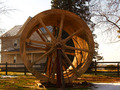
| 01/13/2006 03:56:27 PM | Circleby ragamuffingirlComment: [ I]::: Critique Club :::[/i] ladyhawk22
First Impression - the most important one: My first impression is that this is a nice strong shape with good natural lighting.
Composition: Composition looks pretty good. The subject is obviously a strong, predominant part of the composition in this shot. The subject is almost exactly centered (which doesn't bother me too much in this image). It might be interesting to see the subject placed more to the left, or more to the right...though I don't know what other kind of scenery you had to work around :-) There are just some places where centered is the more interesting of the options! Might suggest playing around with a closer crop so that the wheel fills more of the frame.
Subject: I think you've chosen a good subject and a nice, clearly defined shape. The house in the background is slightly distracting, though I understand it's not as though you could move it ;-) The wood provides good color, escpecially with the natural lighting.
Technical (Colour, focus, and light): Colors in this photo look nice, especially in the wheel. Good shadows and light as well! Focus looks good too.
To grow its vote?: I think the thing that probably hurt you the most here is the background of this photo. You did a great job choosing the subject and everything else looks good. Perhaps blurring the background some might help the foreground to stand out.
Summary: A well chosen subject with good lighting and color, though the background might be considered distracting. |
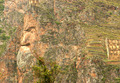
| 01/13/2006 03:41:36 PM | Faceby belinhaComment: [ I]::: Critique Club :::[/i] ladyhawk22
First Impression - the most important one: My first impression is that this is a subtle image, in relation to the challenge theme. An amazing formation in the rock, but one that perhaps has more impact in person than in a photo.
Composition: The composition of this shot is pretty good. I might put the face just ever so slightly more to the right of the frame. That's a quite nitpicky suggestion though :-) Don't really have any issues with the composition of this shot. One other option might be to crop the photo so that the face in the rock is a larger portion of the shot.
Subject: I personally like those shots that show the photographer has a creative and observant eye, which is what this shot tells me. It definitely shows line and shape.
Technical (Colour, focus, and light): Color looks pretty true to life, though for this particular shot I might suggest upping the saturation levels a bit. It's my opinion that more vibrant colors might catch the eye a bit more and may also help accentuate the face in the rock. The natural light looks good in this shot and the focus looks pretty good as well...maybe just a *tad* soft. But it doesn't obscure the subject.
To grow its vote?: I think that perhaps this shot might have been a little out of the box for some voters, though in my opinion it fits the challenge well. Perhaps the key to improving this image lies in the post processing. Some things to try might be different crops, bumping up the saturation, and manipulating the color balance. I might also suggest playing with Levels a bit, and perhaps even trying the shot in Black & White.
Summary: All in all, you did a great job finding this face!! I think it's a great and creative shot that fit the challenge well. Playing around with some of the settings might fine tune this image and make it really pop! |
| 01/13/2006 01:00:08 PM | Untitledby ballyhooComment: Hello from the Critique Club!
Quite a nice shot you've got here! Many of your comments are right along the lines of what I would say too :-) This is a lovely fixture with shapes inside a shape....very good choice for this challenge. The light from the fixture seems to glow in a very pleasing way! The muted colors in the background serve the picture well-most notably the diagonal line, which helps to draw the eye. My only suggestion for improvement would be to use that diagonal to cut the photo from corner to corner, making two triangles as well. You may have thought of that and avoided it, due to the frame in the lower right hand corner? All in all, quite lovely and a very good choice for this challenge! |
| 01/13/2006 12:52:21 PM | Sphericalby aartiprasadComment: Hello from the Critique Club!
You have a wonderful idea here for the Shapes challenge!! It's creative and well composed! The shot looks to be in focus well, with good detail. The only thing hurting you here is the lack of light. The black background works very well for this shot, making the color of the balls stand out. I'm not sure if this shot was set up on a piece of black cloth, or if the black comes from the room being dark....but my suggestion would be to obtain some black cloth for these shots! Lots of people have had great success with velvet, I believe. If your object is on a black cloth, then you can feel free to use as much light as you like to make it visible to the viewers. It's obvious that you have a good vision for this shot and the eye to set it up for what you want! | | Photographer found comment helpful. |
|
Showing 1451 - 1460 of ~2447 |
Home -
Challenges -
Community -
League -
Photos -
Cameras -
Lenses -
Learn -
Help -
Terms of Use -
Privacy -
Top ^
DPChallenge, and website content and design, Copyright © 2001-2026 Challenging Technologies, LLC.
All digital photo copyrights belong to the photographers and may not be used without permission.
Current Server Time: 07/24/2026 03:44:03 AM EDT.
|