| Author | Thread |
|
|
01/13/2006 03:56:27 PM |
[ I]::: Critique Club :::[/i] ladyhawk22
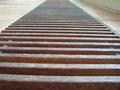
First Impression - the most important one: My first impression is that this is a nice strong shape with good natural lighting.
Composition: Composition looks pretty good. The subject is obviously a strong, predominant part of the composition in this shot. The subject is almost exactly centered (which doesn't bother me too much in this image). It might be interesting to see the subject placed more to the left, or more to the right...though I don't know what other kind of scenery you had to work around :-) There are just some places where centered is the more interesting of the options! Might suggest playing around with a closer crop so that the wheel fills more of the frame.
Subject: I think you've chosen a good subject and a nice, clearly defined shape. The house in the background is slightly distracting, though I understand it's not as though you could move it ;-) The wood provides good color, escpecially with the natural lighting.
Technical (Colour, focus, and light): Colors in this photo look nice, especially in the wheel. Good shadows and light as well! Focus looks good too.
To grow its vote?: I think the thing that probably hurt you the most here is the background of this photo. You did a great job choosing the subject and everything else looks good. Perhaps blurring the background some might help the foreground to stand out.
Summary: A well chosen subject with good lighting and color, though the background might be considered distracting. |
|
Comments Made During the Challenge  |
|
|
01/09/2006 04:23:18 PM |
|
i like the colors in this photo. |
|
|
|
01/09/2006 01:31:38 PM |
|
the house in the back is distracting to the circle |
|
|
|
01/08/2006 06:33:26 PM |
|
Backgrounds are important and this one has a very distracting one. Maybe from another angle? |
|
|
|
01/08/2006 07:50:46 AM |
|
Nice short, i really like the lighting |
|
|
|
01/05/2006 09:17:31 PM |
|
 Photographer found comment helpful. Photographer found comment helpful. |
|
|
01/05/2006 01:59:31 PM |
|
THe light here is just gorgeous. Yay for slanting winter sunshine. :) |
|
| Photographer found comment helpful. |
Home -
Challenges -
Community -
League -
Photos -
Cameras -
Lenses -
Learn -
Help -
Terms of Use -
Privacy -
Top ^
DPChallenge, and website content and design, Copyright © 2001-2026 Challenging Technologies, LLC.
All digital photo copyrights belong to the photographers and may not be used without permission.
Current Server Time: 07/15/2026 10:43:20 PM EDT.