| Image |
Comment |
| 01/18/2006 01:42:29 AM |
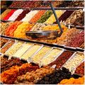
Color balanceby alexgarciaComment: ::: Critique Club ::: ladyhawk22
First Impression - the most important one: Nice market shot with lots of different colors and textures.
Composition: Composition looks good. I might be interested to see the shot a little more angled, so that we get a longer view of the market stand. I also might suggest placing the shot so the scale is a little higher in the photo...it's rather close to the center right now.
Subject: Lots going on in this shot! Certainly plenty of colors. I like these marketplace shots quite a bit...they really give a feel of the place they're taken.
Technical (Colour, focus, and light): Colors look pretty good, though there seems to be a slight yellow tone to the photo (possibly because of lighting?) Focus looks pretty good too, though it seems a touch soft at the corners of the photo.
To grow its vote?: To grow the vote here, I would suggest really making sure that the focus is spot on. In this style of photo (which strikes me as somewhat photojournalistic) the focus can really make a huge impact. It's certainly not horrible, but the sharper the image, the better. I also think that composing the shot to remove the scale from the center of the photo would improve the score as well.
Summary: Lots to look at in this shot! Just a couple things to adjust and we're rockin' and rollin'! |
 Photographer found comment helpful. Photographer found comment helpful. |
| 01/18/2006 01:35:14 AM |
winter blues by ursulaComment: ::: Critique Club ::: ladyhawk22
First Impression - the most important one: Wow, stunning image. Was not surprised to see this getting a ribbon!!
Composition: Beautiful shot! I like the composition just as it is...it splits the screen well and the angle is really good, especially for showing off the backlighting. Might be interesting to see the flower tilted ever so slightly with the face towards us...but really, I love it just the way it is!
Subject: Great choice of subject for this challenge! Really works well to show the lighting technique that was carried off so well here. Beautiful colors that keep the interest of the viewer, and the water droplets add a nice texture.
Technical (Colour, focus, and light): Love the shallow DOF on this shot! Again, seems to show off the lighting and gives an ethereal air to the photo. Colors are spot on! Truly fabulous. Lighting is spectacular!
To grow its vote?: Oh goodness....I really don't think there's anything I could suggest!!
Summary: Wonderful photo and masterfully captured! Congrats! Message edited by author 2006-01-18 11:25:18. |
| Photographer found comment helpful. |
| 01/18/2006 01:30:59 AM |
Recipe for Success or College Cuisineby fotomann_foreverComment: [ I]::: Critique Club :::[/i] ladyhawk22
First Impression - the most important one: This photo made me laugh!! Anyone who's gone to college definitely gets a kick out of this one!! It's so true!
Composition: Composition and creativity are certainly a plus on this photo. I like how you used the books for a backdrop and the notebook as the base. Makes the scene!
Subject: Again, when I saw this photo I thought it was hysterical! And certainly creative. There may have been some voters who would have preferred to see it as a prepared dish, as opposed to still being in the packaging.
Technical (Colour, focus, and light): Lighting and colors look good! And focus is good too, though I would be curious to see it at a shallower depth of field, to slightly blur the titles in the background.
To grow its vote?: I think to grow its vote, I would have showed a bowl/plate of some prepared as well as the packaging. Most people probably expected to see food, rather than packaging. But the colors and other technical aspects look pretty good to me!
Summary: Kudos for a very creative idea that certainly gave many many people a smile :-) |
| Photographer found comment helpful. |
| 01/18/2006 01:25:38 AM |
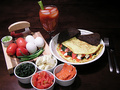
Omlette with Lox Feta and Spinachby _eugComment: ::: Critique Club ::: ladyhawk22
First Impression - the most important one: Looks like a tasty meal!!
Composition: Composition looks good. Everything is framed nicely and there is plenty to look at, as well as plenty of "negative" space. I like the placement of the ingredients on the left and the meal on the right.
Subject: Good choice of subject and I love that you included all the ingredients too. You have some nice colors in the meal and in the ingredients, which gives good variety to the shot.
Technical (Colour, focus, and light): Focus looks good, though I can see what you mean in your comments about oversharpening. I think you did pretty good on it though--not as bad as you thought. It does look a tad oversharp, but nothing horrible :-) Colors look good in this shot, though a tad bit of saturation in the reds and greens might make things pop a bit more. Lighting looks good, though a little uneven. The left side of the photo is considerably darker than the right side (though not so much that you can't see the left side or anything). I think you have the right level of light, but maybe could consider adding some more from the left.
To grow its vote?: To grow its vote, I think more balanced lighting would help. You've definitely got enough to pick up nice detail on the food, but I think a little more would add to the scene. Also, though the colors are certainly true to life, slightly saturated colors tend to pop more on the web and to viewers.
Summary: Great image for this challenge, with good composition. You had a good idea and you followed through on it well!! |
| Photographer found comment helpful. |
| 01/16/2006 03:35:00 PM |
Almond eyesby jmogensenComment: Wonderful composition!! I love the lines from the stairs on the left in contrast with the subject. Great lighting and a wonderful portrait! |
| Photographer found comment helpful. |
| 01/16/2006 03:33:49 PM |
|
| Photographer found comment helpful. |
| 01/16/2006 03:33:18 PM |
|
| Photographer found comment helpful. |
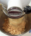
| 01/15/2006 02:52:02 PM |
MmMmMmMm cookiesby nlghttrainComment: Interesting and creative angle on this shot. The focus seems to be primarily on the portion of the mixer with the brand name, though for my tastes I would have preferred to see the focus on the contents of the bowl! Lighting looks pretty good and I like the composition of the photo overall. |
| Photographer found comment helpful. |
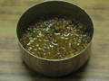
| 01/15/2006 02:50:56 PM |
INDIAN SALTY DISH(DALL)by sandeepsalwan45Comment: Very interesting dish!! I've really enjoyed seeing different cultures represented in this challenge :-) It seems as though your focus is somewhat off, and there appears to be a good deal of noise/pixelation in the image. Looks like some very interesting ingredients and colors in this dish! |
| Photographer found comment helpful. |
| 01/15/2006 02:49:33 PM |
vanilla sky puddingby gocComment: Very interesting colors on this shot, though it's a bit hard to see the food clearly. I think if you were going for an abstract style, then that works. |
| Photographer found comment helpful. |
Home -
Challenges -
Community -
League -
Photos -
Cameras -
Lenses -
Learn -
Help -
Terms of Use -
Privacy -
Top ^
DPChallenge, and website content and design, Copyright © 2001-2026 Challenging Technologies, LLC.
All digital photo copyrights belong to the photographers and may not be used without permission.
Current Server Time: 07/23/2026 10:32:54 PM EDT.