|
|
|
Showing 1431 - 1440 of ~2447 |
| Image |
Comment |
| 01/25/2006 01:16:14 AM | |  Photographer found comment helpful. Photographer found comment helpful. |
| 01/25/2006 01:12:44 AM | | | Photographer found comment helpful. |
| 01/25/2006 01:11:43 AM | | | Photographer found comment helpful. |
| 01/25/2006 01:09:36 AM | Bend steel with my bare handsby moonwellComment: Nice! :-) Very well done...I think I can see how you did it, but I had to look really close! Great colors and lighting...very well executed. | | Photographer found comment helpful. |
| 01/25/2006 01:08:29 AM | Ice Nymphby fadedbeautyComment: Lovely work on the eyes! I'd like to see just a touch more color in the skin...but a lovely shot! | | Photographer found comment helpful. |
| 01/22/2006 03:11:28 AM | | | Photographer found comment helpful. |
| 01/19/2006 02:31:28 AM | Leftoversby ElmakiasComment: ::: Critique Club ::: ladyhawk22
First Impression - the most important one: Good composition, but it looks overexposed....causing the colors to be muted.
Composition: Composition for this image is good! The pumpkin is well placed and I like the leaves as a background.
Subject: The pumpkin was a nice choice in subject, especially as the colors would compliment the leaves well. A fresher pumpkin might go over a tad better, but I wouldn't call it a bad choice by any means!
Technical (Colour, focus, and light): The colors in this photo suffer a bit because of overexposure. For this challenge especially, the colors really need to pop off the screen in order to catch the voter's attention. Try reducing the exposure to get more accurate colors. Adding a little bit of saturation to the pumpkin would be a good move too. Focus looks alright, though it might be interesting to use a shallower depth of field (smaller aperture) to blur the leaves in the background a bit.
To grow its vote?: I think the overexposure is what hurt this image the most. A little bit of overexposure can sometimes be fixed using a Levels adjustment and/or adjusting the Contrast/Brightness.
Summary: Good composition on this photo! With a little more attention to the exposure settings it would come out really nicely. | | Photographer found comment helpful. |
| 01/19/2006 02:21:08 AM | Burstby AngelisComment: ::: Critique Club :::
First Impression - the most important one: Good composition, though the colors could be a little more vibrant. Before reading the notes I was under the impression that the blur was from the balloon moving, not bursting.
Composition: Composition on this shot is very strong in terms of placement. Pleasing to the eye, and the arm and needle are nicely extended to move the eye along the shot.
Subject: Good choice of subject, especially with the play on words :-) Neat idea!
Technical (Colour, focus, and light): The colors look true to life, though I would be interested to see a little tweaking. For *this* challenge, I might suggest adding some saturation to the ballon--to ensure that it really stands out. I also wonder what it would look like if you desaturated the arm a bit...may help the balloon to stand out even more. Focus looks good, especially on the arm. Lighting looks good as well. I think a split second later might have shown the balloon bursting more, but I can hardly imagine how much work it must take to get that kind of shot! In the lower right corner there is a spot where the light is reflecting off the background a bit...but the rest of the black is nice and solid.
To grow its vote?: To grow its vote, as an image in this challenge, I would suggest adding some saturation to the color of the balloon. For a challenge based on color, they really need to pop! I think some voters may also have mistaken the blur for shaking, rather than popping/bursting.
Summary: A great idea!! I more than applaud you for sticking it out through 50 attempts to get this shot! With determination like that to see your concept through, you'll be getting plenty of high scores! |
| 01/19/2006 02:11:04 AM | ...or backlighting?by LevTComment: ::: Critique Club ::: ladyhawk22
First Impression - the most important one: Lovely colors in the leaf that are contrasted nicely by the darkness of the background.
Composition: The placement of the leaf and seed pod on the left are lovely. I'm not sure I care as much for the leaf on the right...I might have considered cropping it out. The light shines off it oddly and it pulls attention away from the more lovely part of your photo on the right!
Subject: A good choice of subject, especially when paired with the darkness of the background. The lighting really makes the colors and details of the leaf stand out.
Technical (Colour, focus, and light): Colors in this shot are lovely!! I really like them. Focus looks good as well. The lighting is really what makes this shot here and certainly demands well deserved attention.
To grow its vote?: To grow its vote, I would recommend cropping out the leaf on the right. I think that is likely what hurt it the most. The other aspects of the photo look very nice!
Summary: Technical aspects look good on this shot. Try to be aware of where your eye is drawn and remember that you don't want to include something in the shot that would take the focus away from your beautiful subject! All in all, a beautiful shot, and one to be proud of!! | | Photographer found comment helpful. |
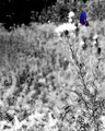
| 01/18/2006 01:49:26 AM | butterflyby ZenjohnComment: ::: Critique Club ::: ladyhawk22
First Impression - the most important one: Lovely colors in the butterfly, and I think selective desat works well for this shot.
Composition: Composition on this shot is pretty good. If you were going for a more minimalistic feel, I think the crop is just fine. I personally might crop out a little bit from the bottom. I think there's enough texture and black & white space to make the butterfly stand out even if the bottom of the plant is cropped out.
Subject: I like the subject of this shot quite a bit. The delicate shape of the butterfly really contrasts well with the woody texture of the plants in the background.
Technical (Colour, focus, and light): Colors on the butterfly are very vivid, thoug the butterfly looks a tad oversharpened. I like the selective desat in this picture and I think it works well for the challenge. I like the DOF too, with the texture of the thistle being in focus (as well as the butterfly) and the background plants just adding to the scene more quietly. There are some portions of the plants where the white highlights look slightly blown out...could likely be fixed with a little levels adjustment.
To grow its vote?: To grow its vote, I would fade the sharpening on the butterfly a bit, and be certain not to blow out the highlights. Those things really seem to catch the voters eye (as I've had to learn myself!).
Summary: A good concept for this challenge, with a good follow through. Just a couple of simple nitpicks to possibly improve the score on this lovely photo. | | Photographer found comment helpful. |
|
Showing 1431 - 1440 of ~2447 |
Home -
Challenges -
Community -
League -
Photos -
Cameras -
Lenses -
Learn -
Help -
Terms of Use -
Privacy -
Top ^
DPChallenge, and website content and design, Copyright © 2001-2026 Challenging Technologies, LLC.
All digital photo copyrights belong to the photographers and may not be used without permission.
Current Server Time: 07/24/2026 06:26:24 AM EDT.
|