| Image |
Comment |
| 04/04/2005 11:03:40 AM |
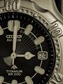
....There was only timeby AFViperComment: Very clever image - technically brilliant. Slightly lacking in sharpness on numerals(focal lenght seems v short and focussed behind the glass and raised bezel). Slightly tenuous connection to theme. |
| 04/04/2005 11:02:05 AM |
Baby on Boardby roadrunnerComment: great image (that belly button piercing looks strained!). amazingly smooth belly contrasts nicely with grass. like the tight crop. good choice if simple colours for model's clothing. Like. |
 Photographer found comment helpful. Photographer found comment helpful. |
| 04/04/2005 11:00:55 AM |
Creation of the Universeby scudsComment: great idea! Like the black surround. However, lighting seems too bright for this scene - maybe a smaller aperture, underexposed picture, with contrast & brightness tweaked in post-processing would have worked better? |
| Photographer found comment helpful. |
| 04/04/2005 10:56:36 AM |
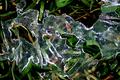
Primordial ooze.by cathysappComment: yup - that's ooze! Not sure how, photographically, you could capture the "primordial" bit. This image is triking, but maybe not enought to get over the "yuk" factor!, Like the composition and lighting. |
| 04/04/2005 10:48:54 AM |
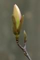
First flower in spring / Magnoliaby RUEDISCHMUTZComment: nice detailed image. slight lack of sharpness, perhaps on tip of bud and in hairs on bud case. Very slightly flat - more contrast in lighting would have improved, I think. Image slightly lacking in innovation... |
| Photographer found comment helpful. |
| 04/04/2005 10:46:52 AM |
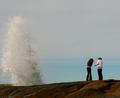
Water ruledby crank2oComment: Great capture! wish there was fraction more on LHS (water is leaving frame) and could see more of your people (faces). Sky is a little uninteresting, and might benefit from more contrast and saturation in blue spectrum. |
| Photographer found comment helpful. |
| 04/04/2005 10:45:36 AM |
|
| Photographer found comment helpful. |
| 04/04/2005 10:44:13 AM |
|
| Photographer found comment helpful. |
| 04/04/2005 10:43:12 AM |
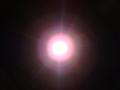
God said "Let There Be Light"by bearbearComment: Very simple but effective! Maybe not quite even enough in halo terms, and central light very blown out - slightly more gradation might have been interesting. Nice image. |
| 04/04/2005 10:42:01 AM |
|
| Photographer found comment helpful. |
Home -
Challenges -
Community -
League -
Photos -
Cameras -
Lenses -
Learn -
Help -
Terms of Use -
Privacy -
Top ^
DPChallenge, and website content and design, Copyright © 2001-2026 Challenging Technologies, LLC.
All digital photo copyrights belong to the photographers and may not be used without permission.
Current Server Time: 07/17/2026 12:58:19 AM EDT.