| Image |
Comment |
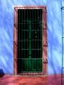
| 04/04/2005 11:18:39 AM |
CASA AZUL - FRIDA KAHLOby e-shootComment: Nice colours, detail. Green door itself a little dark. wire on RHS is distracting. And cannot see any link to challenge. |
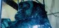
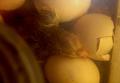
| 04/04/2005 11:17:38 AM |
In the begining they were manby jigglebugComment: Nice idea. However, technically suffering quite a lot. Reflections in glass are very distracting (get closer to glass, consider polarising filter). subject is out of focus and wires in background distract.frame on LHS adds nothing and should be cropped out. |
 Photographer found comment helpful. Photographer found comment helpful. |
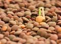
| 04/04/2005 11:16:02 AM |
Genesisby gaurawaComment: Very attractive photo. like the lighting (slightly back lit?) and the DoF separates fore, mid and background nicely.Very sharp. I like this. |
| Photographer found comment helpful. |
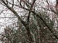
| 04/04/2005 11:14:45 AM |
New Lifeby SKKCComment: You are not using your ful 640 pixels - picture is pixelated as a result. Image is very hard to make out.sky looks a little overxposed. |
| Photographer found comment helpful. |
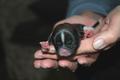
| 04/04/2005 11:13:55 AM |
Breakthroughby PhileineComment: great capture! very cute. photographically very challenging situiation - there is a strong colour cast (could be eliminated in PS) and a lot of grainiess (not so much a problem here, but could be removed with NeatImage too see if it would be improved without graininess). Like the composition, except for the thing on the bottom left - which is indistinct and very dark. |
| Photographer found comment helpful. |
| 04/04/2005 11:11:43 AM |
Beginning Of The Beginningby knowvakComment: nice image. Liek the addition of the rosary. while candle lighting is atmospheric, wonder whether a secondary source might have been used to get the book slightly brighter? Goodfocus and detail. |
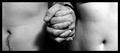
| 04/04/2005 11:10:49 AM |
In the Beginning...One Man, One Womanby GIRLcoBabeComment: nice idea, well executed. Wonder if male model should have turned in a bit more to get belly buttons equally spaced from the sides. wrist watch (?) on male model distracts. Border is very thick - should be thinner if one at all. More definition in the models', or perhaps more moody lighting, might have provided more detail & interest (not that I can compete on that front...!) |
| Photographer found comment helpful. |
| 04/04/2005 11:08:17 AM |
In the beginning there was life.by lineyComment: Great timing - on the dog's part to arrive that week! Flash lighting does little to add depth to the photo, and composition might have focussed tighter on pup. Thanks for sharing sute pic, though! |
| Photographer found comment helpful. |
| 04/04/2005 11:06:55 AM |
Beginning To Get In Shapeby RolandBComment: good idea. maybe need a little more in the image - maybe lose the jumper (reds look under-saturated on my monitor) and focus on a weak looking arm to capture theme. several colours in triple shadow slightly distract (and slight graininess there). Like the composition. |
| Photographer found comment helpful. |
| 04/04/2005 11:05:05 AM |
|
Home -
Challenges -
Community -
League -
Photos -
Cameras -
Lenses -
Learn -
Help -
Terms of Use -
Privacy -
Top ^
DPChallenge, and website content and design, Copyright © 2001-2026 Challenging Technologies, LLC.
All digital photo copyrights belong to the photographers and may not be used without permission.
Current Server Time: 07/16/2026 11:47:15 PM EDT.