Eye "Q"
by
MatthewComment: Many thanks to all those who have commented!
In particular, Beetle, e301, rex and photoshootme spotted my sensor dust. That dust really shows up on a long exposure using a low ISO setting. I have bought a cleaning kit...!
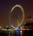
Tallbloke wanted to steal my technique - not sure that there is much to steal. I positioned myself on Westminster Bridge with tripod and remote wire and experimented with several long exposures, and a couple of short ones. Here is the cropped but otherwise unaltered image

As can be seen, I really only had to alter the contrast and a little saturation (as standard with a DSLR), with a tiny bit of levels and USM. I did do a Neatimage pass in an attempt to minimise the dust (which did very little).
As for sharpening - I received several comments - rayg544 thought it was sharp, gibun that it was too sharp, imagineer that it was a little soft. Myself, I think it maybe a little oversharpened, but I have noticed that any softness is always commented upon!
On composition, I agree with e301 and rex that the composition is not the best - I was a little constrained by distracting bright lights coming from City Hall on the RHS, and sensor dust on the left. I attempted several recompositions and did this one at the last minute after a big night out (maybe I should try that more often if it works)...!
For those that asked, the line on the river (not road!) was caused by a passing boat, which I quite liked (and this image was better than others for other reasons), and the two "objects" on the bottom left are the white lights with a shadow pattern created by the trees in front of them (completely invisible to the human eye - only apparent in long exposure).
Tristalisk thought that it was a bit tilted - perhaps: I straightened the image using the Shell building on the RHS as a vertical guide. I think that any tilt appears as a result of the angle, the imbalance in the lighting creating an optical illusion, or a tilt that is present in the Eye itself.
For saracat, here is an outtake showing the London Eye without the motion blur (it is very slow in reality):

I am very pleased that the various technical glitches (glaring to me!) did not hold everyone back on the voting front. Thanks again!