| Image |
Comment |
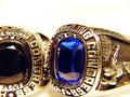
| 04/25/2005 06:56:45 AM |
Because You LOVE herby RayEthierComment: Quite a nice image - though ring propped up like that feels a bit odd. Text - I don't like. Font is fussy. Colour is very strong for a pale-ish image. "Special", in England at least, has other connotations. |
 Photographer found comment helpful. Photographer found comment helpful. |
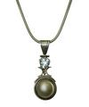
| 04/25/2005 06:55:02 AM |
Bob's Fine Jewelryby strangeghostComment: Am I looking at photography here, or reading copy? Text is far too domineering. band of ring not lit enough to be visible. |
| Photographer found comment helpful. |
| 04/25/2005 06:53:56 AM |
|
| Photographer found comment helpful. |
| 04/25/2005 06:53:20 AM |
Untitledby troyloxComment: Nice, butwish the focus on the heart was just slightly sharper, and contrast a bit higher. |
| Photographer found comment helpful. |
| 04/25/2005 06:52:26 AM |
Native American jewelryby dragonladyComment: Nice subject. Floor a little distracting. Cannot stand your font!! And cannot read half of it - you needed another colour font, I think, maybe dark red, to stand out from the pot. Feels as though you are wasing some space, too: tope LHS and RHS are empty. |
| Photographer found comment helpful. |
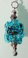
| 04/25/2005 06:50:58 AM |
Aqua lampwork beadby PaperfibeComment: small & bottom is blurry. Lighting is casting a very strong, distracting shadow. - hope you overcome the likely low score and continue to participate and improve. |
| 04/25/2005 06:49:05 AM |
|
| Photographer found comment helpful. |
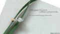
| 04/25/2005 06:48:26 AM |
Writing a Love Poemby admart01Comment: Nice background and detail. Like the image as a whole. Funny reflection on LHS of ring - yellow/wood? Taken in your kitchen? |
| Photographer found comment helpful. |
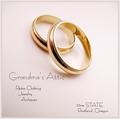
| 04/25/2005 06:46:56 AM |
Grandma's Atticby tfarrell23Comment: Nice image. Don't like your font - needs anti-aliasing. Not sure how text augments your photo. |
| Photographer found comment helpful. |
| 04/25/2005 06:45:28 AM |
|
| Photographer found comment helpful. |
Home -
Challenges -
Community -
League -
Photos -
Cameras -
Lenses -
Learn -
Help -
Terms of Use -
Privacy -
Top ^
DPChallenge, and website content and design, Copyright © 2001-2026 Challenging Technologies, LLC.
All digital photo copyrights belong to the photographers and may not be used without permission.
Current Server Time: 07/17/2026 04:08:22 PM EDT.