| Image |
Comment |
| 06/02/2005 07:42:00 AM |
Up or Down?by thomaspeopleComment: I am making this comment on a number of votes, but please don't hold that against me: I just wanted to let you know why I gave you a relatively low score in this challenge. I have approached voting with the starting point that the photograph should stand on its own (ie without the title), and have as a focal point a decision (ie I should look at this photo and one of the main things that I should be thinking about when looking at the photo is, "there is a decision just made, being made, or about to be made, and this photo captures that moment". Ideally, I'd love to be provoked by the image into thinking that "the essence of this photo is the decision it portrays".
Unfortunately, absent the title, I would not have guessed that your photo was intended to capture a "decision". As the rules state, I am voting with high regard to the challenge description. However, I am explaining why in case you were left wondering why your score is not doing was well as you expected!
Specific to your picture, I would add that
the highlights in the controller are overexposed and the image might have been more interesting if we coud have seen the model's face (eg game reflecting in his eyes...)
|
 Photographer found comment helpful. Photographer found comment helpful. |
| 06/01/2005 09:45:44 AM |
In two mindsby RiponladyComment: This feels strangely familiar...
Horizon feels very slightly tilted, and the viewer might have gotten a better idea of the decision being taken if the crop had been a little tighter, so as to show more detail of the box and papers. This could have been done, while retaining the reflection, using portrait orientation. You can correct the horizon in Photoshop - hold the mouse button down over the eyedroppper tool until you are given a selection of three tools: choose the ruler. Use the ruler to map what should be a horizontal line on the image (eg the edges of the table) and go to Image/Rotate/Arbitrary. The correct angle should already be in the box for you (from the ruler tool) and you need only press okay, and use the crop tool to make your selection.
Although looking at it, it may be the table that is not quite straight to the window ledge.
In any case, I think that this should do reasonably well, as it at the very least shows a decision being made (unlike many of the others!). |
| Photographer found comment helpful. |
| 06/01/2005 09:33:59 AM |
|
| Photographer found comment helpful. |
| 06/01/2005 06:05:30 AM |
Finding One's Pathby BobsterLobsterComment: Now - I like the Banksy in the background: a valuable bit of art! Instantly recognisable (though am not sure where this particular one is located).
As for the picture: I like the motion and composition. I am having a tough time finding any pictures that stand by themselves - the decision element in most is imported purely by the title. Am having that difficulty here. |
| Photographer found comment helpful. |
| 06/01/2005 05:33:59 AM |
Look Both Ways!by The EskimoComment: heavily over sharpened - bad haloing.
And very hard to see how the photo meets the challenge. |
| Photographer found comment helpful. |
| 06/01/2005 05:31:04 AM |
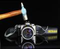
Fatel Decision !by richabhatiaComment: insurance fraud is no way to try and fund the purchase of a Canon... ;)
nice picture, but I am really struggling with most of the pictures in this challenge, as almost all require the words "decision to [x]". This photo is pretty reliant on the title to make it a "decision" (though not as bad as some).
The photo of the Nikon expoloding with the full impat would have made it more interesting! As it is, the hammer appears to have a bit of motion blur, but not enough to carry this off convincingly. I wonder if you could have used a long exposure and flashed the scene 2 or 3 times with the hammer moving, to get a good motion blur? |
| Photographer found comment helpful. |
| 06/01/2005 05:14:57 AM |
|
| Photographer found comment helpful. |
| 06/01/2005 04:51:04 AM |
A Salty Breezeby J_EhratComment: Congratulations on an excellent first entry - I look forward to seeing more from you.
Matthew |
| Photographer found comment helpful. |
| 05/25/2005 04:18:58 AM |
|
| Photographer found comment helpful. |
| 05/23/2005 09:21:54 AM |
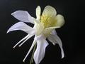
Distinctly Irisby glad2badadComment: I like this photo, but it is competing in a particularly strong field, and does not have the necessarty "wow" factor to avoid the middle ground. The middle ground for this challenge was a bit lower than usual, I think, because there are quite a lot of "wow" shots.
I would criticise the photo as follows. the gradation of colour in the background travels from yellow to blue, but the blue is not a strong blue: there is still a strong yellow cast. I might strengthen the blues in the top half of the image using colour balance controls, and possibly curves in certain channels.
The clouds are very subtle. I might have experimented with a polarising filter to punch out the whites in the cloud from the blue. As it is, the clouds are sufferring from the same yellow haze/colour cast.
Uniformity of the flowers is impressive - they are well matched and cast an interesting silhouette (if not immediately obvious as flowers). Drama might have been added if you could have caught a hihglight line tracing around the flowers to emphasise their shape and nature: possibly hard or impossible with this type of flower, but easier with flowers that have fluff on their leaves or petals (ie change of fauna being photographed - impractical to find different flowers on this timescale etc. I am sure, but availability/choice of subject will affect scoring dramatically). |
| Photographer found comment helpful. |
Home -
Challenges -
Community -
League -
Photos -
Cameras -
Lenses -
Learn -
Help -
Terms of Use -
Privacy -
Top ^
DPChallenge, and website content and design, Copyright © 2001-2026 Challenging Technologies, LLC.
All digital photo copyrights belong to the photographers and may not be used without permission.
Current Server Time: 07/17/2026 05:55:01 AM EDT.